
Filler Myths: a dermatology talk built on evidence
A conference talk for a cosmetic dermatologist on why patients are turning away from dermal fillers, and which of their fears are real. We designed a talk that turns sales data, surveys, studies and headlines into six clear concerns.
- Client
- Dermatologist (name withheld)
- Industry
- Medical aesthetics
- Service
- Event presentation design
- Deliverables
- Conference talk
- Platform
- PowerPoint, 16:9
The challenge
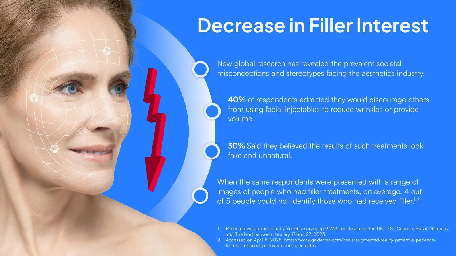
The talk had a lot to hold: sales figures, survey results, MRI studies, social-media trends and six clinical concerns, each with its references. Doctors in the room needed the evidence, and the story still had to stay clear.
Every claim kept its source on the slide, without turning the deck into a journal article.
- Medical data
- Colour coding
- Cited research
- Clear hierarchy
Inside the deck
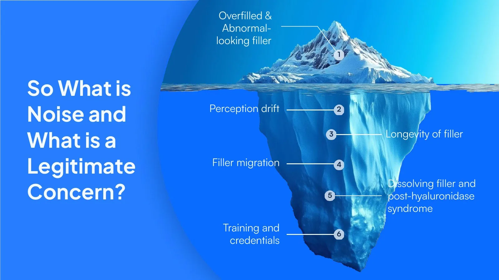
One map for the whole talk: six concerns on an iceberg, from what patients see to what sits below the surface.
Our approach
-
01
One blue, one warning colour
A single clinical blue carries the deck. Red appears only for decline, so a falling number reads before anyone reads the label.
-
02
Evidence on every slide
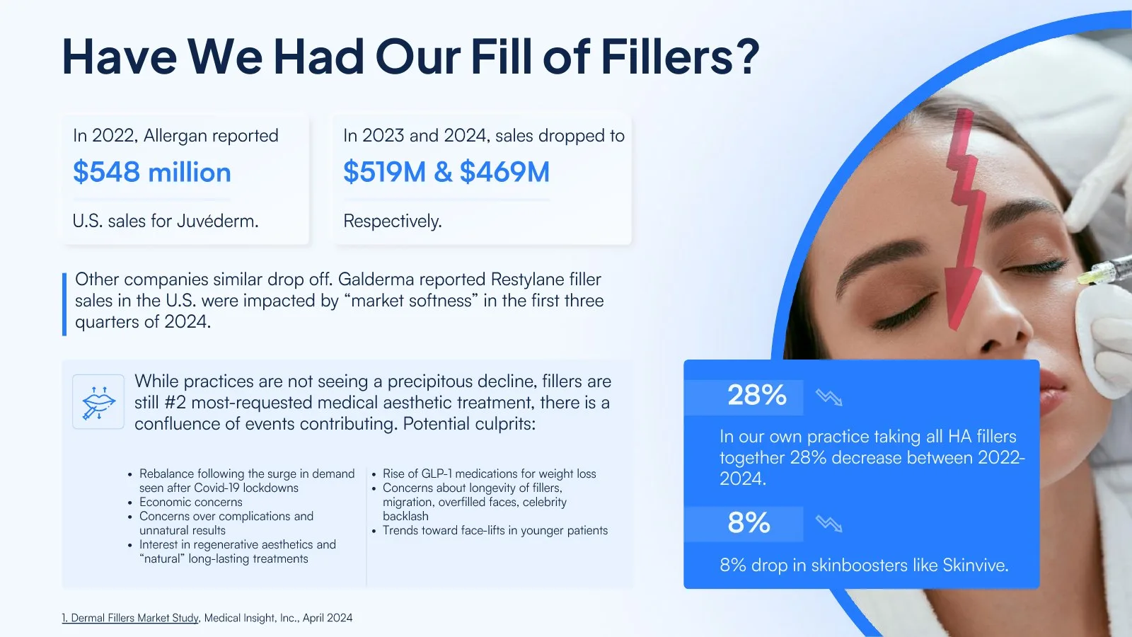
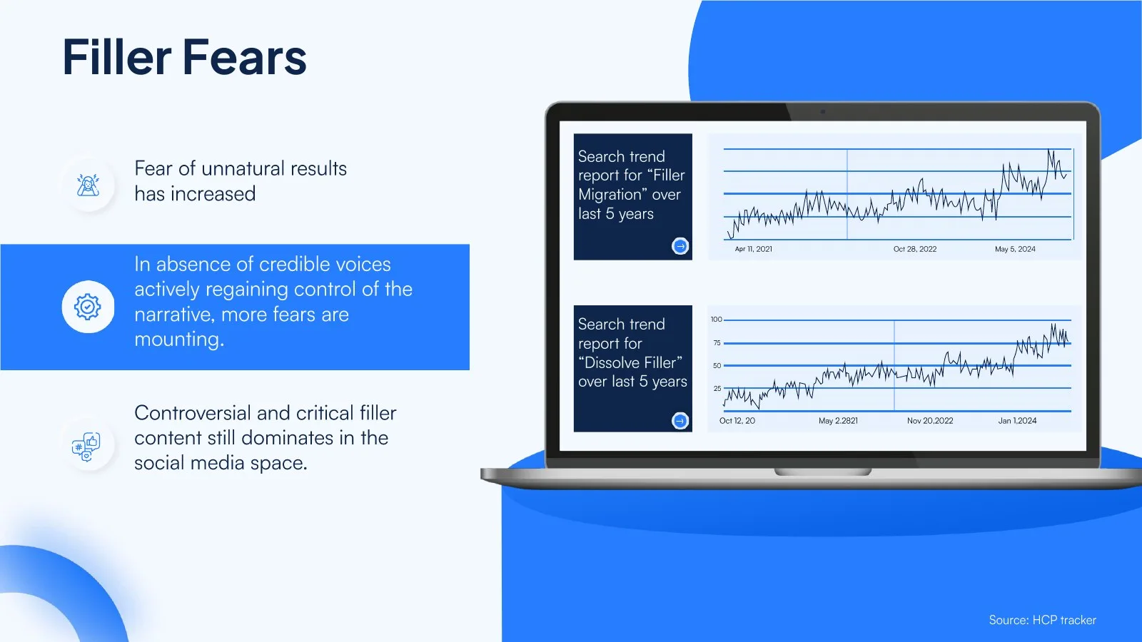
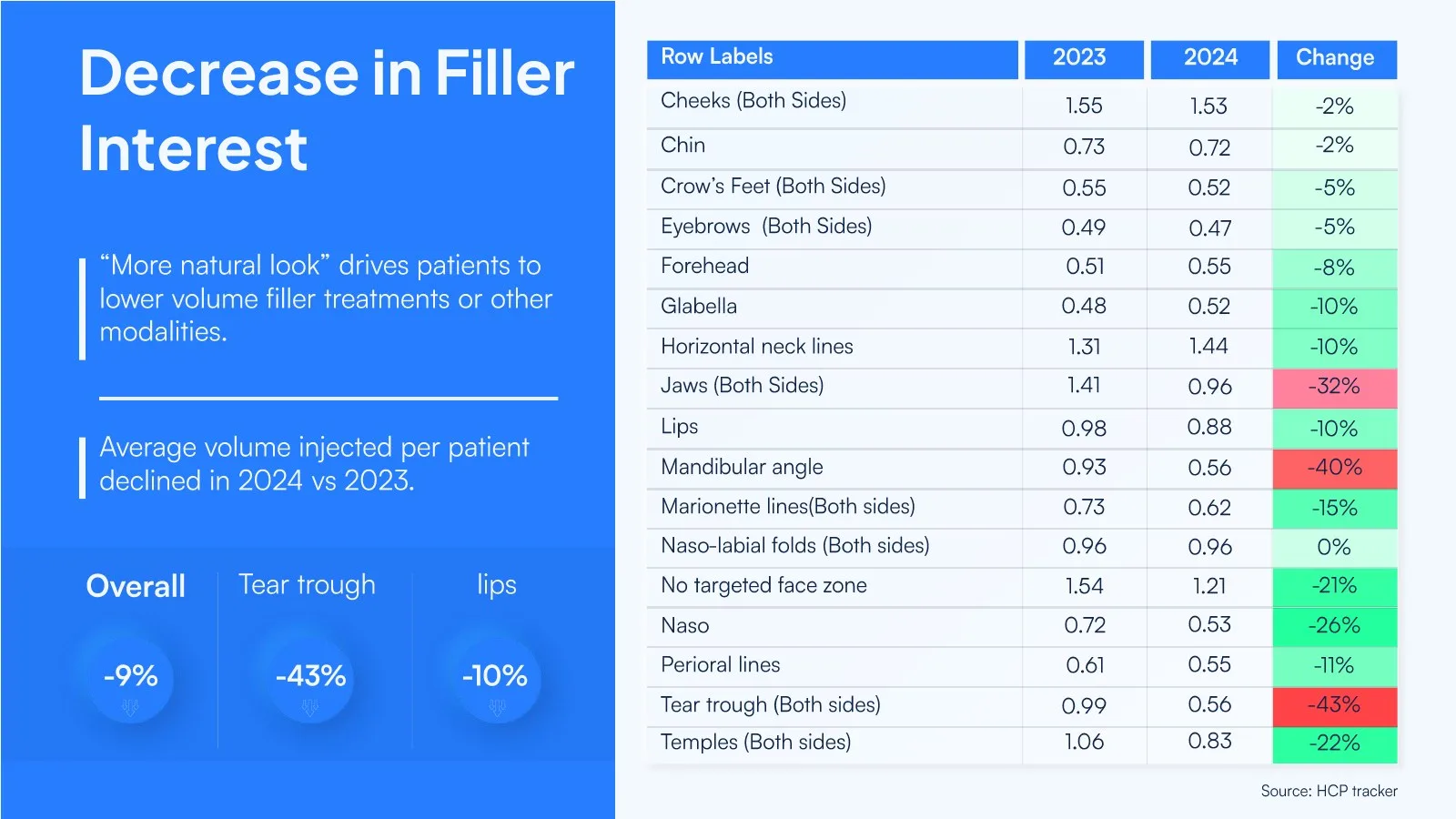
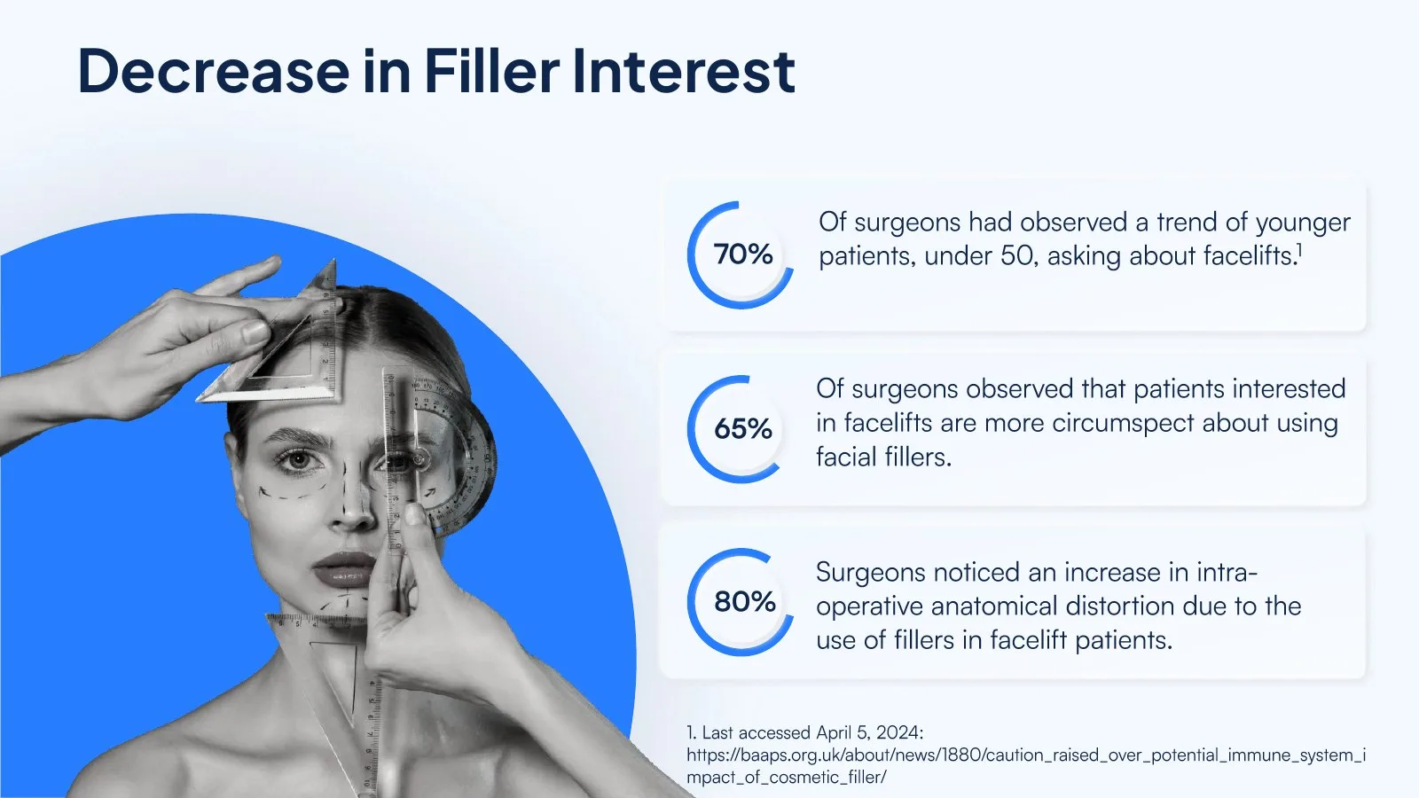
Sales figures, survey results and study data sit in clear tables and stat callouts, with the source on the slide.
-
03
A map for the talk
The iceberg slide sets out the six concerns, and the deck works through them in order: overfilling, perception drift, longevity, migration, dissolving filler and training.
The visual system
The palette, type and structure used throughout the deck.
Palette
- Clinical blue #2178F8
- Deep navy #0C244C
- Alert red #EA0036
- Ice #F0F8F8
- White #FFFFFF
Typefaces
-
Plus Jakarta Sans Bold Headlines and figures
-
Satoshi Regular Body copy
Design craft
-
Evidence-led design
Sales data, surveys and studies set in clear tables and stat callouts, sources kept.
-
Colour with meaning
One clinical blue throughout and red kept for decline, so the story reads at a glance.
-
A map for the talk
An iceberg slide frames the concerns, and the deck follows it section by section.
What we delivered
-
01
Credible for a medical audience
Research presented clearly, with every source in place.
-
02
Clarity in a complex topic
Noise separated from real concern, one section at a time.
-
03
A polished conference presence
A consistent, professional look for the speaker on stage.

Have a deck due?
Let’s make it unmissable.
Upload your deck or notes, or start with an AI draft. Our designers take it from there, from $10 a slide.