From the designer's side of the table, the brief is the most useful file in a project. It holds what only you know: who the audience is, what the deck must achieve, what is final and when you need it.
This guide covers what to send, how to write each part of the brief, which brand files designers need and how to run feedback rounds without losing days. There is a free fill-in template at the end that works with any designer. If you haven't chosen one yet, start with how to choose a presentation design agency.
Why the brief decides the result
A designer works from what you send. Every gap gets filled with a guess, and guesses are what revision rounds get spent fixing.
Compare two briefs for the same deck. One says: "Investor deck, 15 slides, modern look." The other says: "Seed investors who know logistics but not Juniper Freight. They'll read the PDF alone before a first call. The one thing to remember: we cut empty truck miles. Use our navy, not the green from the old website."
The same designer could take either brief. Only the second gives them a real chance of getting it right on the first draft.
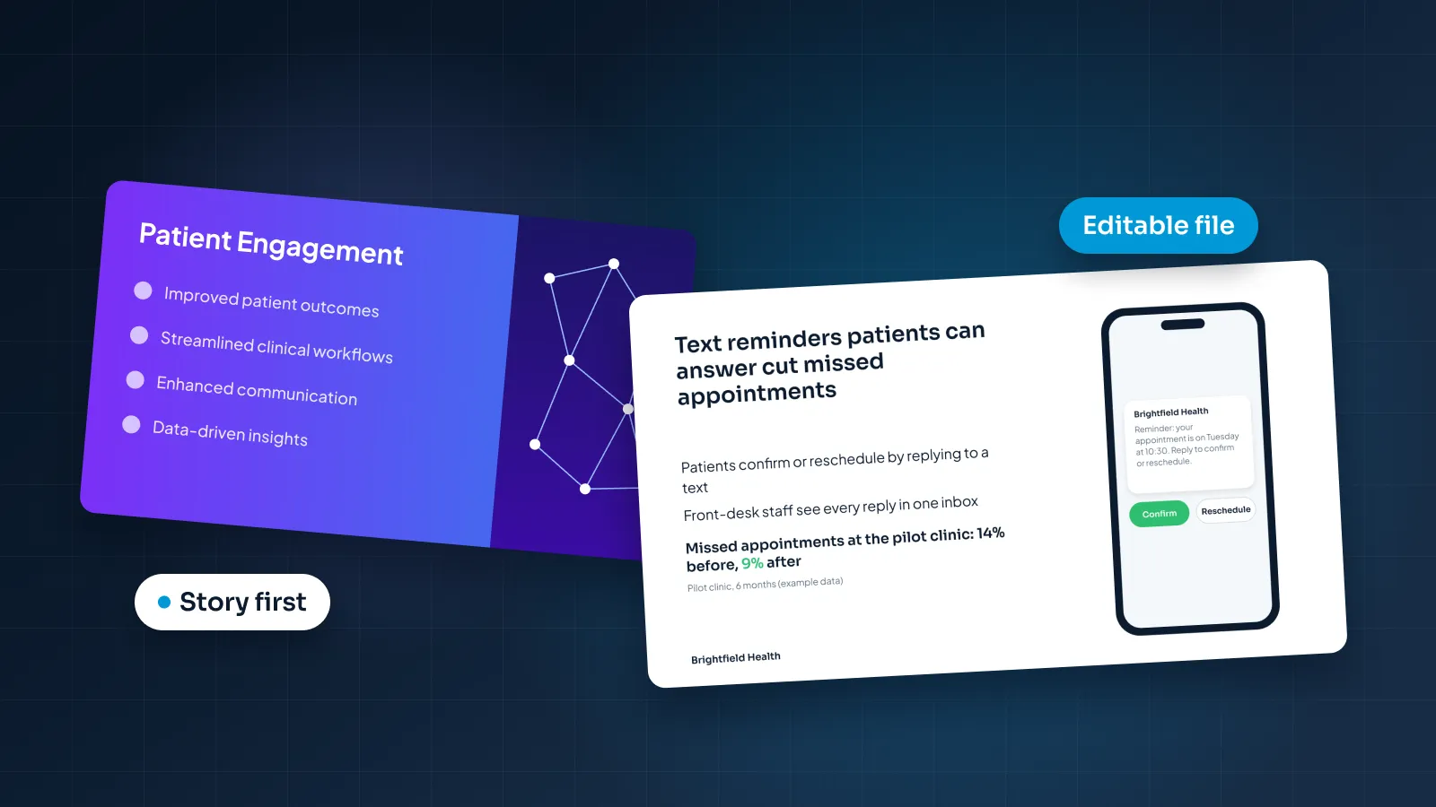
The brief also decides what kind of slide to make. A deck read alone needs full-sentence headlines and enough context to stand without a speaker. A deck presented live needs far less text, because you do the explaining. Same content, two different designs, and only you know which one you need.
A designer can fix a weak slide quickly, but no amount of polish fixes a deck aimed at the wrong audience.
It shapes the price too. A clear scope (slide count, complex slides, software, deadline) lets a designer quote accurately instead of guessing. Our guide to presentation design cost explains what moves the number.
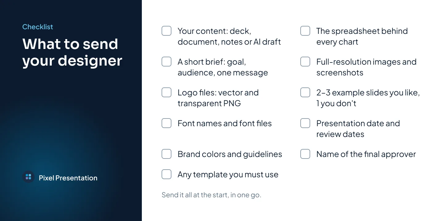
What to send your designer: the checklist
Send everything in one go, at the start. Content and files that arrive mid-project mean redesigning slides that were already finished.
- Your content. The current deck, a document, rough notes or an AI draft. Say which parts are final.
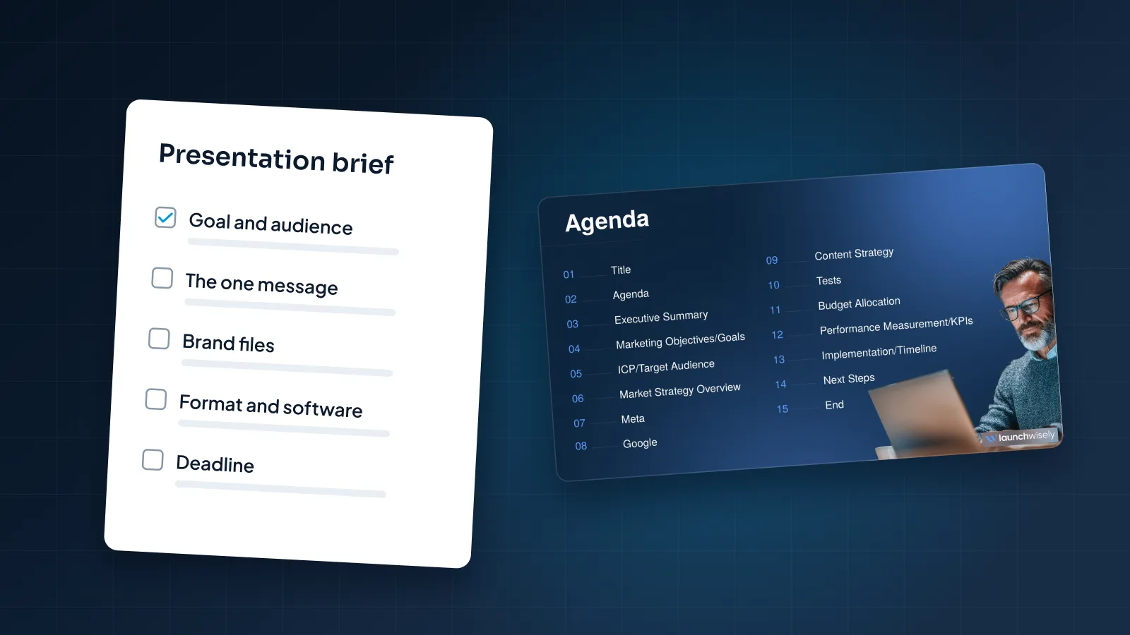
- The brief. Goal, audience, one message, format, length, deadline and approver. Each part is covered below.
- Brand files. Logo files, fonts, colors, guidelines and any template you must use.
- Source data. The spreadsheet behind every chart, not a screenshot of it.
- Images. Photos, product screenshots and headshots at full resolution, and only ones you have the right to use.
- Examples. Two or three slides or decks you like, and one you don't.
- Dates. When you present, when you want a first draft and when your team can review.
- Permissions. The customer names and logos you are allowed to show.
With Pixel Presentation, you start by uploading your deck, document or notes, or by creating an AI draft in our draft studio. The brief comes next, and brand guidelines you upload once are reused on every project. How it works shows each step.
Writing the brief, section by section
A brief does not need to be long. One or two pages is plenty for most decks. What matters is that each section answers a question the designer would otherwise have to guess.
Goal and audience
Start with who will see the deck and what you want them to do afterward. "Investors" is too broad. "Seed-stage investors who know health tech but haven't heard of us" tells the designer how much to explain.
Write the action as a verb: approve the budget, book a demo, sign the pilot, fund the round. A Calder Robotics deck asking warehouse buyers to start a pilot needs proof and next steps up front. The same company's board deck needs risks and numbers first.
The one message
If your audience remembers one sentence from the deck, what should it be? Write it in under 20 words. For example: "A team of two can install Calder Robotics in a weekend."
That sentence becomes the test for every slide. Slides that support it stay. Slides that don't move to the appendix. It also tells the designer what gets the biggest type and the most space.
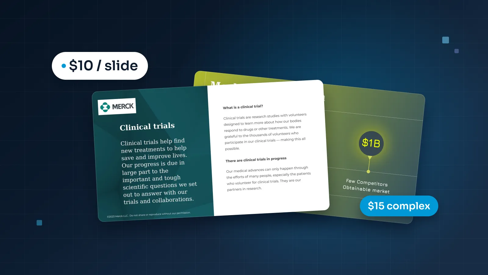
The realtor partnership sales deck for Pilot Mortgage Group shows the idea in practice: pain points first, then visible proof, then one clear call to action.
Context and occasion
Tell the designer how the deck will be used:
- Presented live, sent as a PDF, or both?
- In a meeting room, on a video call or on a conference stage?
- Who presents, and how long is the slot?
- Will anyone print it or read it on a phone?
For an event, ask the organizer for the screen size and ratio now. Event screens, including LED walls, are not always 16:9.
Content status
Mark what is final, what is a draft and what is missing. A simple label per slide works: "final", "edit for clarity", "placeholder, numbers coming Tuesday".
Say whether you want the story restructured or your order kept. Say whether copy editing is welcome. If the content is an AI draft, say so, because it usually needs a firmer story and tighter headlines. Our guide on making an AI-generated presentation look professional covers what to fix first.
Brand
Point to your brand guidelines, or list what you have: logo, colors, fonts. Then say how strictly to follow them. "Follow our guidelines exactly" and "use our colors, but push the look" lead to very different decks.
Two or three tone words help, such as "calm and clinical" or "bold and direct", as long as your examples back them up. If your company requires a template, say so here and attach it.
Format and software
Name the software the deck must live in: PowerPoint, Google Slides, Keynote or Figma Slides. Then say who will edit it after delivery, and on what. A deck your sales team edits in Google Slides needs Google Fonts so it looks the same for everyone. A Keynote deck needs its fonts installed on the Mac that presents it.
Also note:
- Slide size. 16:9 is the standard today. 4:3 is legacy, so ask for it only if you know you need it.
- PowerPoint version. If your team uses an older version, say which. Morph transitions, for example, need PowerPoint 2019 or later, or Microsoft 365.
- Extras. Animation, speaker notes set up for presenter view, or a PDF for sending.
Whatever the software, ask for native, editable files: live text, charts built with the tool's own chart engine and master layouts so new slides match. That is the baseline for professional PowerPoint presentation design, and it's worth writing into the brief.
Length and deadline
Give a target slide count for the main deck, and say whether an appendix is fine. If you're unsure, give the length of your time slot and let the designer suggest a count.
For the deadline, give the date you present, not only the date you want files. Then work backwards, leaving time for your own review, any sign-offs and at least one rehearsal. Ask your designer when their clock starts. It usually starts when the content and brief are complete, not when you first get in touch.
Examples you like and dislike
Send two or three examples and say what you like in each. It might be the chart style, the white space, the photography or headlines that read as full sentences. "I like this one" doesn't help much on its own, because the designer can't tell which part you mean.
One example you dislike is often just as useful. It rules out a whole direction in a sentence.
Keep it to a handful. Twenty references with no notes point everywhere at once.
Who approves
Name one person who collects feedback and gives the final yes. List anyone else who must sign off, such as a founder, legal or compliance, and say when they will see the deck.
The most expensive surprise in a design project is a new reviewer at round two who wants a different direction. Naming everyone up front prevents it.
Brand files designers need
Send these at the start, even if they seem obvious. A logo saved from a website is often too small to project cleanly.
- Logo. A vector version (SVG, EPS, AI or PDF) and a PNG with a transparent background. Include light and dark versions.
- Fonts. The exact font names and the font files, or a note that the deck should use a standard font. If the deck will be edited on computers without your fonts, agree on a fallback.
- Colors. Hex or RGB values for primary and secondary colors, and which ones are meant for text.
- Guidelines. The brand guidelines PDF, if you have one.
- Template. Any PowerPoint, Google Slides or Keynote template your company requires.
- Imagery. Your photo library, product shots and preferred icon style.
- Legal lines. Required disclaimers, footers or trademark notes.
Some brand colors are too light for text. A careful designer checks text against WCAG contrast ratios (4.5:1 for normal text, 3:1 for large text) and moves light brand colors to accents and shapes.
If you must use an existing template, a good designer will work inside it and tell you before starting if its layouts are broken. Fixing a template first is faster than discovering its problems halfway through.
Deadlines, reviews and feedback rounds
Most design projects follow the same shape: brief, first draft, review rounds, approval and final files.
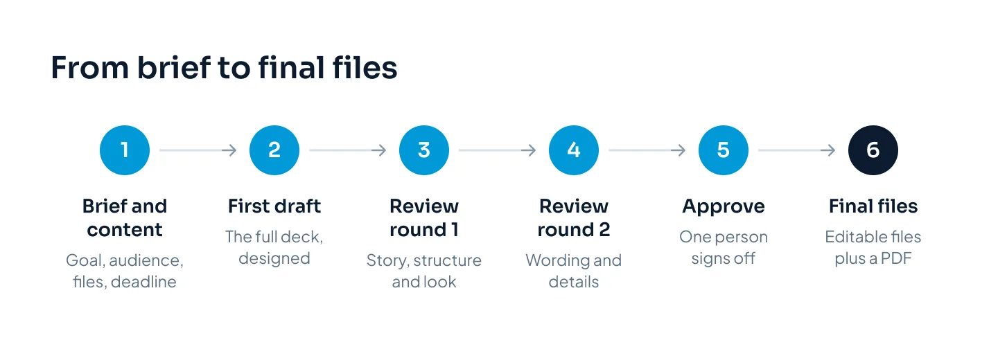
How you give feedback decides how many rounds you need. These habits help:
- Consolidate. Collect everyone's comments into one list, sent by one person. Settle disagreements inside your team before they reach the designer.
- Point to the slide. "Slide 6: show quarterly, not monthly" is quick to act on. "Make it pop" is not.
- Say what's wrong, not only the fix. "This chart hides our growth" lets the designer find the best fix. It may not be the one you had in mind.
- Front-load the big things. Use round one for story, structure and overall look. Save wording and small details for round two.
- Comment in one place. Use comments in the file, or one document with slide numbers. Not email, chat and a call at once.
Every order with us includes two revision rounds, express orders too. Extra rounds are $25 each, and small edits within 14 days of delivery are free. Most 10–20 slide decks take three to five working days, counted from when the content and brief are in. If your date is tight, Express (48 hours) and Rush (24 hours) are available when a designer has the hours free. The pricing estimator shows what they add.
Mistakes that slow projects down
These are the delays a clear brief prevents.
- Sending content that isn't final. "We'll update the numbers later" often means designing the same slides twice. If something will change, mark it as a placeholder.
- No single approver. Five reviewers with equal say produce five directions.
- A new stakeholder at round two. Someone senior sees the deck late and changes the brief. Show them the brief first.
- Style words with no examples. "Modern", "clean" and "premium" mean different things to everyone.
- Charts sent as screenshots. A picture of a chart has no data behind it. Send the spreadsheet so the chart can be built in PowerPoint's own chart tool and updated in Excel later.
- Changing software mid-project. Moving from PowerPoint to Google Slides after design means rework, because some features don't convert cleanly.
- Missing content. A late section can delay delivery of the whole deck.
- No buffer before the presentation. Files delivered the night before leave no time to rehearse or fix a font problem on the presenting laptop.
Free presentation brief template
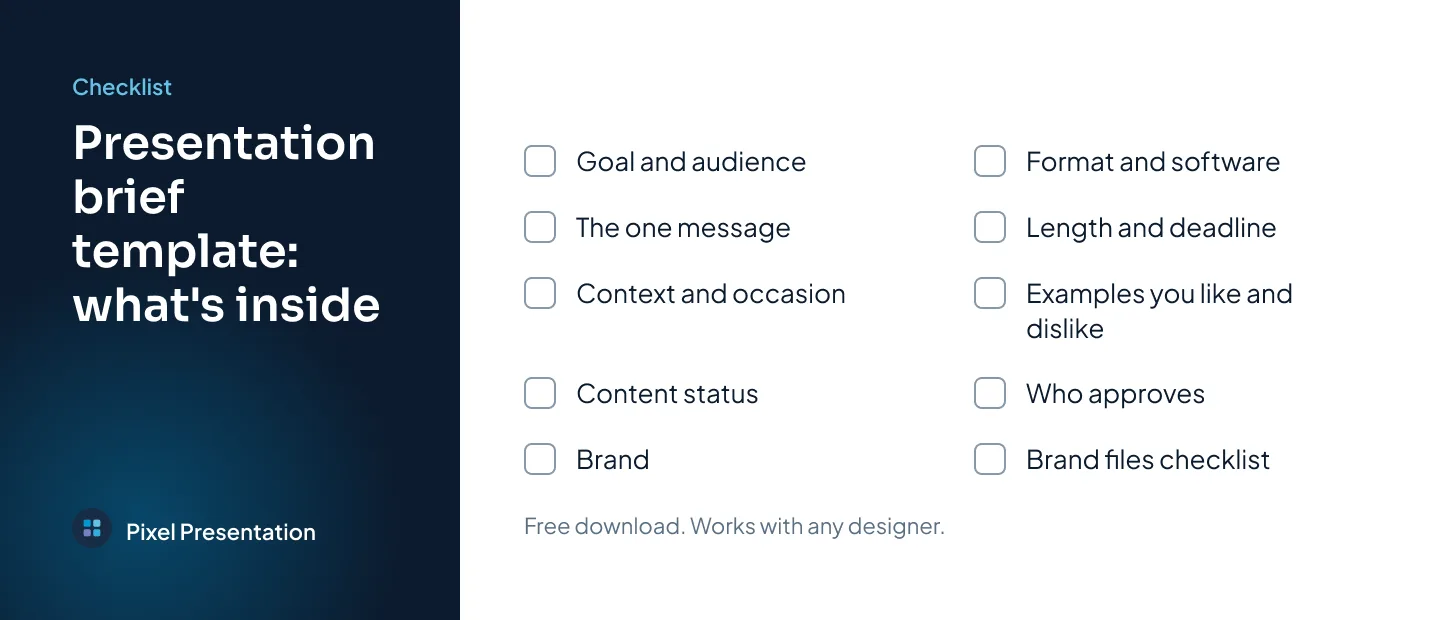
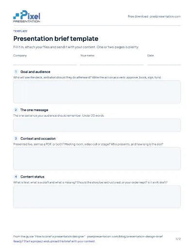
The template turns every section of this guide into one fill-in document, with a brand files checklist at the end. It works with any designer or agency.
Free download
Presentation brief template
A free, fill-in presentation brief template with every section from this guide and a brand files checklist.
When your brief is ready, you can start a project and upload it with your content in the same step.