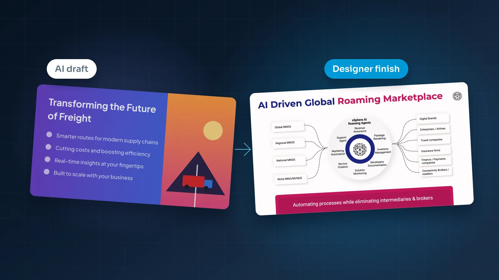
An AI tool can give you a complete deck in minutes. Then you look at it properly, and something is off: it's tidy, but it could belong to any company.
That's fixable. This guide covers why AI decks look generic, the signs that give them away and how to fix each one, in the order a designer would work. If you're still deciding whether to use AI at all, start with our comparison of AI presentation makers and presentation designers.
Why AI decks look generic
AI presentation tools are built to produce a reasonable deck for anyone. That's their strength, and it's also why the result looks like no one in particular.
Four things cause most of the problem:
- Shared layout systems. The tools build slides from the same layout systems, so their outputs tend to look alike. People who see a lot of decks recognize them.
- Average wording. AI tends to write the safe, typical sentence for a topic, which any company in your category could also use.
- A theme, not a brand. Colors and fonts come from a theme. They may be close to your brand, but the details that make it recognizable are missing.
- Equal weight everywhere. Every slide gets a title, a few bullets and an image, so nothing stands out as the main point.
Only one of these is about visual style. The rest are about content, which is why a new theme alone rarely fixes an AI deck.
Most of what makes an AI deck look generic is that it says generic things.
Signs a deck was made by AI, and the fix for each
None of these patterns proves that AI was involved; people make them too. But they're typical of AI drafts, and each one has a clear fix.
Titles that name a topic instead of making a point
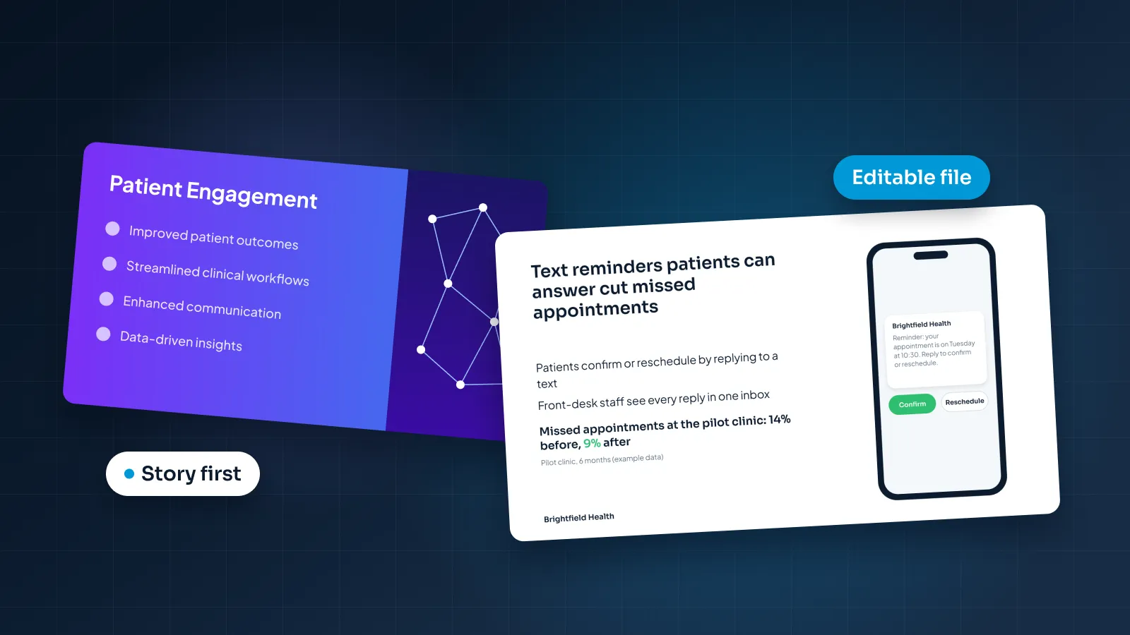
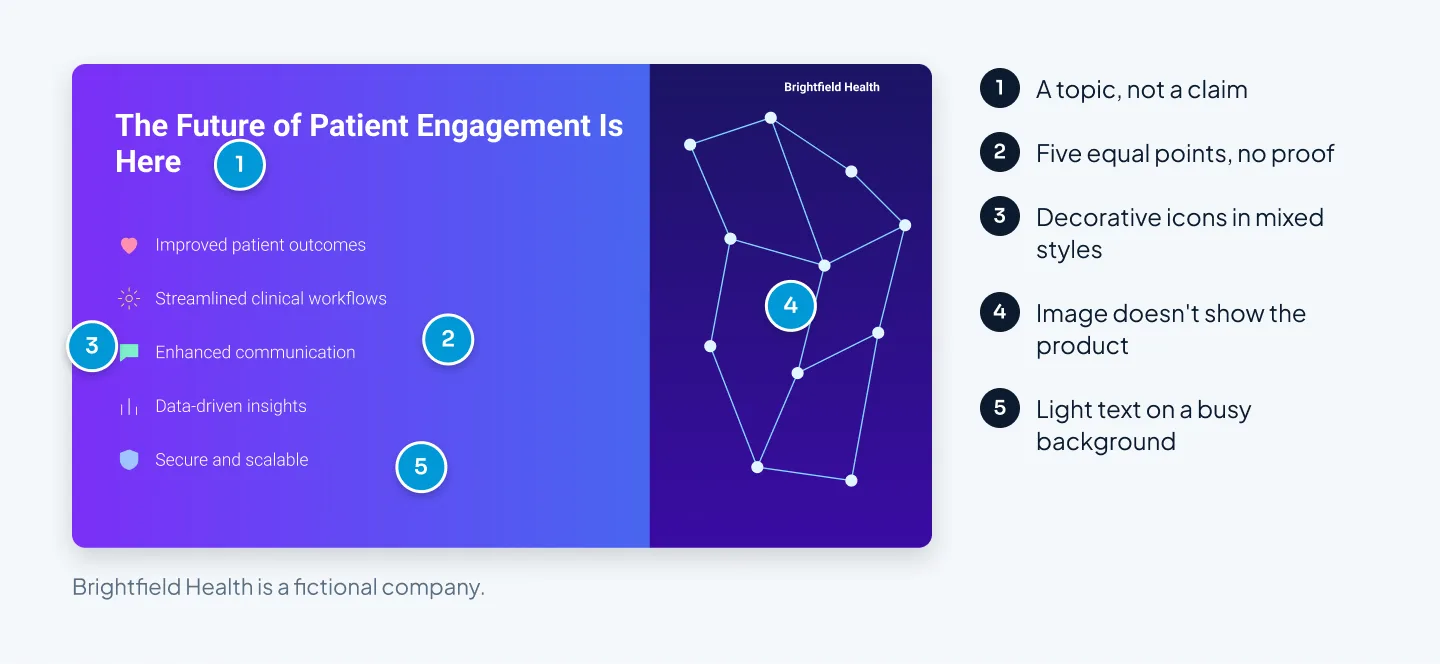
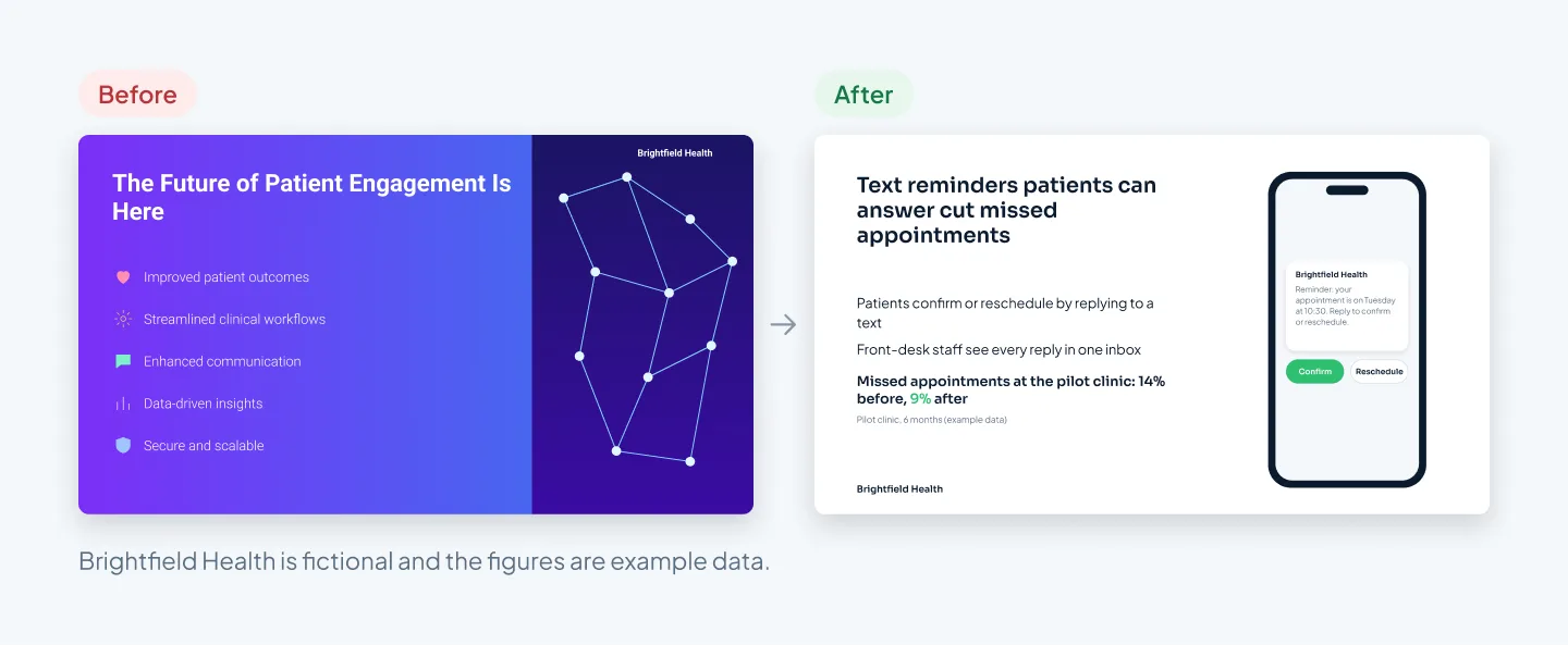
"The Future of Patient Engagement Is Here" could head any healthcare deck. It gives the audience nothing to agree or disagree with.
Fix: rewrite each title as the one thing that slide should prove, in a full sentence. For example: "Text reminders patients can answer cut missed appointments."
Three to five equal bullets on every slide
AI spreads content evenly, so each slide gets a similar list of short, vague points.
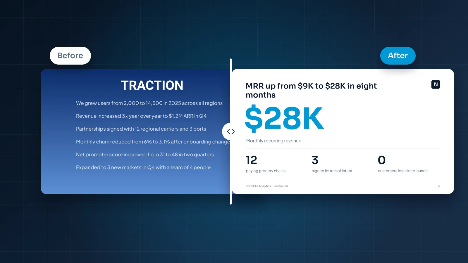
Fix: find the one point that matters on each slide. Support it with a number, a picture or a short example, and cut or move the rest.
The same few layouts, over and over
Title, bullets and an image on the right. Then the same again. Then a row of three cards.
Fix: choose each layout from its content. One number gets a big-number slide, two options get a comparison, a process gets numbered steps and a trend gets a chart.
An icon beside every bullet
Decorative icons, often in mixed styles, are one of the quickest giveaways.
Fix: delete them. Bring icons back only where they help people scan, such as labeling categories, and use one set in one style and one color.
Images that could belong to anyone
Stock photos of handshakes and skylines, or generated images of glowing networks, don't show your product, your customers or your team.
Fix: use real screenshots and photos, or no image at all. There's more on this below.
Words that sound impressive and say little
"Streamlined", "next-generation", "innovative", "data-driven": AI copy leans on adjectives your competitors use too.
Fix: replace each adjective with the fact behind it: a number, a customer type, a time saved, a feature name. If there's no fact behind it, cut it.
Numbers with no source
AI tools can write figures that sound right and aren't, and charts that aren't connected to any data.
Fix: check every number against your own source and add a short source line under each chart. Rebuild any chart you can't edit with PowerPoint's own chart tool, so the data sits in an embedded Excel sheet.
Text that's hard to read
Light text on gradients and photos looks fine in a thumbnail. On a projector or a shared screen, it's hard to read.
Fix: put text on plain backgrounds and check the contrast. The WCAG standard is at least 4.5:1 for normal text and 3:1 for large text.
Fix the story first
It's tempting to start with colors and fonts. Resist it. Restyling slides you'll later cut wastes effort, and a polished slide with a vague message is still vague.
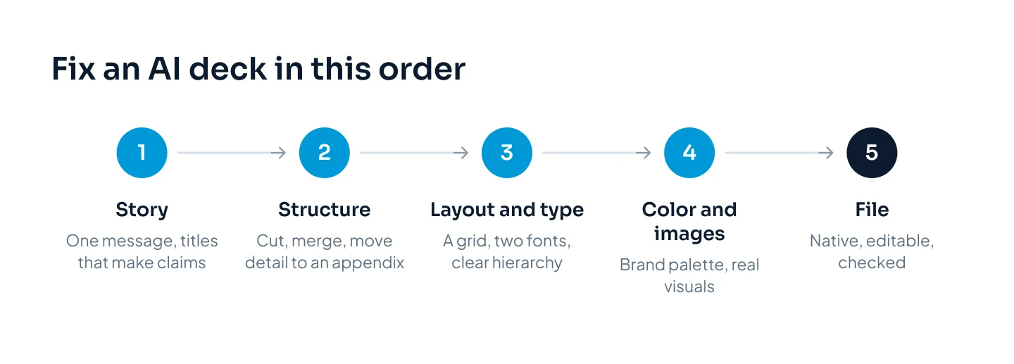
Work through the story in four steps:
- Write the one sentence. What should the audience believe or do after the last slide? Write it down, then check every slide against it.
- Read only the titles. Read them top to bottom. If they don't tell the story on their own, rewrite them as claims until they do.
- Cut and merge. Remove slides that repeat a point and merge slides that split one idea. AI drafts tend to run long.
- Move detail to an appendix. Backup data, full feature lists and methods can sit after the closing slide, ready for questions.
Then read the text aloud. If a line sounds like something you'd never say in a meeting, rewrite it the way you'd say it.
Fix layout, type and color
With the story settled, the visual fixes go quickly. Our guide to making a PowerPoint look professional covers these rules in depth. Here's the short version for an AI deck.
Layout
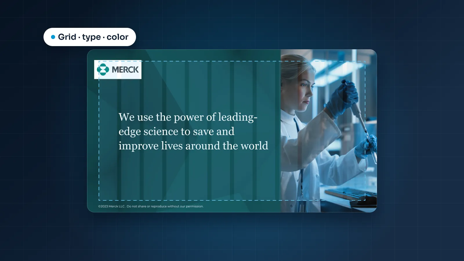
- Set margins and a simple grid, and align every text box and image to it.
- Give each slide one focal point: the number, the chart or the headline. Make everything else visibly smaller.
- Leave empty space. A slide doesn't need to be full to be finished.
- Build slides from master layouts rather than boxes placed by hand, so new slides match.
Type
- Use two fonts at most, one for headings and one for body text, and set them as theme fonts in the Slide Master.
- Make the hierarchy obvious: titles clearly larger than body text, and body text at one size throughout.
- For a deck you'll present, avoid body text smaller than about 18 pt.
- Left-align body text. Centered paragraphs and sentences in capitals are harder to read.
Color
- Replace the theme colors with your brand palette, so charts and shapes pick it up automatically.
- Use a neutral base and one accent color, and save the accent for what you want people to notice.
- Drop decorative gradients unless they're part of your brand.
- Check the contrast of every text color against its background.
Replace generic images and icons
Images are where AI decks look most borrowed. Replace them in this order of preference:
- Your product: real screenshots, cropped to the part that matters.
- Your people and your work: team photos, customer sites and finished projects, with permission.
- No picture: a simple diagram or one big number often says more than a photo.
- Stock photography: chosen carefully, used sparingly and kept to one consistent style.
If you keep an AI-generated image, look at it at full size before you present. Make sure it doesn't pass itself off as your real product, customers or team.
For icons, pick one set and use it everywhere: same style, same line weight, same color. If an icon doesn't help someone find or group information, delete it.
Logos need the same care. Use current files from your brand guidelines, and show customer logos only if you have permission.
Get a clean, editable PowerPoint or Google Slides file
Many AI tools export to PowerPoint or PDF. The catch is that exported files often have fixed text boxes, images or layouts that are harder to edit than a deck built natively. You usually find out when a colleague tries to update it.
Open the export and run these checks:
- Text: click into a few titles. Is the text editable, and does it sit in a real placeholder or in a fixed box?
- Layouts: open the Slide Master. Are there layouts you can reuse, or was everything placed by hand on blank slides?
- Fonts: are the fonts installed on your computer and your colleagues' computers? Missing fonts get substituted, and spacing breaks.
- Charts: click each chart. If you can't edit its data, it's a picture and needs rebuilding.
- Images: are images separate objects, or flattened together with text into one picture?
- Accessibility: run PowerPoint's Accessibility Checker to find missing alt text and check the reading order.
If most slides pass, repair the ones that don't. If most fail, rebuild the deck on a proper master. It's faster than patching every slide, and you end up with a file your team can keep using.
Moving to Google Slides adds a step. Google Slides imports .pptx files, but complex PowerPoint features (some animations, SmartArt, custom fonts and some chart formatting) can change on conversion. Fonts are limited to Google Fonts, so swap custom fonts for the closest Google Font before you share the deck.
To see what a placeholder-based build looks like, take the Merck template system: a PowerPoint template system for patient and clinical-trial content, with layouts built on placeholders.
When to hand it to a designer
Fixing an AI deck yourself makes sense for an internal or one-off presentation. Hand it to a designer when:
- the deck goes to investors, buyers, a board or a conference audience;
- the export is broken and needs rebuilding, not tidying;
- it has to match your brand guidelines exactly;
- the data slides need to be accurate and easy to update;
- your team will reuse it, so it needs a proper master;
- the fixes would take you longer than a day.
Send the designer the AI deck or its export, the source for any numbers, your brand guidelines and your deadline.
At Pixel Presentation, that's what our presentation redesign service is for. Upload the draft from your AI tool, and our designers rebuild it in 3–6 working days. Design is $10 a slide, or $15 for complex slides such as custom infographics. Two revision rounds are included, and you can pay after you approve the final deck.
You can estimate your deck if you'd like a number first, or read how the process works.
Your drafts and files are used only to make your presentation, and our AI providers are contractually barred from training on them.
For examples of what changes when a designer takes over, see our presentation redesign before-and-after examples.