

Slides rarely look amateur because someone lacked talent. They look amateur because nothing is consistent: titles jump around, there are four fonts and seven colors, and every slide tries to say three things at once.
The fix is a short set of rules that presentation designers apply to every deck. This guide goes through them in order: practical PowerPoint design tips, with the numbers we use as starting points for margins, type sizes and palettes. You can apply all of it in PowerPoint today, with no extra software.
One idea per slide
The quickest way to make a slide look professional is to put less on it. A slide built around one idea has room for white space, a clear title and a single visual that proves the point. A slide carrying three ideas needs small text and a patient audience.
Here's the test we use: can you write the point of the slide as one sentence? If you can, that sentence becomes the title. If the sentence needs two "ands", you have two or three slides.
In practice, a one-idea slide has:
- A title that states the point. "Wait times fell from 9 days to 6", not "Operations update".
- One supporting element. A chart, a big number, an image, or up to three short lines of text.
- Somewhere else for the extras. Detail that doesn't serve the point moves to the speaker notes, the next slide or an appendix.
Don't worry about slide count. A 20-slide deck with one idea per slide is usually quicker to present than a 10-slide deck where every slide needs a minute of explaining.
Decks that are sent rather than presented, such as pre-reads and leave-behinds, can carry more words. The rule still holds: one point per slide, stated in the title, with the supporting detail underneath.
If a point has to build up step by step, reveal it in stages instead of showing everything at once. Simple entrance animations do this well, and our guide to PowerPoint animation and Morph covers when motion helps and when to skip it.
A grid and consistent margins
Alignment is what makes a slide read as "designed". When the title on slide 4 starts a few millimeters to the right of the title on slide 3, few people could name the problem, but the deck feels loose.
Start with the right canvas
Use 16:9 widescreen (1920 × 1080 px). It fits modern laptops, monitors and meeting-room screens, while 4:3 is a legacy format. Set the slide size before you design anything, because changing it later forces PowerPoint to rescale every slide.
Set margins and keep to them
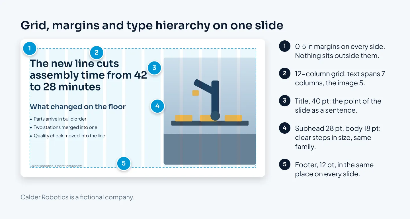
Our starting point is a margin of about 0.5 inch (1.3 cm) on every side of PowerPoint's standard 13.33 × 7.5 inch widescreen slide. Titles, text, charts, logos and page numbers all stay inside it.
The only things that cross the margin are full-bleed images, and those go all the way to the edge, not almost.
Use a 12-column grid
Inside the margins, divide the width into 12 equal columns with small gaps between them. Twelve splits cleanly into halves, thirds and quarters, so two-column, three-column and text-plus-image layouts all line up with each other. A text block might span seven columns and an image the other five.
In PowerPoint, turn on guides from the View tab and add vertical and horizontal guides for your margins and columns. Add them in Slide Master view and they appear on every slide that uses that master. Then use the Align and Distribute commands instead of dragging objects by eye.
Fix the positions that repeat
Titles start at the same point on every slide. Body content starts at the same height. Logos, footers and slide numbers sit in fixed spots.
When you click to the next slide, nothing should jump.
Use space to group
Space does the work that boxes and lines usually do. Keep related items close together and put more space between unrelated ones, and the structure reads without a single divider.
Type: two fonts and a clear hierarchy
Fonts are where decks drift fastest. Someone pastes in a paragraph from an email, someone else picks a playful font for one slide, and soon the deck has five.
Choose two fonts at most
Use one font for headings and one for body text, or a single family in two weights, which is often the cleanest option. Choose fonts that are easy to read on screen.
Script, handwritten and novelty fonts belong on invitations, not in business decks.
Use a few sizes with clear steps
Hierarchy means the audience can tell, at a glance, what to read first. That needs a few sizes with real gaps between them. These are the sizes we start from:
| Text | Presented on screen | Sent to be read |
|---|---|---|
| Slide title | 36–40 pt | 28–32 pt |
| Subhead | 24–28 pt | 18–20 pt |
| Body text | 18–20 pt | 12–14 pt |
| Labels and sources | 12 pt | 10 pt |
The example slide above uses 40, 28 and 18 pt. The exact numbers matter less than the steps between them: a 24 pt title over 20 pt body text doesn't look like a title.
For a presented deck, 18 pt is our floor for body text; only labels, footers and source lines go smaller. If the text doesn't fit at that size, there's too much text.
Set text so it reads easily
- Left-align body text. Center only short titles or single lines.
- Line spacing: about 1.1 for titles and 1.2 to 1.3 for body text, so lines neither crash into each other nor float apart.
- Line length: don't run body text across the full slide. Half to two-thirds of the width is easier to read.
- Emphasis: use bold or your accent color for a key phrase. Skip underlines, which look like links, and avoid all caps for anything longer than a short label.
- Text on photos: only over a calm area of the image, or on a solid or darkened panel.
Make them theme fonts
In Slide Master view, open the Fonts menu and choose Customize Fonts to set the heading and body fonts. Every placeholder and new text box then picks them up. If the brand font ever changes, you change it once.
Check how your fonts will travel. If a font isn't installed on the computer that opens the deck, PowerPoint substitutes another one and your line breaks move. Use fonts that every presenter has, embed them in the file where the font license and your version of PowerPoint allow (it's one of PowerPoint's save options), or send the fonts with the deck.
Google Slides works differently and sticks to Google Fonts. If your deck will move between apps, our comparison of Google Slides, PowerPoint and Keynote explains what changes when you convert.
Color: a small palette and one accent
A deck with seven colors has no color system. A deck with five, used with rules, looks like a brand.
Build the palette
We start with five or six colors:
- A dark color for text, often a very dark gray or navy rather than pure black.
- A light background, usually white or off-white.
- One or two neutrals, such as a light and a mid gray, for lines, secondary text and chart bars that aren't the point.
- A primary brand color for structure: section dividers, key headings, icons.
- One accent that means "look here".
Most slides use only three of these. That restraint is what makes the accent work.
Use the accent once per slide
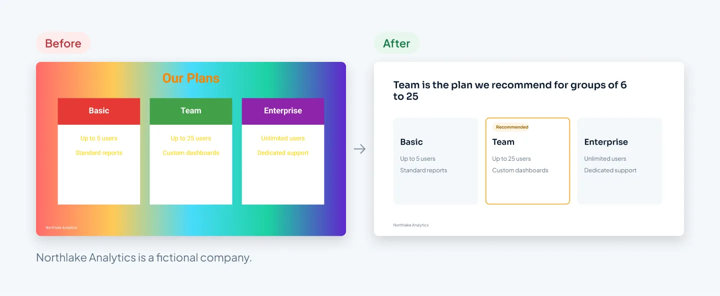
The accent marks the one thing you want noticed: the key number, the highlighted bar, the recommended option. If it appears on six elements, it stops meaning anything.
A quick check: glance at the slide for one second. Your eye should land on whatever the accent marks.
Check contrast
Text has to stand out from its background. The WCAG contrast standard asks for a ratio of at least 4.5:1 for normal text and 3:1 for large text.
Light gray text on white and white text over a pale photo are the usual failures. Any free online contrast checker will test a pair of colors in seconds.
Set theme colors
In Slide Master view, the Colors menu lets you customize the theme colors. There are twelve slots: two dark and two light colors for text and backgrounds, six accents and two hyperlink colors. Charts, tables and SmartArt pull from these slots, so a chart you insert later already uses your palette.
PowerPoint colors chart series in accent order, so put the color you want to see first in Accent 1.
Choose a background and keep to it
White or very light backgrounds suit most business decks, especially ones read on laptops or printed. Dark backgrounds suit stage talks and image-led decks. Section dividers can break the pattern; content slides shouldn't.
Skip gradients, glows and heavy shadows unless your brand guidelines use them. Nothing dates a deck faster.
Images and icons that match
A deck feels assembled when its pictures come from five different places. It feels designed when they look like they belong together.
Photos
- One style. Keep lighting, color and framing consistent. Mixing glossy stock, phone snapshots and cartoon illustrations is a giveaway.
- Real over generic. Show your product, your team, your customer's setting. Handshakes, lightbulbs and people pointing at blank screens read as filler.
- Crop with intent. Either run a photo full-bleed to the slide edges or place it in a frame that sits on your grid. Avoid small photos floating mid-slide.
- Never stretch. Resize from the corners, and use Crop (including its Aspect Ratio option) to fit a frame without distorting the image.
- Large enough. A full-bleed photo on a 1920 × 1080 slide should be at least that size, or it will look soft on a big screen.
- Alt text. Give every meaningful image alt text so screen-reader users get the same point, and run PowerPoint's Accessibility Checker to check the reading order.
Icons
- One set, one style. All outline or all filled, the same stroke weight, the same size, the same color.
- Labels, not decoration. An icon should help someone scan. If it needs explaining, delete it.
- Vector where possible. SVG icons stay sharp at any size and can be recolored to match your theme.
Logos
Client or partner logos look tidiest in a single color, such as all gray, or all white on a dark band. Size them so they look equal, not so they measure equal.
Only use logos you have permission to show.
Charts and tables
Data slides are often where a deck loses its polish, because PowerPoint's default chart shows everything at once. The short version:
- Build charts with PowerPoint's own chart tool (Insert, then Chart), not as pasted screenshots. Native charts use your theme fonts and colors, stay sharp on any screen, and keep their data in an Excel sheet you can update.
- Make the title the takeaway. "West is the only depot below target", not "Delivery performance".
- Cut the clutter. Remove gridlines, 3D effects and extra decimals. Replace the legend with labels next to the data.
- Gray first, accent second. Put every series in a neutral color, then give the accent to the one that proves your title.
Tables follow the same logic. Remove the vertical lines, keep horizontal rules light, right-align numbers with the same number of decimals, and bold the total or the row that matters.
If a presented table runs much past seven rows, show the rows that make the point and move the full table to an appendix.
We cover chart choice, action titles and KPI slides in detail in our guide on how to present data in PowerPoint.
Build consistency into the slide master
Professional slides aren't more decorated. They're more consistent.
Everything above is easy on one slide and hard on forty, especially when four people edit the same deck the night before. The slide master is where consistency stops depending on memory.
What to set up
- Theme fonts and colors, as described above.
- Guides for your margins and grid columns.
- Layouts for each kind of slide the deck repeats: title, section divider, title and text, two columns, big number, image and text, chart, quote, closing.
- Placeholders in each layout, sized and positioned on the grid, so content lands in the right place.
- Fixed elements such as the logo, footer and slide number, placed on the master rather than pasted onto each slide.
- Clear layout names, like "Chart, full width", so colleagues pick the right one.
Using it day to day
Add slides with New Slide and pick a layout. To switch an existing slide, use the Layout menu on the Home tab. When you paste slides from another deck, choose the paste option Use Destination Theme so they take on your fonts and colors.
Google Slides has themes and master layouts that work in a similar way, so the principle carries over if your team works there.
When a template makes sense
If your team builds decks every week, a proper template saves rebuilding all of this each time and keeps everyone on brand. Our guide to custom PowerPoint templates shows how a brand template is built, layout by layout, and our PowerPoint template design page covers what one includes.
For an example, see the Merck PowerPoint template system, designed for patient and clinical-trial content, with calm editorial type and layouts built on placeholders.
Before and after
Here is how the rules work together on one slide: a quarterly update from a fictional clinic group, Brightfield Health.

What changed:
- One idea. The before slide held seven updates. The after slide keeps the three results that answer "how did Q3 go?" The app rating, hiring, budget and next-quarter plans move to their own slides.
- A title that says something. "Q3 Update" became "Q3: more patients, shorter waits".
- Numbers as the visual. Three big numbers with short labels replace full sentences, so the audience gets the result before the presenter speaks.
- Grid and margins. Content sits inside 0.5 inch margins, in three equal blocks of four grid columns each.
- Type. One font family, with a 40 pt title, large numbers and 18 pt labels, instead of mixed fonts at random sizes.
- Color. Dark text on white, with the numbers in the brand color. The clip art and the three unrelated colors are gone.
Nothing was invented or rounded up. The facts and numbers are the same; there are just fewer of them on each slide.
For more pairs like this from pitch, sales and corporate decks, see our presentation redesign before-and-after examples.
Quick checklist
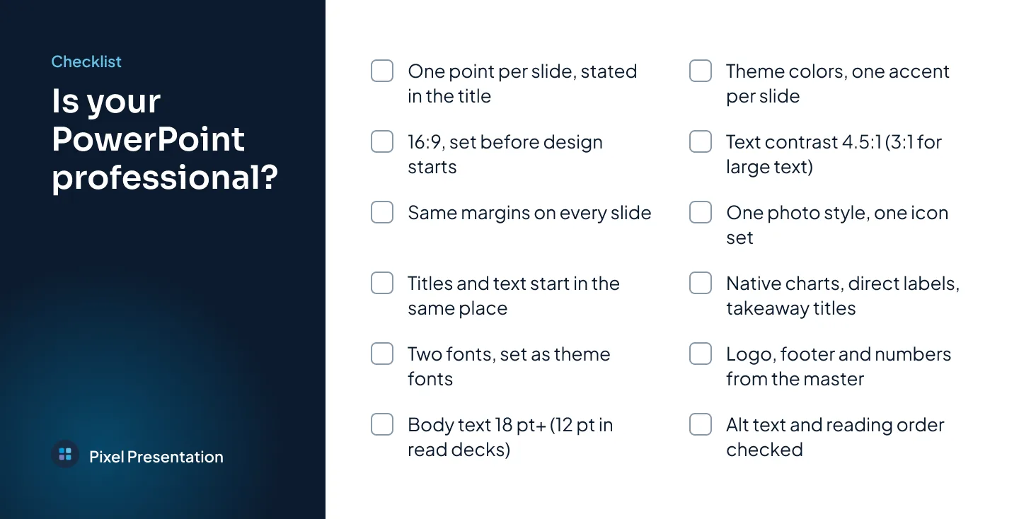
Run through this before you present or send a deck:
- Each slide makes one point, and its title states it.
- The deck is 16:9, set before design started.
- Everything sits inside the same margins.
- Titles, body text and footers start in the same place on every slide.
- There are two fonts at most, set as theme fonts.
- Body text is at least 18 pt on presented slides (12 pt in decks sent to be read).
- Colors come from the theme, with one accent per slide.
- Text meets 4.5:1 contrast, or 3:1 for large text.
- Photos share one style, and icons come from one set.
- Charts are native, labeled directly and titled with the takeaway.
- Logo, footer and slide numbers come from the master.
- Images have alt text, and the reading order is checked.
If you'd rather hand the deck over, that's what our PowerPoint presentation design service is for. At Pixel Presentation, design is $10 a slide with a 5-slide minimum, or $15 for complex slides such as multi-series data charts and custom infographics. PowerPoint design takes 3–6 working days once we have your content and brief, and you get fully editable files built on master layouts.
The pricing estimator shows the exact price for your deck before you order.