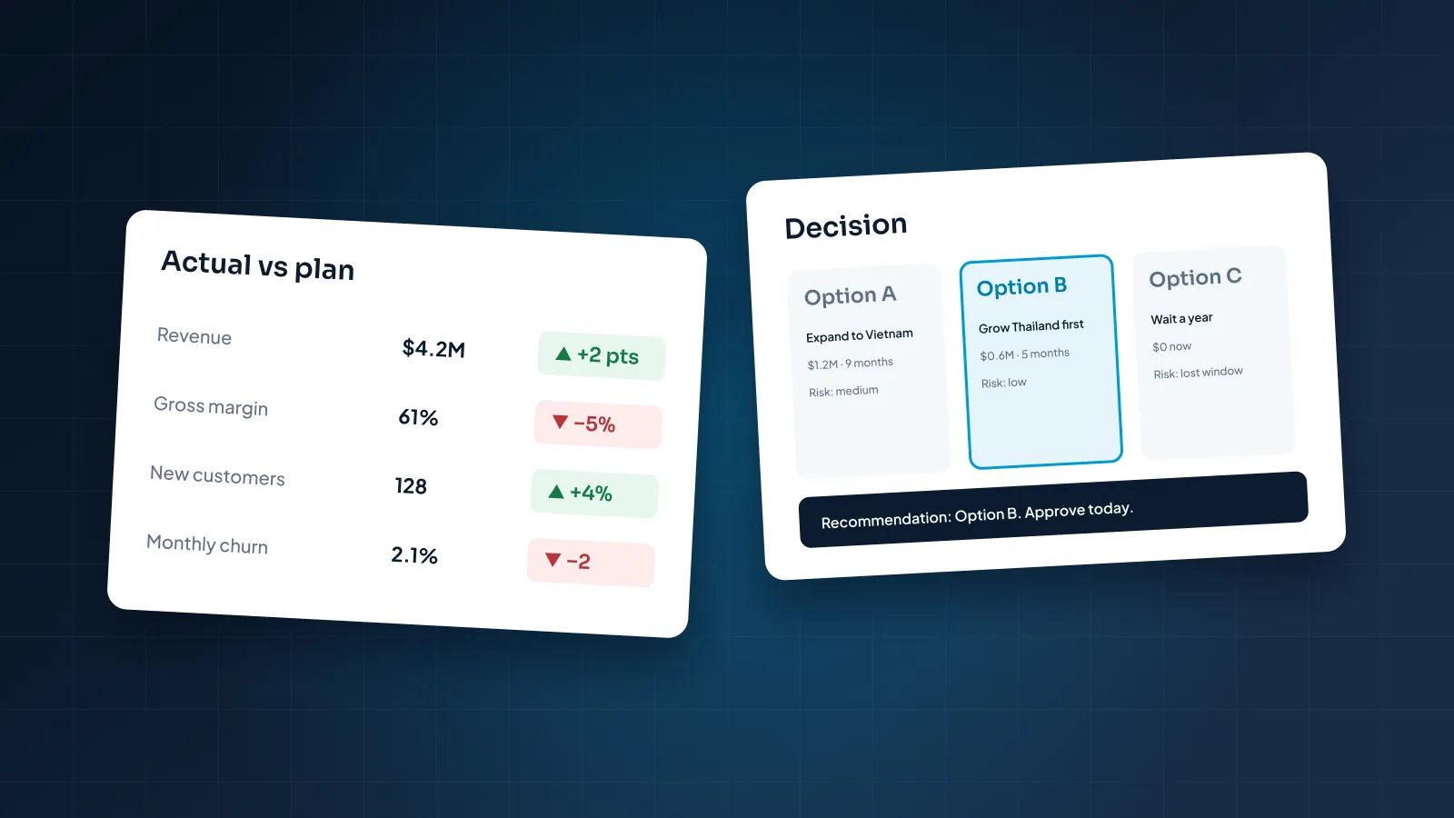
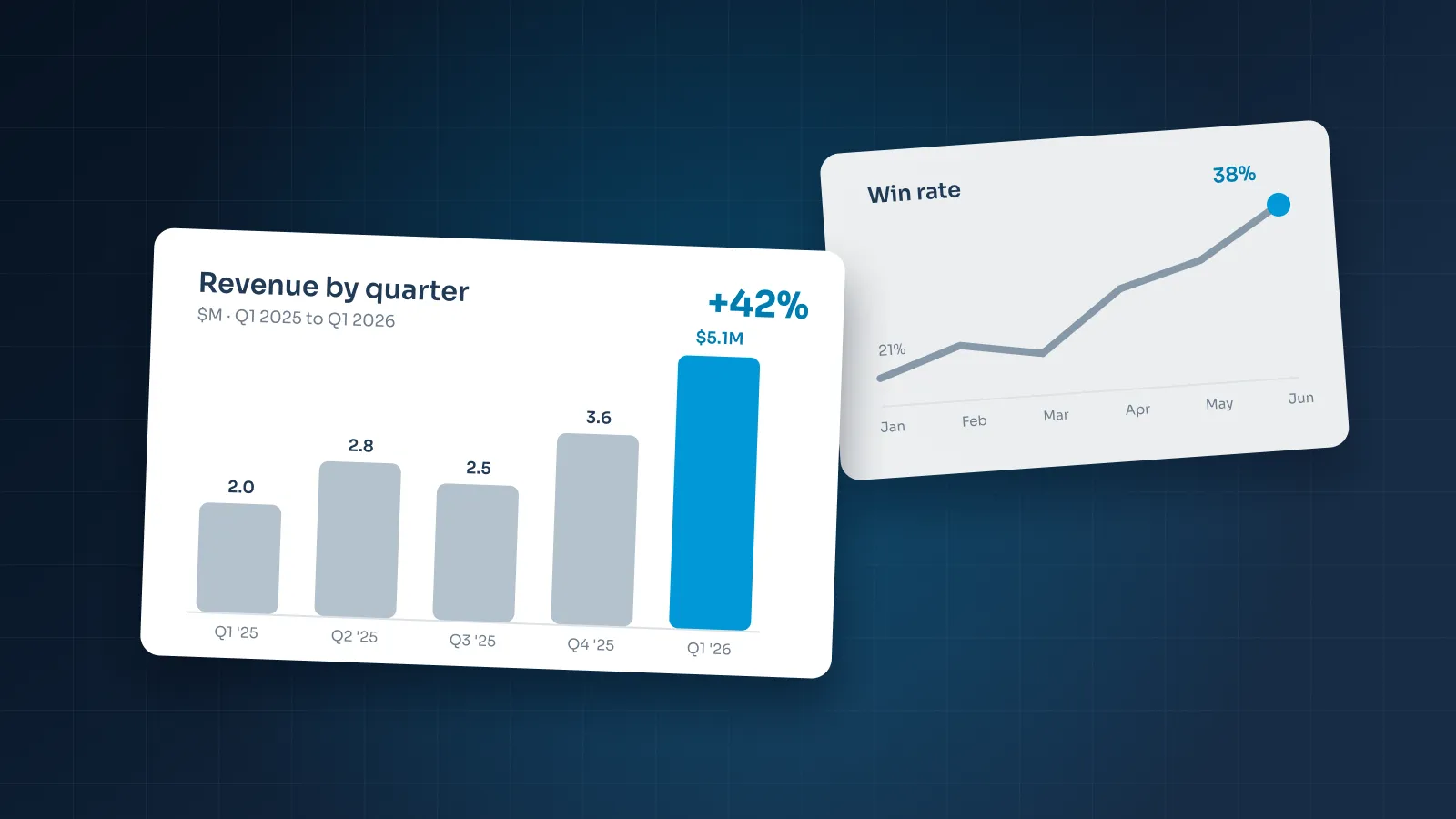
A data slide gets a few seconds before the presenter moves on. If the audience spends them matching colors to a legend, the point never lands.
This guide shows how designers approach data visualization in PowerPoint: choosing the chart, cutting the clutter, writing the title and using color with intent. It builds on the layout, type and color rules in our guide to making a PowerPoint look professional. Every company and number in the examples is fictional.
Start with the message, not the chart
Many weak charts start the same way. Someone selects a range in Excel, clicks Insert Chart and pastes the default onto a slide. The chart is accurate, but it doesn't say anything.
Before you open the chart tool, write one sentence: what should the audience conclude from this slide? For example:
- "West is the only depot below our on-time target."
- "Churn has risen for three quarters in a row."
- "Renewals now bring in more revenue than new sales."
That sentence decides everything else: which data to show, which chart to use and what to highlight. If you can't write it, the slide isn't ready. The data may be context that belongs in the appendix, or reference material that works better as a table.
Then cut the data down to what proves the sentence. Say Calder Robotics, a fictional manufacturer, wants to show that one product line drove this year's growth. The audience doesn't need twelve months for all eight product lines. It needs that one line next to the total, or next to the rest combined.
Most business messages fall into a handful of shapes, and each shape points to a type of chart:
- Comparison: which is bigger, smaller, first or last.
- Change over time: rising, falling, flat or turning.
- Part of a whole: what share each piece contributes.
- Bridge: how one number became another.
- Relationship: whether two measures move together.
Pick the right chart
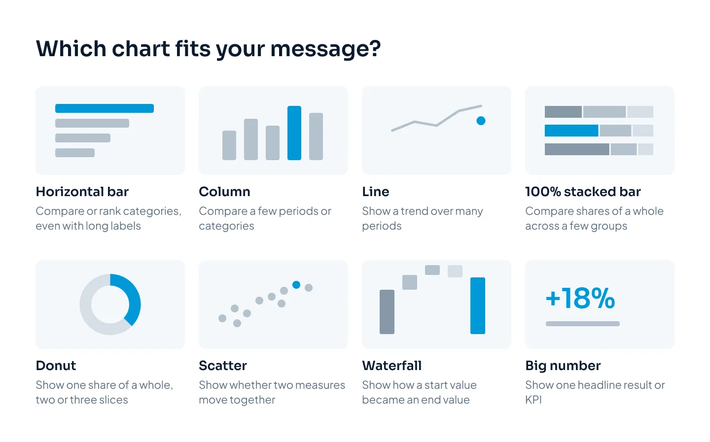
Once you know the message, the chart type mostly picks itself. These are the charts we reach for most in business decks, and the situations where each one goes wrong.
| Chart type | Use it for | Avoid when |
|---|---|---|
| Horizontal bar | Comparing or ranking categories | Showing change over time |
| Column | A few periods or categories | Labels are long or categories many |
| Line | Trends over many periods | Categories have no natural order |
| 100% stacked bar | Shares of a whole across a few groups | Middle segments need exact comparison |
| Pie or donut | One share of a whole, two or three slices | Slices are similar or numerous |
| Scatter | Two measures that may move together | The room needs the answer in seconds |
| Waterfall | How a start value became an end value | The steps don't add up to the total |
| Table | Exact values people will look up | One pattern should stand out |
| Big number | One headline result or KPI | The number means little without its trend |
A few defaults are worth questioning:
- Pie charts work for a single share, such as the part of revenue that comes from renewals. They fail when you ask people to compare several slices by angle. A sorted bar chart does that job better.
- Dual-axis charts let the choice of scales suggest a relationship that may not exist. Two small charts that share a time axis are clearer.
- Bar and column axes start at zero. A cut axis makes small differences look large. Line charts can start nearer the data when the change is the point, as long as the axis labels make that clear.
Remove the clutter
PowerPoint's default chart is built to show everything. Your slide needs to show one thing. Go through the chart and delete anything that doesn't help the message:
- Gridlines. Delete them, or make them very light gray if people genuinely need to read values off the axis.
- The legend. Replace it with labels placed next to each line or bar. A legend makes the eye travel back and forth to match colors.
- Duplicate scales. If every bar has a data label, you rarely need the value axis as well. Pick one.
- 3D, shadows, gradients and bevels. Remove them all. 3D bars distort the values they show.
- Extra decimals. Round to what the decision needs: $4.2M, not $4,213,587. Keep a decimal only when it changes the conclusion.
- Borders and fills. Remove the chart border and any plot-area background.
- Random order. Sort bars by value unless the categories have a natural order, such as months, age bands or funnel stages.
- Repeated units. State the unit once in the chart heading ("Revenue, $M") rather than on every label.
In PowerPoint, select the chart and use Add Chart Element on the Chart Design tab to switch gridlines, legends, axes and data labels on or off. Right-click any part of the chart to format it.
Once a chart looks right, right-click it and choose Save as Template. The next chart then starts from your clean version instead of the default.
Write the takeaway as the slide title
A topic title tells the audience what the chart is about. An action title tells them what it shows. Compare:
| Topic title | Action title |
|---|---|
| Revenue by region | The Northeast delivered half of this year's growth |
| Customer churn | Churn has risen for three quarters in a row |
| Q3 on-time delivery | West is the only depot below the 90% target |
Good action titles follow a few rules:
- A full sentence with a verb, kept to one or two lines.
- Specific: a number, a direction or a comparison, not "Strong performance".
- Proven by the chart. If the chart doesn't show what the title says, change the chart or change the title.
- Honest. If growth was flat, the title says flat.
Under the title, a small chart heading says what is measured, in what unit and over what period: "On-time deliveries by depot, Q3, % of shipments". A source line at the bottom, in small type, says where the numbers came from. Careful readers look for both before they trust a chart.
Consultants call these action titles, and they suit any audience that has to make a decision. They also serve people who skim: read only the titles, in order, and the deck's argument should still hold.
A chart without a takeaway in its title is homework for your audience.
Color to highlight, not decorate
Default charts give every series its own color. That tells the audience every series matters equally, which is rarely the point of the slide.
Start with everything in gray. Then give the accent color to the bar, line or segment that proves your title. The eye goes there first, and the title confirms what it sees.
A few more rules:
- Keep meanings fixed. If Enterprise customers are navy on slide 4, they're navy on slide 12. Setting your palette as theme colors helps, because PowerPoint colors chart series from the theme's accent colors in order.
- Use shades for ordered data. Low-to-high values read better in light-to-dark shades of one color than in a rainbow.
- Don't rely on color alone. Some people can't easily tell red from green. Add a label, a marker or a word such as "Below target".
- Save red for bad news. If red decorates the chart, it can't warn anyone.
- Check label contrast. Text on and around a chart needs a contrast ratio of at least 4.5:1 against its background, under WCAG. White labels on pale bars often fail.
Tables, dashboards and KPI slides
Not every number belongs in a chart. Sometimes the audience needs exact figures, several measures at once, or one headline result.
Tables
Use a table when people will look up exact values or compare across rows and columns. Build it with PowerPoint's own table tool, so it stays editable and on theme. Then:
- remove vertical lines, and keep horizontal rules light or drop them;
- set the header row apart with weight, not a heavy fill;
- right-align numbers, with the same number of decimals in each column;
- bold the total row and put a single rule above it;
- highlight the row or cell that makes your point in the accent color.
On a presented slide, if a table runs much past seven rows, show the rows that matter and move the full table to the appendix.
Dashboards
A dashboard slide puts several charts on one page. It works in decks people read, such as board pre-reads and monthly reports. It struggles when presented, because a speaker can only talk about one chart at a time.
Keep every panel on the same grid, use the same chart type for the same kind of data, and keep scales consistent where panels are compared. The slide still gets an action title.
Board decks often need both versions: a dashboard in the pre-read and one chart per slide in the meeting. Our guide to board presentations covers how to plan the two.
KPI slides
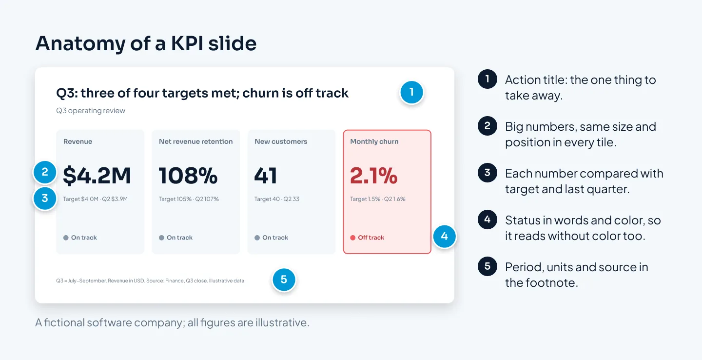
A KPI slide shows a few headline numbers, each with something to compare it against. Each KPI needs:
- the number, large;
- a short label;
- a comparison, such as against target or last quarter;
- a status in words as well as color.
Keep the KPIs in the same order and position every period, so regular readers know where to look. Our limit for a presented KPI slide is four numbers. Beyond that, it's a table.
The same thinking works in sales decks, where one proof number with its source can persuade more than a chart full of figures. Our guide to sales deck structure shows where those proof slides belong.
Before and after
Here's one chart from a fictional logistics company, Juniper Freight, before and after the rules above.
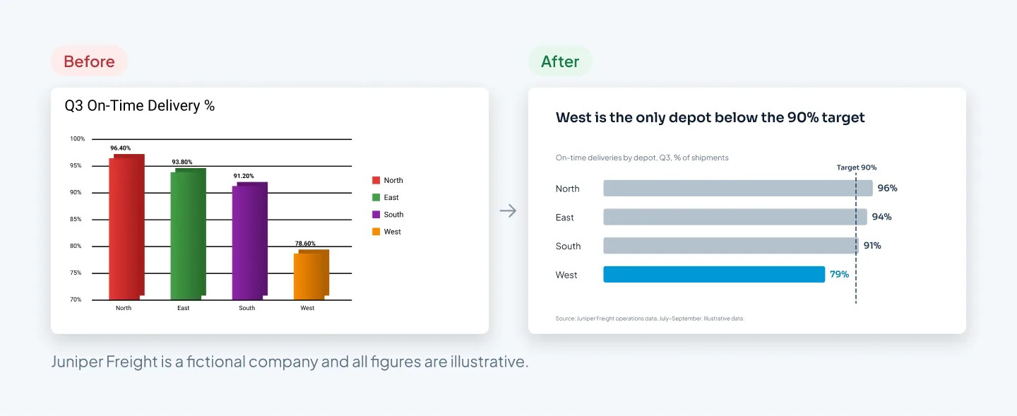
What changed:
- The title states the takeaway. "Q3 On-Time Delivery %" became "West is the only depot below the 90% target".
- The chart type fits the message. 3D columns in four colors became horizontal bars, sorted from highest to lowest.
- The axis starts at zero. The before chart started at 70%, which made West's column look about a third the height of North's. The real gap is 79% against 96%.
- Color highlights one thing. Three depots are gray. West is in the accent color, next to a dashed line marking the 90% target.
- Labels replace the legend and gridlines. Each bar carries its value, rounded to a whole number.
- Context sits where people expect it. A small heading gives the measure and period, and a source line sits at the bottom.
The data didn't change. The after slide simply says what the before slide left the audience to work out. For more redesigns like this, including other data slides, see our presentation redesign before-and-after examples.
Build native, editable charts
A chart pasted in as a picture looks fine until someone needs to change a number. Then it has to be rebuilt from scratch. Pictures of charts also go soft on large screens and ignore your theme fonts and colors.
Build charts natively instead:
- Insert the chart in PowerPoint (Insert, then Chart). Its data lives in an embedded Excel sheet; right-click the chart and choose Edit Data to update it.
- Paste from Excel as a chart, not a picture. PowerPoint's paste options let you embed the workbook or link to the original file. Linked charts can update when the source changes but break if the file moves, so embedding is safer for a deck that gets emailed.
- Let the theme do the styling. Native PowerPoint charts pick up your theme fonts and colors, so they match the rest of the deck without manual formatting.
- Add alt text. Give each chart a short description of its takeaway, so screen-reader users get the point too.
This is how we build data slides at Pixel Presentation. Every chart is made with PowerPoint's own chart tool, so your team can update the numbers in Excel next quarter without coming back to us.
Multi-series data charts and custom infographics count as complex slides, at $15 instead of $10 a slide, and you see which slides count before you order. The pricing estimator shows the total for your deck.
If the data lives in board, investor or quarterly decks, our corporate presentation design service covers the whole deck, not just the charts. For a worked example, see the Utatu Opus solar investment proposal, an animated proposal for a rooftop solar project that makes a financial model easy to follow.