Most board decks are written by people who know the business far better than the directors reading them. That gap is the problem. Management wants to show everything the team did; the board needs to know what changed, what's at risk and what it has to decide.
This guide covers what to include in a board presentation and in what order. It also covers splitting the pre-read from the version you present, and designing financial, KPI and decision slides.
One note first: what a board must receive and formally approve depends on your company, its governing documents and your jurisdiction. Your chair, company secretary or legal counsel sets those rules. This is design and structure guidance, not legal advice.
What directors need from a board deck
Directors see the business a few times a year, and some sit on other boards or hold other jobs. They're responsible for oversight, so they read your deck with three questions in mind: are we on plan, what could hurt us, and what do you need from us?
Board decks are a special case of corporate presentation design: the audience is small, senior, short on time and able to say no. Everything in the deck should do one of four jobs:
- Decisions. What the board must approve or advise on, with your recommendation.
- Performance against plan. Results compared with the budget or plan the board approved, and why they differ.
- Risks. What's new or worse since the last meeting, and what you're doing about it.
- Strategy. One or two topics where you want the board's thinking, not only its sign-off.
What directors don't need is an activity report: a slide per department listing what each team did. "Marketing ran four campaigns" doesn't tell a director whether the business is on track. "Pipeline is behind plan for the second quarter running, and here's what we're changing" does.
Use one test for every slide. Does it help the board decide something, understand performance or see a risk? If not, it goes to the appendix or out of the deck.
A board deck is a decision document, not an activity report.
A simple board deck structure
The order below works for most quarterly meetings. Adapt it to your agenda, then keep it the same from meeting to meeting so directors know where to look.
- Cover. Company, meeting date, version and a confidentiality marking.
- Agenda. Each item marked "for decision", "for discussion" or "for information".
- Executive summary. One slide, including the asks.
- Performance against plan. The handful of numbers the board tracks.
- Financials and KPIs. Income statement and cash summaries, plus the KPI dashboard, all with variances.
- Risks. What's new, what's changed, what's closed.
- Strategic topic. One deep-dive for discussion.
- Decisions. The options, then your recommendation and the ask.
- Appendix. Detail, department updates, definitions.
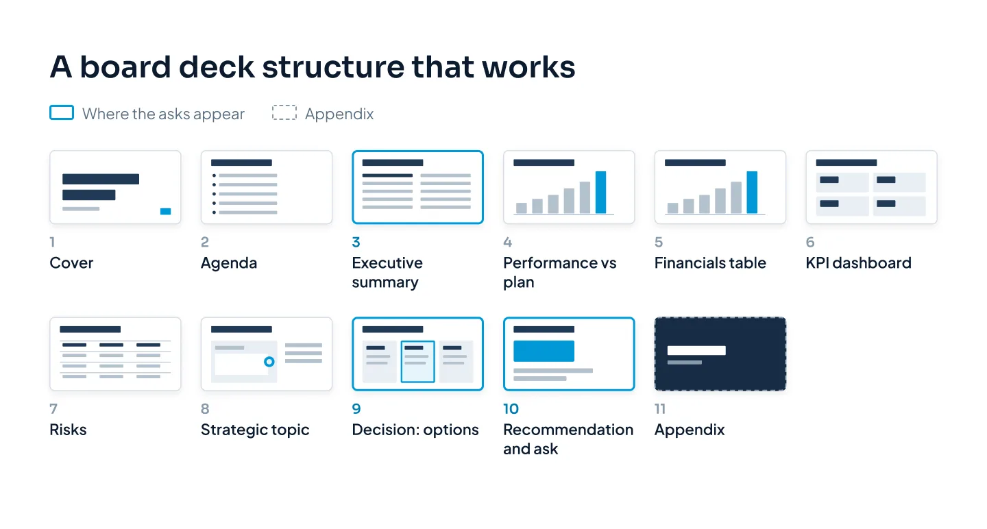
Department updates usually belong in the appendix. Directors can read them if they want to, and the meeting time goes to the items that need the board.
Executive summary first
If a director reads one slide, it's this one. Put it straight after the agenda and write it so it works on its own, without you in the room.
A strong executive summary has four parts:
- A headline. One sentence on where the business stands: "Q3 revenue 5% behind plan, cash ahead, one capacity decision needed."
- What matters. Three or four points, each a full sentence with its "so what".
- Risk changes. Anything new or worse since the last meeting.
- The asks. Each decision you need, with the slide number where it's covered.
Write the points as sentences, not labels. "Gross margin" is a label. "Gross margin came in two points below plan on higher fuel costs; we've repriced two contracts from October" is a summary.
Keep it to one slide with a clear split: what's happening on the left, what you need from the board on the right. If your board likes status colors, pair each one with a word such as "On plan", "Behind" or "Ahead". Color alone fails for color-blind readers and on black-and-white printouts.
Above all, put the decision request here, not only at the end. A director who knows on page three that you'll ask for a capital approval reads every page after it with that question in mind.
Pre-read vs presented: two versions
Many boards receive their papers several days before the meeting, often through a board portal. If yours does, you need two versions of the deck, because they do two different jobs.
The pre-read is a document. Directors read it alone, often on a tablet, with nobody to explain it. Every slide needs a full-sentence title, labeled periods and units, definitions for any metric that isn't obvious, and a source line for the numbers. It can be denser than a slide you present, because each reader sets the pace.
The presented version is a prompt for discussion. Directors have already read the detail, so don't walk them through it again. Use fewer slides, larger type and one point per slide, and get to the issues and decisions quickly.
| Pre-read | Presented | |
|---|---|---|
| Job | Inform before the meeting | Focus the discussion |
| Read by | Each director, alone | The room, together |
| Density | Full detail, notes, sources | One point per slide |
| Titles | Full sentences that stand alone | Short takeaways |
| Length | Main deck plus appendix | A short selection |
| Format | PDF, often in a board portal | Slides on screen |
Build both from one master file. Make the pre-read first, then copy the slides you'll discuss into the presented version and strip them back. Keep the same chart styles and colors in both, so a director recognizes the chart they annotated the night before.
Version control matters more here than in almost any other deck. Put the meeting date and version number in the file name, and if anything changes after the pre-read goes out, tell the board what changed. A number that differs between the pre-read and the screen makes directors doubt every other number.
Financial and KPI slides
Directors study these slides more closely than any others. Four habits keep them readable.
Show variance against plan
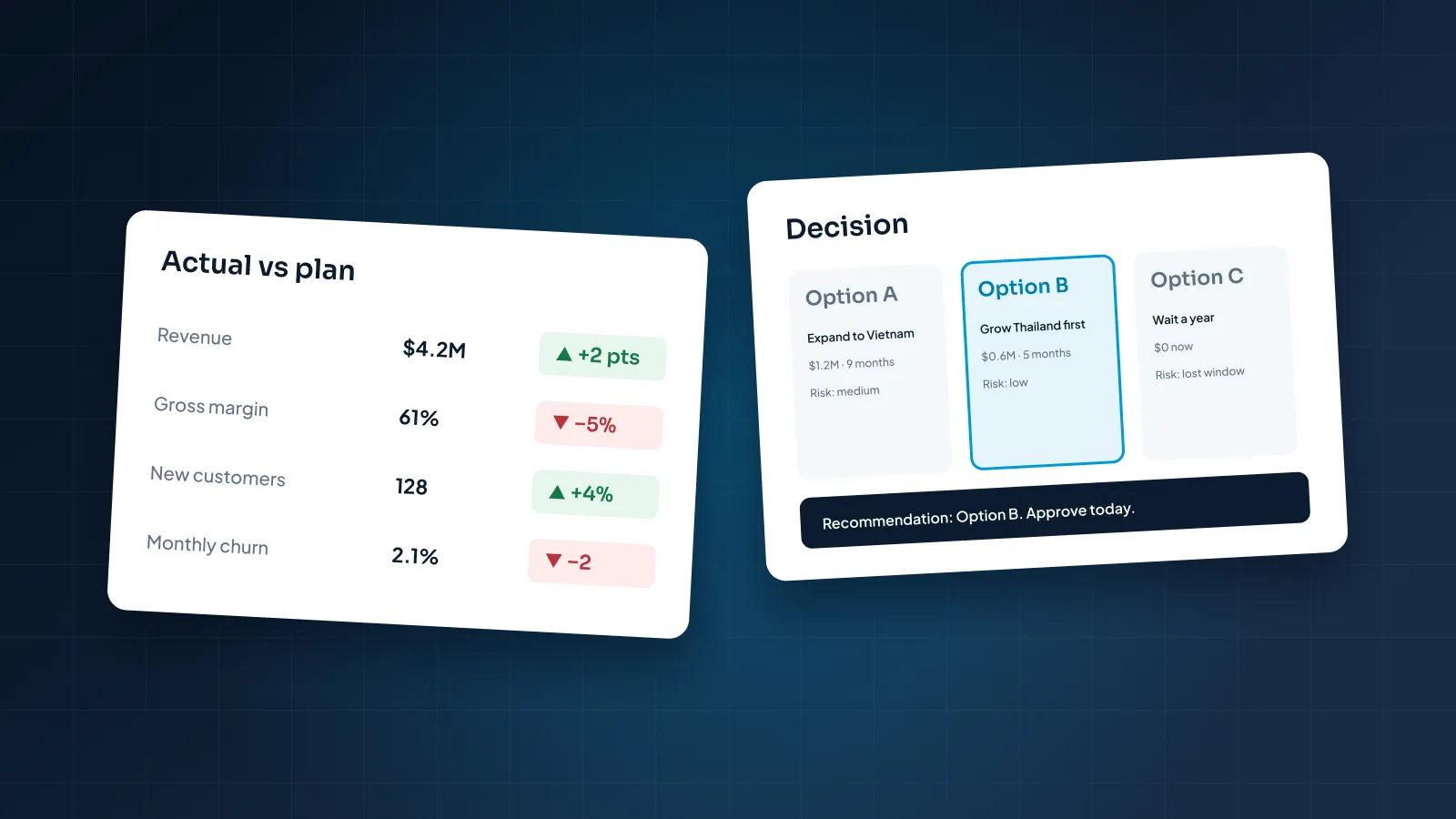
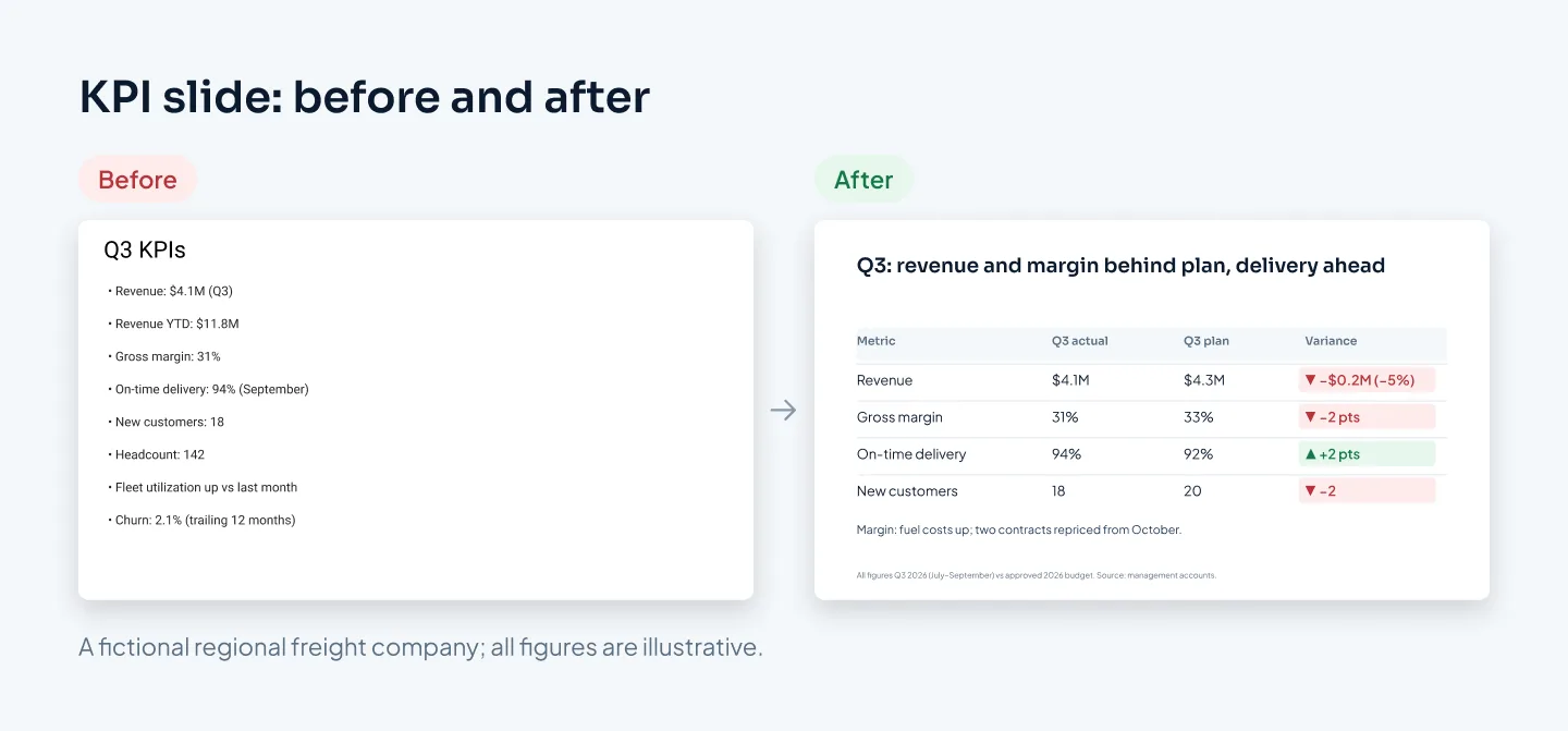
An actual on its own means little. For every number that matters, show the actual, the plan or budget, and the variance in money and percent. If your board also tracks prior year, add it as another column rather than another slide.
Then explain the variances that matter, in one line each, on the same slide. A director shouldn't have to hunt for the reason on page 31.
Keep periods consistent
Don't mix the month, the quarter, year-to-date and the trailing twelve months on one slide unless each is clearly labeled. Pick the periods your board uses, label every chart and column with its period, and keep them in the same order every meeting. If a metric's definition changes, say so on the slide.
Round sensibly. "$4.1M" reads faster than "$4,112,384", and no board decision rests on the last three digits. Use the same units and decimal places throughout.
One chart, one point
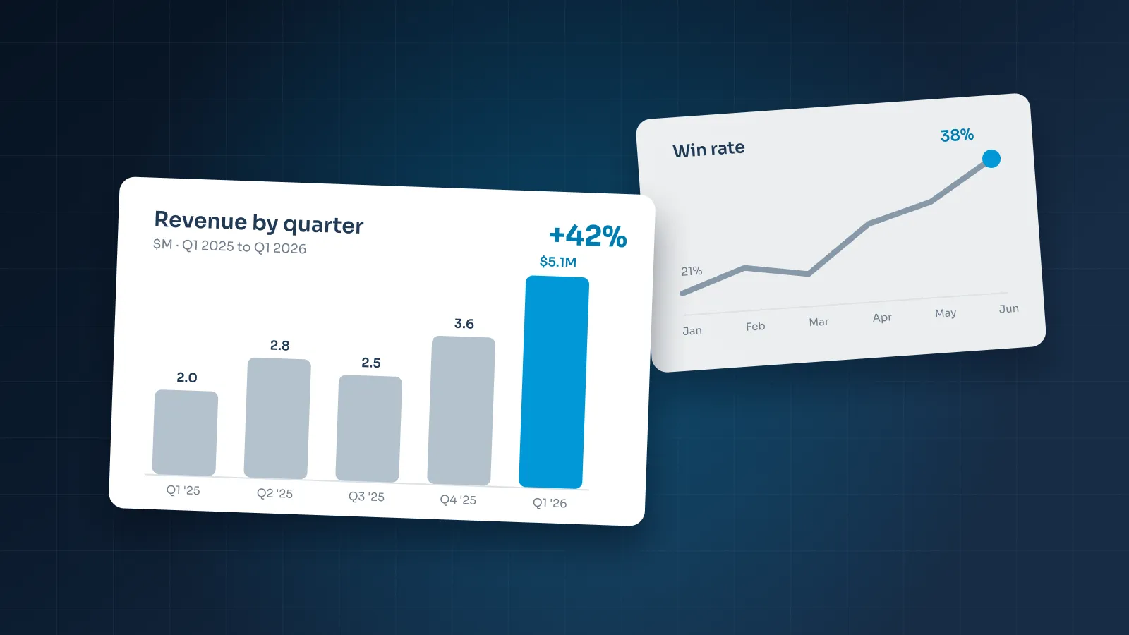
Each chart should make one point, and the slide title should state it: "Gross margin two points below plan as fuel costs rose", not "Gross margin". Highlight the bar or line that carries the point and set the rest in gray. Two points need two charts.
Our guide to presenting data in PowerPoint covers chart choice and decluttering in more depth.
Same KPIs, same place
Keep the KPI set and its order stable. When the cash slide is always slide six, directors can compare quarters at a glance.
This is the strongest case for a custom board template. KPI, financial and decision layouts are built once, with native PowerPoint charts linked to an Excel sheet. Finance can then update the numbers each quarter without rebuilding slides.
For a worked example, see our Utatu Opus investment proposal. It's an animated proposal for a rooftop solar project that makes a financial model easy to follow.
Making the decision clear
Every decision you bring to the board deserves its own slide. Not a bullet in the CEO update, and not just a line in the summary, but a slide that lays out the choice.
A clear decision slide has five parts:
- The question as the title, for example "Decision: how we add capacity for the 2027 peak season".
- The options side by side, including "delay" or "do nothing" when that's a real option.
- The same criteria for every option, in the same order: cost, timing, risk.
- Your recommendation, clearly marked, with the reason in one line.
- The ask: exactly what the board is asked to approve, how much, and by when.
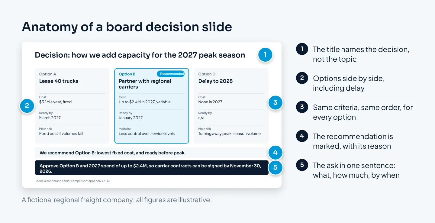
Put the supporting detail, such as the financial model or a vendor comparison, in the appendix and point to it from the slide. Directors who want to test the numbers can, and the decision slide stays clear.
Write the ask in plain words. If a formal resolution is needed, your company secretary or counsel drafts it; the slide's job is to make the choice easy to understand.
In the presented version, bring up the decision slide when the discussion starts and leave it on screen while the board talks. It keeps the conversation on the choice rather than drifting back into the data.
Board presentation checklist
Run through this before the pre-read goes out. For wider pre-send checks on brand, accessibility and file hygiene, use our corporate presentation checklist.
- The agenda marks each item for decision, discussion or information.
- The executive summary works on its own and lists every ask with a slide number.
- Every slide helps the board decide, understand performance or see a risk.
- Department updates and supporting detail sit in the appendix.
- Financial and KPI slides show actual, plan and variance.
- Every chart and table column is labeled with its period and units.
- Each data slide's title states the takeaway.
- Status colors are paired with a word or symbol.
- Each decision has its own slide with options, a recommendation and the ask.
- The pre-read and presented versions show the same numbers.
- Slides are numbered, and the file name carries the meeting date and version.
- The PDF reads well on a tablet and printed in black and white.