A corporate deck rarely fails on one big problem. It fails on small ones: a chart that disagrees with the appendix, last year's logo, a font that gets swapped on the board chair's laptop.
This is the checklist to run before a company presentation goes to clients, investors or the board. Each section has boxes to tick and short notes on why each item matters. It works whether you build the deck yourself or bring in corporate presentation design help, and there's a version to download at the end.
Audience and purpose first
Most problems in a corporate deck start before slide one. If you can't say who the deck is for and what it should achieve, no design will rescue it.
- One named audience. "The board," "the client's procurement team," "all staff." Not "everyone."
- A one-sentence purpose. What should the audience know, decide or do afterward?
- Presented or sent. You know whether people will hear it from you or read it alone.
- The time slot. The slide count fits the time you have, not the time you'd like.
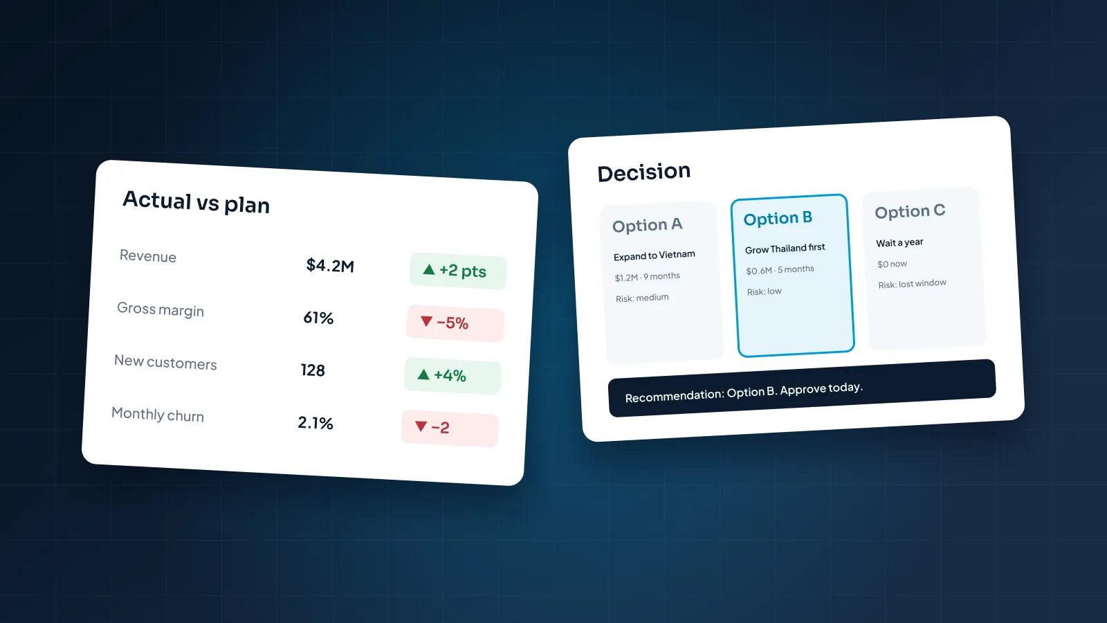
- The ask is on a slide. Approval, budget or a next step is written down, not only spoken.
- What they already know. Background they've heard before is cut or moved to the appendix.
A useful purpose sentence is specific enough to fail. "Update the board on hiring" can't fail. "The board approves the Q4 hiring budget" can, and it tells you which slides you need.
"Presented or sent" changes more than people expect. A deck read alone needs fuller headlines and more context than one you talk through.
Board decks are the clearest case, because directors often read ahead. Our guide to board presentations covers the pre-read and the presented version.
Story and structure
- Headlines tell the story alone. Read only the slide titles, in order. They should make sense without the body text.
- Headlines are sentences, not labels. "Support costs fell after we moved to one supplier" says more than "Cost overview."
- The summary comes first. The conclusion sits on slide two or three, with the detail after it.
- One idea per slide. A slide with two messages becomes two slides.
- The agenda matches the sections. Same names, same order.
- Detail lives in an appendix. Backup tables and methodology wait after the close, ready if someone asks.
- The deck ends on the ask, not on "Thank you" or "Questions?"
Structure is where a corporate deck wins or loses its reader. A clear order lets an executive skim the deck in a minute and still leave with the point.
The summary slide does the most work. Three to five short lines are enough: what happened, what it means and what you need from this audience. If someone reads only that slide, they should still know what to do.
If the headlines don't tell the story on their own, the design won't save it.
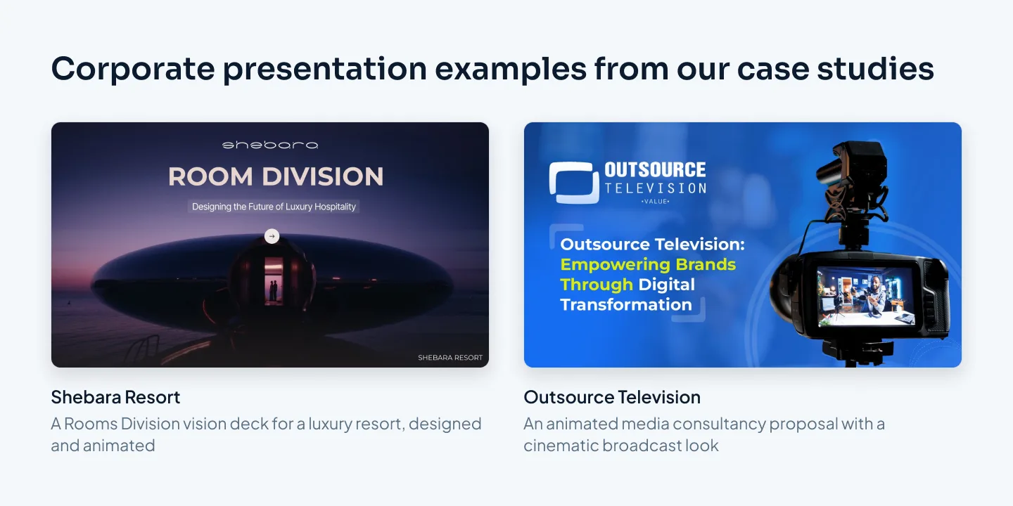
Story isn't only for sales decks. The Rooms Division vision deck we designed for Shebara Resort, a luxury resort, is built as a story about the guest experience, told with resort photography and Morph motion.
Brand
- The current template. Not a copy of a copy from three years ago.
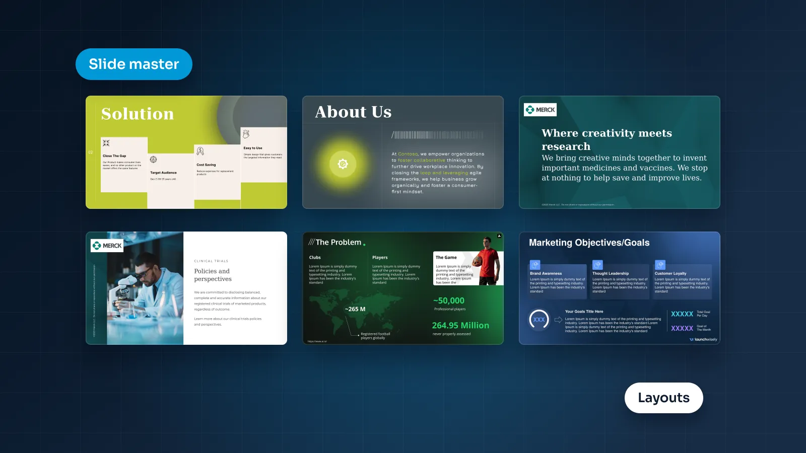
- Every slide sits on a master layout. No loose text boxes standing in for placeholders.
- Theme colors only. No near-matches picked by eye.
- Theme fonts only. One for headings and one for body text, set in the master.
- The right logo. The current version, in the correct color for the background, never stretched.
- Matching icons and images. One icon set, one photo style.
- Consistent footers. Slide numbers, a confidentiality label and dates where needed.
Brand problems usually arrive with pasted slides. Someone copies a slide from an older deck, and its fonts and colors come along with it. In PowerPoint, paste with "Use Destination Theme" so the slide picks up the current template.
For slides that have drifted, the Reset button on PowerPoint's Home tab puts placeholders back to their master layout position and formatting. Run it slide by slide, then check nothing important moved.
If the corporate presentation template itself is the problem (broken layouts, wrong fonts, missing slide types), fix it once at the source. Here's how a custom PowerPoint template is built from brand guidelines.
Two corporate presentation examples from our case studies:
Data and charts
- Numbers match everywhere. The figure on slide 4 matches the summary and the appendix.
- Units, periods and currencies are labeled. "$3.4M, Q3 2026," not "3.4."
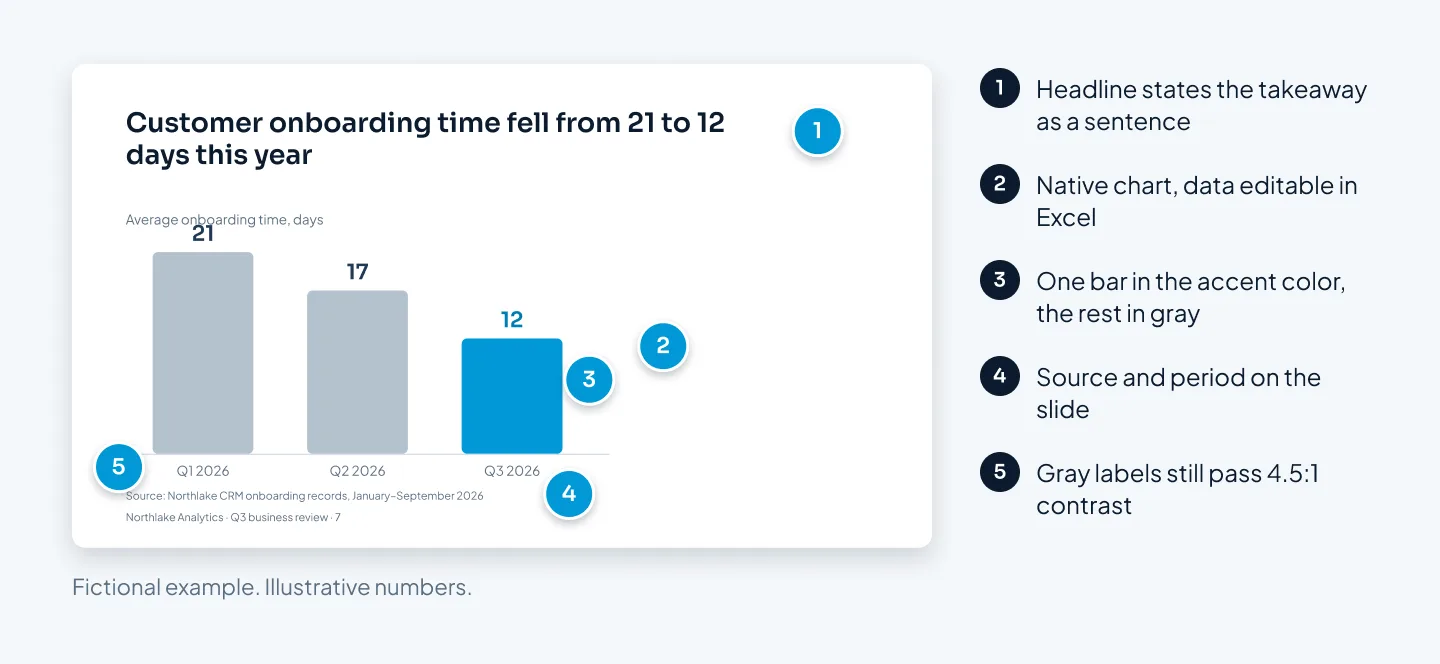
- Every chart has a source and a date.
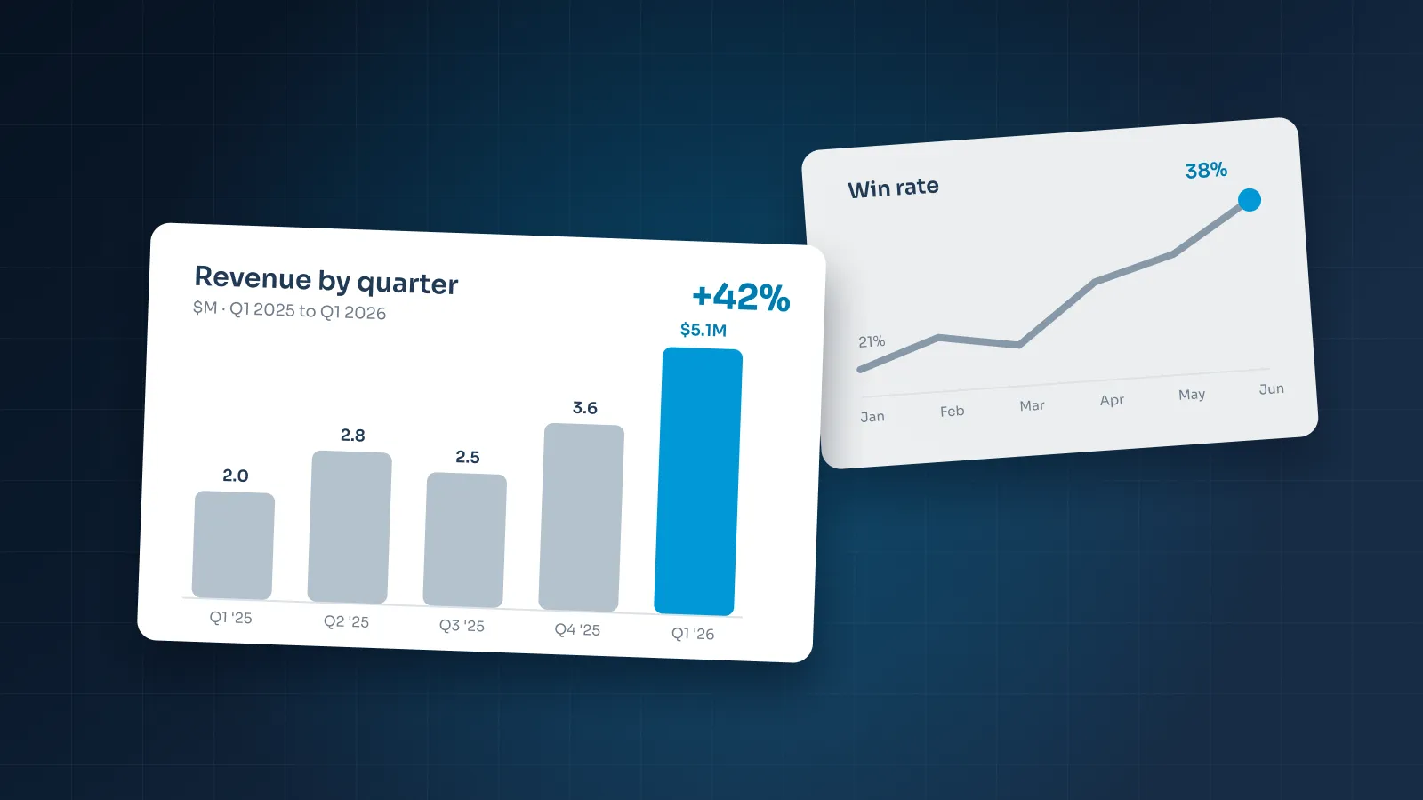
- The chart type fits the message. Bars to compare, lines for change over time, a table when people need exact values.
- Each chart makes one point, and the headline states it.
- The key data is highlighted. One accent color for what matters, gray for context.
- Charts are native and editable, not pasted screenshots.
- Bar charts start at zero.
Mismatched numbers cost a presenter more credibility than any design flaw. Finance-minded readers will check, so reconcile every figure against one source before you start styling.
Rounding counts too. "$3.4M" on one slide and "$3,412,000" on another read like two different numbers. Pick one level of rounding per deck and keep exact figures for the appendix.
Native charts matter next quarter as much as today. A chart built with PowerPoint's own chart tool keeps its data in an embedded Excel sheet, so whoever updates the deck changes numbers instead of rebuilding a picture. For chart choice and styling, see our guide on how to present data in PowerPoint.
Accessibility
- Text contrast passes WCAG. At least 4.5:1 for normal text and 3:1 for large text.
- Color isn't the only signal. Labels, patterns or position carry the meaning too.
- Images have alt text. Charts get a one-sentence summary of what they show; purely decorative images are marked as decorative.
- Reading order is checked. A screen reader follows the slide's reading order, which can differ from what you see.
- Every slide has its own title. No missing titles and no duplicates.
- Links say where they go. "Q3 results report," not a bare URL or "click here."
- No tiny text. Footnotes are still readable on a laptop screen.
- PowerPoint's Accessibility Checker is clear. Run it and fix what it flags.
Accessibility makes a deck better for everyone, not only for screen-reader users. Text that passes contrast also survives a washed-out projector and a phone in sunlight.
The usual contrast failures are light gray text on white and white text on a mid-tone brand color. Test those pairs with a contrast checker before the deck goes out. And if you have to shrink text to make it fit, the slide has too much on it.
PowerPoint's Accessibility Checker catches missing alt text and helps you check reading order. It takes a few minutes and finds problems you can't see by looking.
The file: fonts, links, size, versions
- Fonts display everywhere. Embed them where your version of PowerPoint and the font license allow, or use fonts every viewer has.
- Links work. Click every hyperlink and every jump to another slide in Slide Show mode.
- Video and audio play from the file. Embed them in the presenting file, not linked to a folder on your laptop; in an emailed copy, link to hosted video instead.
- The file is a sensible size. Pictures are compressed and unused slides are deleted.
- The file name gives the version. For example "Northlake_Q3-Review_v4_2026-10-13.pptx," never "final_FINAL2."
- Internal material is removed. No comments, hidden slides or notes meant only for your team.
- A PDF copy is exported and checked. Page through it for font swaps, broken charts and anything cut off.
- Speaker notes are ready in the presenter version, set up for Presenter View.
- Animation runs on the presenting computer. Morph needs PowerPoint 2019 or later, or Microsoft 365.
Fonts are the classic failure. If a font isn't installed or embedded, PowerPoint swaps in another one and your line breaks move. Google Slides avoids this by using Google Fonts, and Keynote needs the fonts installed on the presenting Mac.
Animation needs the same test. An animated deck such as the media consultancy proposal for Outsource Television, with its cinematic broadcast look and Morph motion, should be rehearsed on the computer it will play on.
Version names save more pain than they cost. Put the date in year-month-day order so files sort correctly in any folder, and raise the version number every time the file leaves your hands.
Before sending, the Document Inspector in PowerPoint for Windows can find comments and presentation notes; check for hidden slides yourself. Then send the PDF alongside the editable file, so anyone without PowerPoint, or reading on a phone, sees the deck as you designed it.
Download the checklist
Run the list twice: once when the story is settled, and again just before you hit send. The first pass catches structure problems while they're cheap to fix. The second catches the file problems that creep in during the last hour.
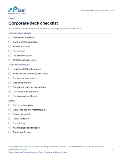
Free download
Corporate deck checklist
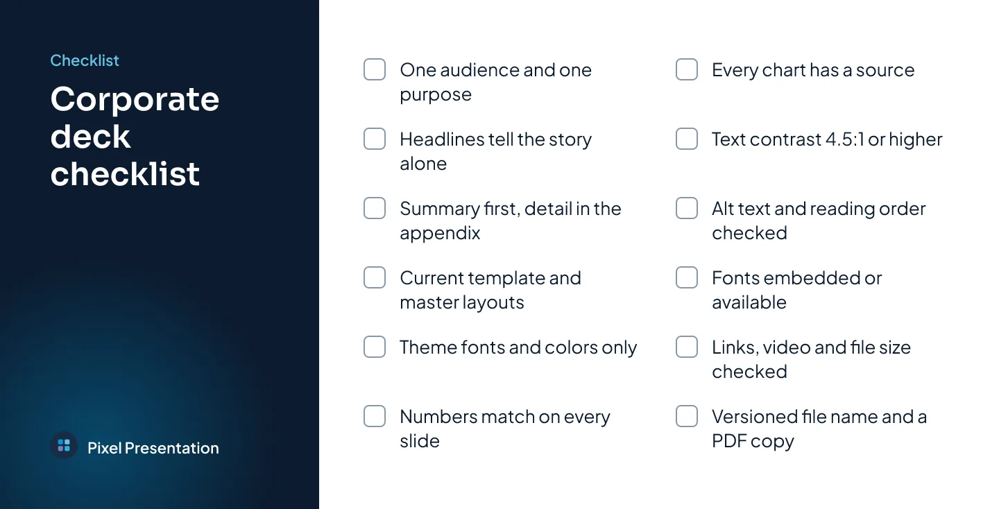
Every item from this article in one corporate deck checklist you can keep beside your next deck.