Plenty of sales decks open with the seller: the founding story, the office map, the wall of logos. Buyers sit through it, then ask the question the deck should have answered on slide two: why should we change anything at all?
This guide gives you a sales deck structure that starts with the buyer instead, slide by slide, with annotated examples from a fictional company. It also covers live decks versus leave-behinds, tailoring for each buyer, and the proof that makes a deck believable. The structure works whoever builds the deck, whether that's your own team or a sales presentation design service like ours.
What a sales deck must do
A B2B sales deck has one job: move a group of people from "interesting" to an agreed next step. That step might be a pilot, a technical review, a proposal or a signed order. It is rarely a decision made in the room.
The word "group" matters. The person in your meeting is rarely the only one who decides. Budget holders, users, IT and procurement all have a say, and most of them will never hear your pitch. They see the deck when your champion forwards it.
So a good sales deck does four things:
- It makes the buyer's problem the subject. Your company appears when it becomes the answer, not before.
- It gives a reason to act now. A real problem with no urgency gets parked until next year.
- It makes its claims believable. Specific proof beats adjectives every time.
- It works without you. The headlines carry the story when someone reads the deck alone.
A sales deck is about the buyer's problem, not your company's history.
Your history still has a place, just later. One "why us" slide after the proof does more than five slides of milestones at the start, because by then the buyer has a reason to care.
The structure, slide by slide
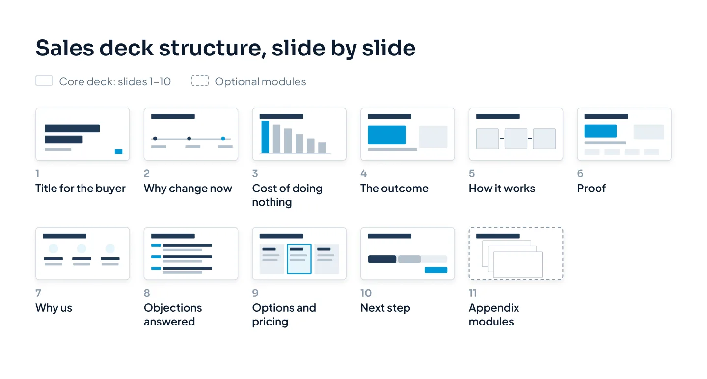
Here is a sales deck structure for a first or second meeting, built on about ten core slides. Each slide answers one question the buyer is asking, in the order they tend to ask it. It opens with a title slide that names the buyer and the purpose of the meeting, not your tagline.
To keep the examples concrete, picture Calder Robotics, a fictional company that sells warehouse picking robots to distribution centers.
The shift: why change now
Start with a change in the buyer's world, not with your product. Something has moved, and the old way of working is getting more expensive or more risky.
For Calder, the headline might be "Faster delivery promises have made every picking error more expensive." The buyer nods because they already feel it. Keep the slide light: one headline, one supporting line or image.
Skip the giant market-size number here. A buyer can't connect a global figure to their own warehouse, so it reads as filler.
The cost of doing nothing
Now make the problem specific. Show what staying put costs the buyer, in their terms: money, time, risk or growth they're missing.
The strongest version uses numbers from your discovery call, so the math is theirs, not yours. For Calder, that's a simple formula: errors per week, times the cost of each re-shipped order, times 52. When the inputs come from the buyer, nobody argues with the total.
If you don't have their numbers yet, show the formula with blanks and fill it in together. The slide becomes a conversation instead of a claim.
The promised outcome
Describe life after the change before you explain how it happens. Write it as something the buyer wants, such as "Every order leaves right the first time, with the team you already have," not as a feature list.
A before-and-after layout works well here. Put today on the left and the outcome on the right, with three short, parallel rows each, so the difference is obvious at a glance.
How it works
Now, and only now, comes your product. Show how you deliver the outcome in three or four steps, drawn as a simple process diagram. A buyer should be able to repeat it to a colleague over lunch.
Resist the screenshot tour. If a screen matters, crop it to the part that matters and label it. Save the full walkthrough for the demo, which is a different meeting with a different job.
Proof
Proof turns your claims into the buyer's confidence. The best proof slide shows a customer like them, a specific result, a timeframe and a source. There's an annotated example later in this post.
If you need a "who we are" slide, one is enough, and it goes straight after the proof. Include whatever helps the buyer trust you to deliver: team, support model, where you operate.
Objections, answered before they're asked
Your sales team already knows the objections that come up again and again: switching costs, risk, timing, "we already have a tool for that." Name them in the deck and answer them.
That can be one slide with three short question-and-answer pairs, or a few appendix slides the rep pulls up when the question comes. Either way, raising an objection before the buyer does shows you understand their position.
Pricing and options
When pricing belongs in the meeting, show options rather than a single number. Two or three packages with clear differences let the buyer choose how to say yes, instead of whether to say yes.
Place the price near the cost of doing nothing, so the buyer weighs it against the problem rather than against zero. And keep pricing as its own module, so reps can drop it from early meetings where it would come too soon.
The next step
End with one specific ask, not "Questions?" Name the step, who is involved and when: "A four-week pilot at one site, starting the first week of next month."
Add three or four dated steps on the same slide. That gives your champion a plan to forward, and it answers the question every stakeholder will ask them: what happens next, and what do they need from us?
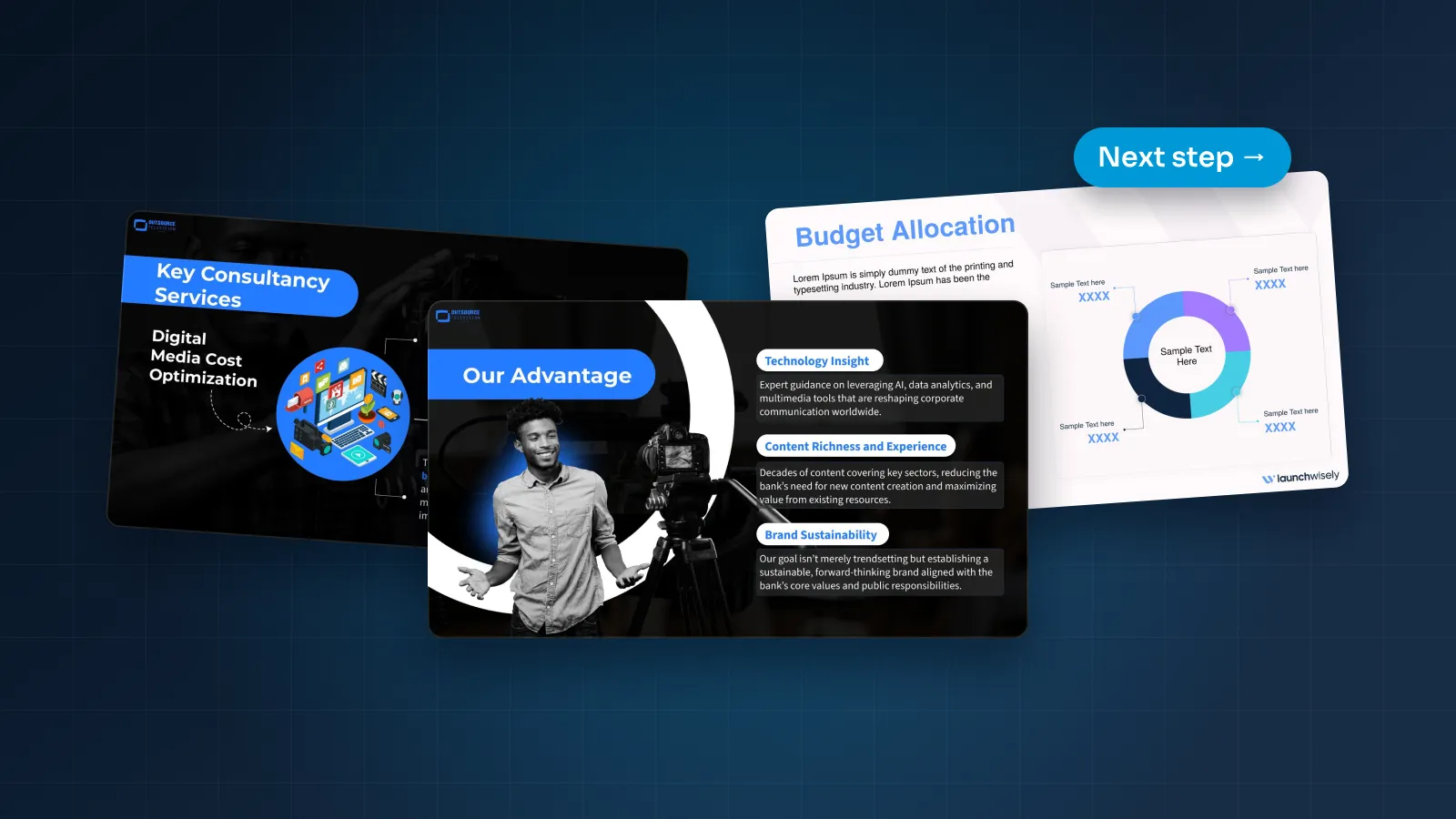
You can see this order at work in the realtor partnership sales deck we designed for Pilot Mortgage Group: pain points first, visible proof, one clear call to action.
Live deck vs leave-behind
A live deck and a leave-behind look alike, but they do different jobs. Using one file for both usually means it does neither job well.
The live deck supports a speaker. Slides are sparse: a headline, a visual, a few words. The rep carries the story, and the detail sits in the speaker notes.
The leave-behind is read alone, often on a phone, by people who never met you. It needs full-sentence headlines, a little more text and enough detail to answer questions with no rep in the room. The same goes for a deck you send ahead of a meeting.
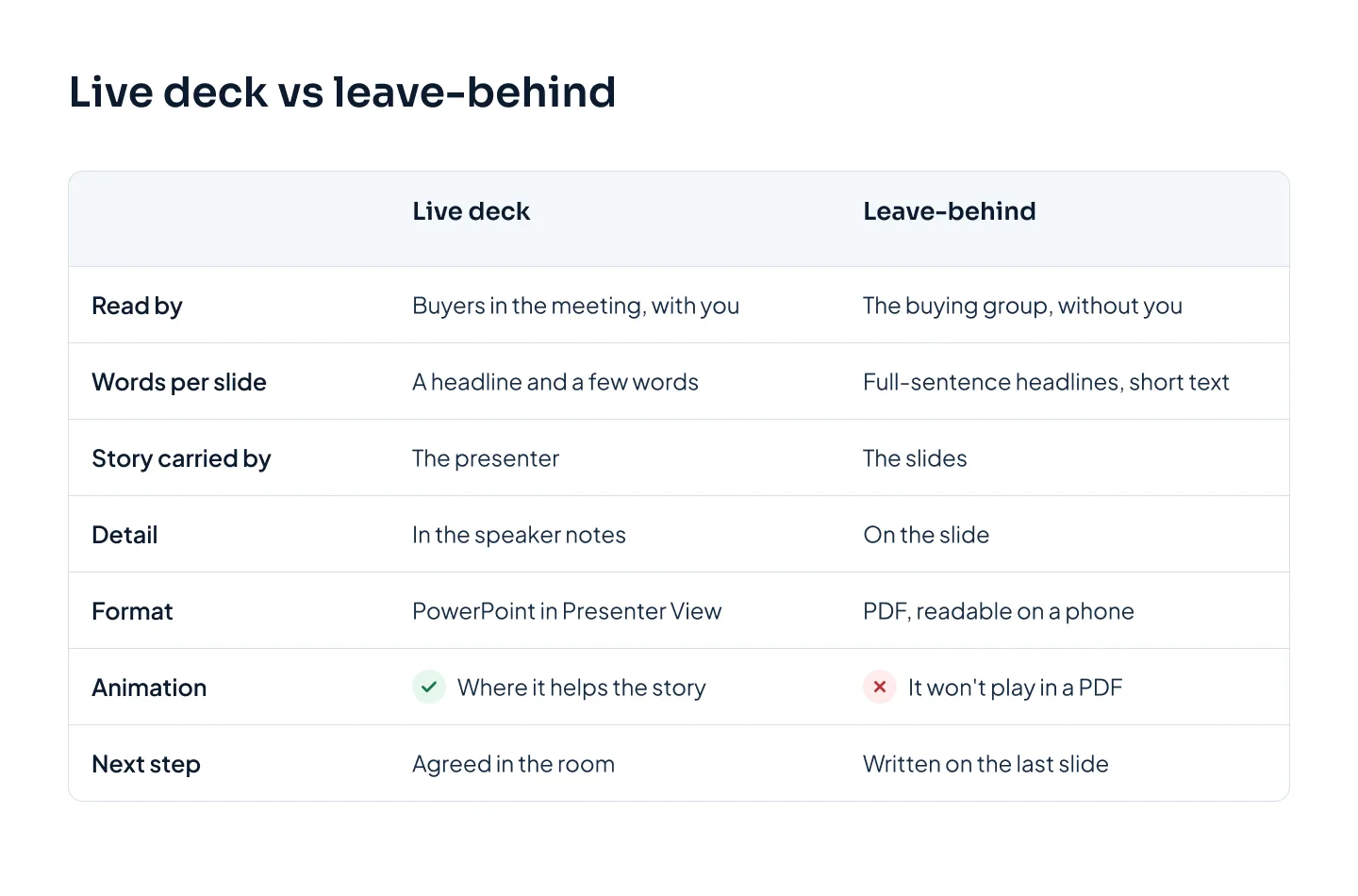
The practical answer is one story in two versions, on the same slide master. Write the leave-behind first, because it has to carry every claim on its own. Then copy it for the live deck: cut each slide back to its headline and one visual, and move the extra text into the speaker notes. The buyer recognizes the leave-behind as the deck they saw, and it still makes sense without you.
Tailoring it per buyer and industry
A sales deck that a whole team uses can't be one fixed file. A 15-minute intro call, an hour-long workshop with operations and a final meeting with finance need different slides. So do a hospital and a retailer.
The answer is modules. Keep a core story that rarely changes: the shift, the outcome, how it works and the next step. Build everything else as sections you can swap in or out, such as industry problems, proof by industry, integration and security, pricing and rollout.
Then tailor by who is in the room:
| Who's in the buying group | What they want to know | Modules to include |
|---|---|---|
| Budget holder | What it costs and what it returns | Cost of doing nothing, pricing and options |
| Day-to-day users | What changes in their week | How it works, rollout and training |
| IT and security | Whether it fits and is safe | Integration, security, data handling |
| Procurement | Risk, terms and references | Pricing detail, contract terms, references |
| Executive sponsor | Why now and what success looks like | The shift, the outcome, proof |
For each industry, swap three things and keep the rest. Change the language on the problem slides, the proof (a customer from the same industry beats a bigger name from another) and the images. A hospital buyer should see a hospital, not a warehouse.
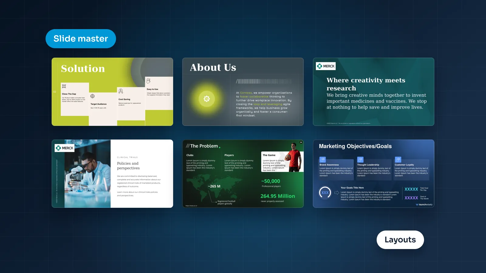
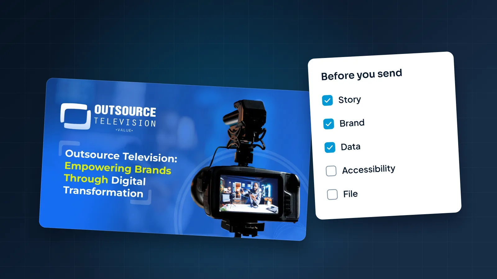
Tailoring only works if the design survives reps editing it. That means a proper slide master with a layout for each module, so a rep can drop in a new case study without breaking the grid. If your current template fights your team, see how a custom PowerPoint template is built. And before a tailored copy goes out, run it through a pre-send presentation checklist, so one customer's logo never lands in another customer's deck.
Proof, numbers and visuals that sell
Buyers discount claims and believe specifics. A few rules make proof slides land.
One number per slide, with context. "A big drop in errors" means little. "40% fewer picking errors in 90 days, across two sites" gives the buyer something to hold against their own operation. (That figure belongs to our fictional example.)
Show the source. A small line under the number, such as "Source: customer warehouse data, March to June," keeps the claim credible when the deck reaches a skeptic.
Use names and logos only with permission. A customer logo is a strong signal, which is exactly why you need the customer's agreement to show it. Without it, describe the customer instead: "a regional distributor with two sites" is still useful proof.
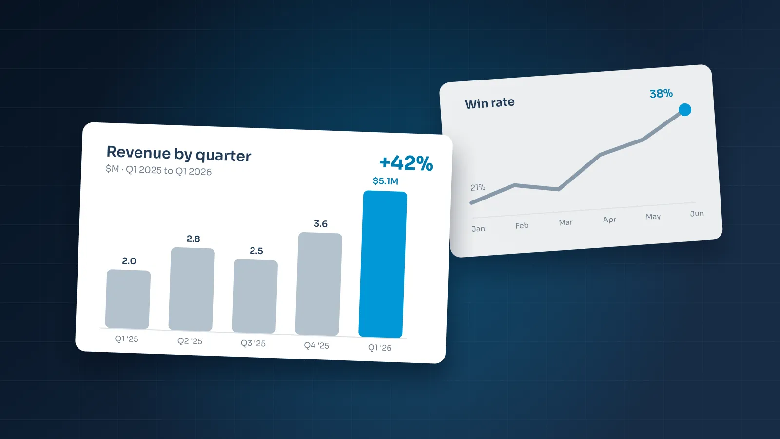
Make charts readable at a glance. Give each chart one message, highlight the key bar or line in your accent color and put everything else in gray. Label data directly instead of using a legend. Build charts as native, editable objects so the team can update next quarter's numbers in minutes. Our guide to presenting data in PowerPoint goes deeper.
Pick images from the buyer's world. A photo of a real site, a cropped product screen or a simple diagram does more than a stock photo of a handshake. If an image could appear in any company's deck, it isn't helping yours.
Keep the logo wall honest. A row of customer logos works on the "who we are" slide, as long as every logo belongs to a real customer who agreed to appear.
Annotated example slides
These sales presentation examples are three slides from the fictional Calder Robotics deck, with the design decisions that make each one work. The company, its customer and every number are made up for illustration.
The cost-of-doing-nothing slide
- Headline: "Picking errors cost you money every week you wait."
- Layout: a three-part formula across the slide: errors per week × cost per error × 52 weeks = yearly cost. Each input sits in its own box, labeled with where it came from, such as "from our call on October 14."
- Why it works: the buyer's own numbers make the total hard to dispute, and the formula reads in seconds.
The proof slide
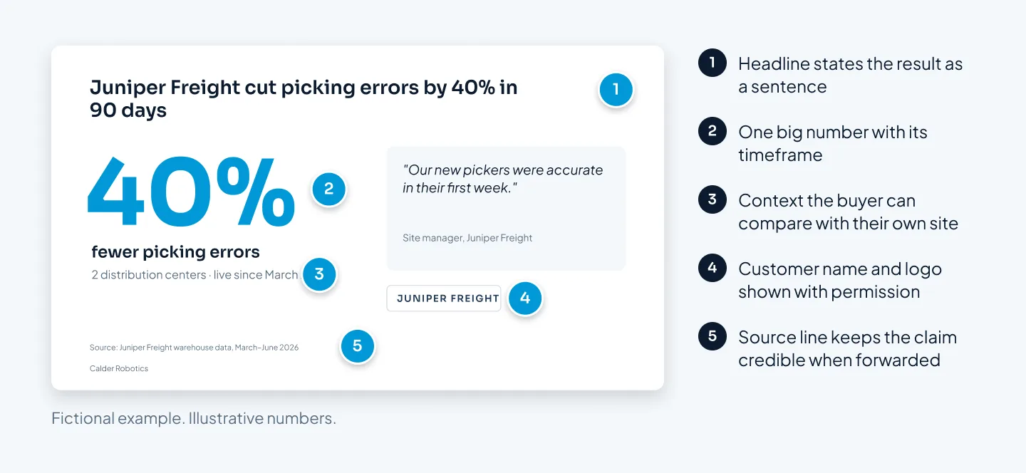
The headline states the result as a sentence. One big number carries the slide, with its timeframe beside it. A line of context (two distribution centers, live since March) lets the buyer compare it with their own sites.
A one-line quote from a site manager adds a human voice. The customer's logo appears because, in this example, the customer agreed. A source line sits at the bottom in small type.
The next-step slide
- Headline: "Next step: a four-week pilot at one site."
- Layout: a short timeline with four dated steps: site visit, data review, install and results review. Each step names one owner on each side.
- Why it works: it ends the meeting with a decision to make rather than a question to ponder, and it gives your champion a plan to forward.