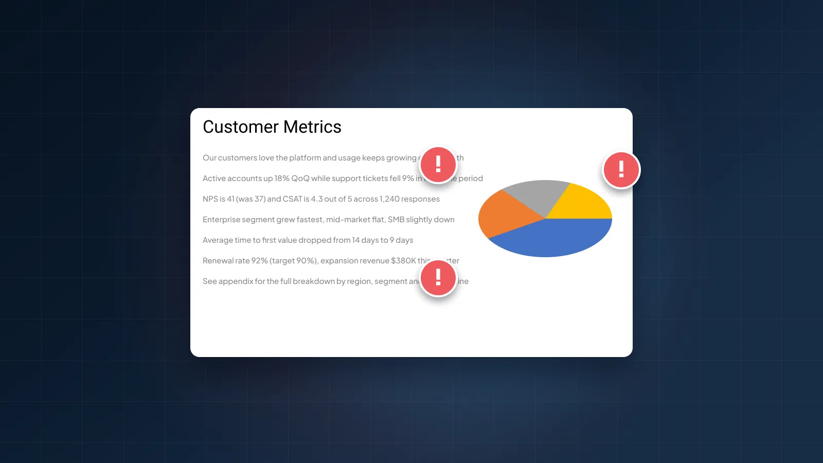
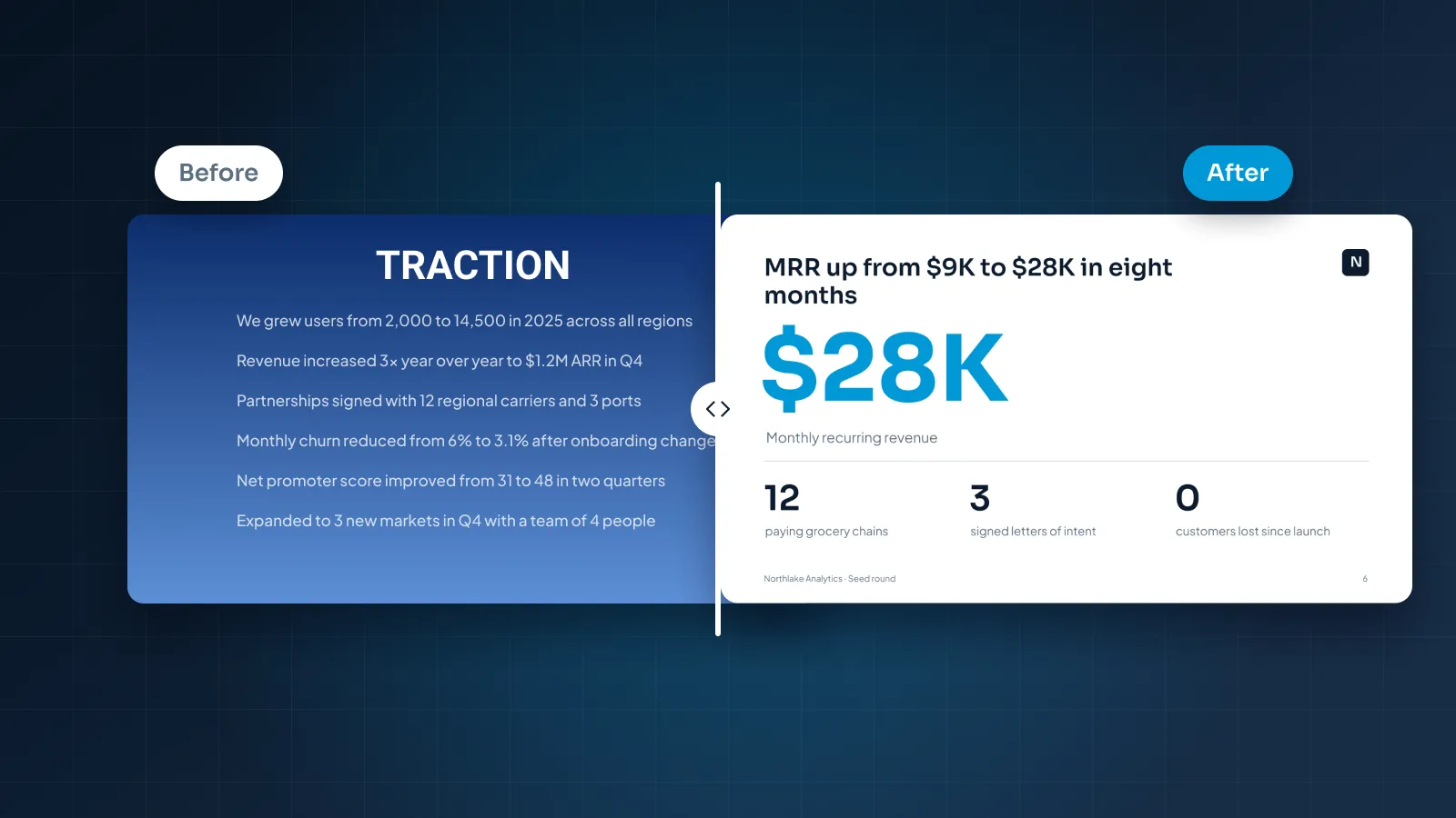
Most decks that look wrong don't need new content. They need the content they already have to be easier to see, and that's what a redesign does.
It's easiest to understand with slides, so this post walks through four before-and-after pairs: a pitch deck slide, a sales slide, a corporate slide and a data slide. These are rebuilt sample slides for fictional companies, made to show typical fixes. They are not client work. Each pair lists what we changed and why, so you can apply the same fixes to your own deck.
What a redesign is (and isn't)
A redesign starts from your existing deck. The story, the facts and the order mostly stay. What changes is everything that decides how fast someone understands a slide: layout, type sizes, color, icons, charts and the space between things.
A proper redesign also builds the new look into the file. In PowerPoint, the layouts live in the slide master, so the next slide your team adds matches the rest. Charts are rebuilt as native charts, so the numbers can still be updated in Excel.
Here's what a redesign isn't:
- A rewrite. Copy gets edited for clarity: a shorter title, a crowded slide split in two. Bigger content changes should be suggested to you, not made quietly.
- A new theme. A new theme swaps fonts and colors. It doesn't fix a slide with seven bullets and the key number buried in the middle.
- A rebrand. The work follows your brand guidelines. If you don't have any, the deck still needs a consistent palette and type pair, but that's not a new identity.
- A change to your numbers. A designer changes how a number is shown, never what it is.
If your deck started in an AI tool, the same logic applies. Our guide to choosing between an AI presentation maker and a designer covers when a tool's output is enough and when it needs a human finish. For whole decks, this is the work our presentation redesign service does.
Before and after: pitch deck
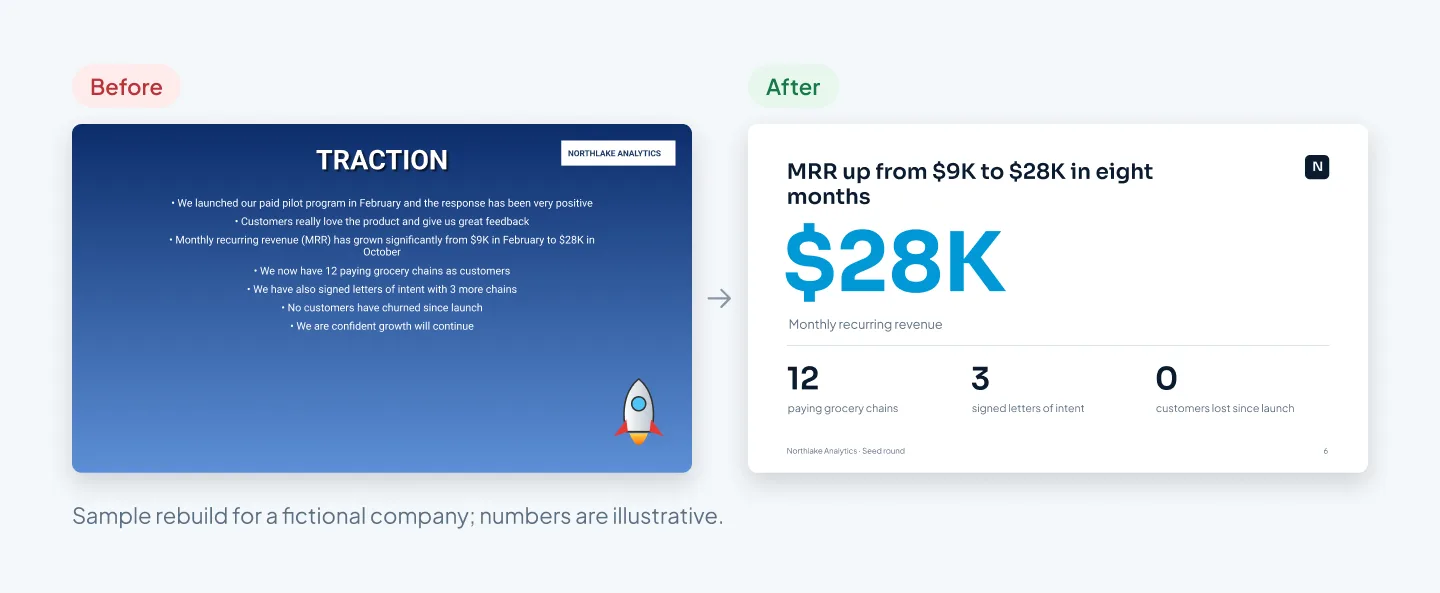
Northlake Analytics is a fictional seed-stage startup that sells demand forecasting to grocery chains. This is its traction slide, where the strongest proof in a pitch deck should live.
The before version has everything an investor needs. It's just at the wrong size and in the wrong order: the best number sits halfway through the third bullet.
What we changed and why
- The title states the point. "TRACTION" became "MRR up from $9K to $28K in eight months". An investor who reads only the titles still gets the story.
- The best number is the biggest thing on the slide. $28K moved out of bullet three and up to the top, where the eye lands first.
- Three facts became three stats. Paying chains, signed letters of intent and customers lost each get a number and a short label, so they scan in seconds.
- Two lines were flagged for cutting. "Customers really love the product" and "We are confident growth will continue" give an investor nothing to check. A real customer quote would do that job better. In a real project, a cut like this is suggested to you first.
- The decoration went. The clip-art rocket, the gradient and the white box around the logo are gone. The logo now sits small, in the same spot on every slide, from the master.
- Everything aligns to one grid. Centered text makes the eye find a new starting point on every line. Left-aligned text reads faster.
For more founder-specific fixes, see pitch deck design mistakes that lose investors.
Before and after: sales deck
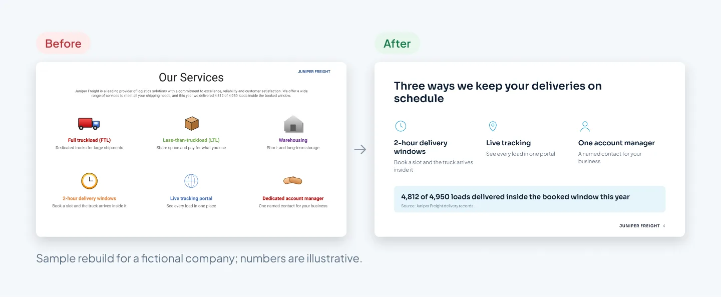
Juniper Freight is a fictional regional freight company. This is the "Our Services" slide from its deck for retail buyers. It's written from the seller's side: a list of everything the company does, with its best proof hidden at the end of a paragraph.
What we changed and why
- The title is about the buyer. "Our Services" says what's on the slide. "Three ways we keep your deliveries on schedule" says why a retail buyer should care.
- Six services became three. For a buyer worried about late deliveries, delivery windows, live tracking and one account manager are the answer. Truckload options and warehousing move to an appendix slide. A sales deck built in modules can show a different three to the next buyer.
- The proof came out of the paragraph. "4,812 of 4,950 loads delivered inside the booked window" was hiding behind "a leading provider of logistics solutions". It now has its own line, and the generic claims are gone.
- One icon style. The before slide mixes 3D, flat, glossy and outline clip art in four colors. The after uses one set of line icons in one color at one size. Mismatched icons are one of the quickest tells of a homemade deck.
- Equal columns, left-aligned text. Each column has the same width, a bold label and one line of detail.
If you add customer logos or case studies as proof, use only the ones you have permission to show. For a whole sales deck built on the same idea, see the Pilot Mortgage Group realtor partnership sales deck: pain points first, visible proof, one clear call to action.
Before and after: corporate slides
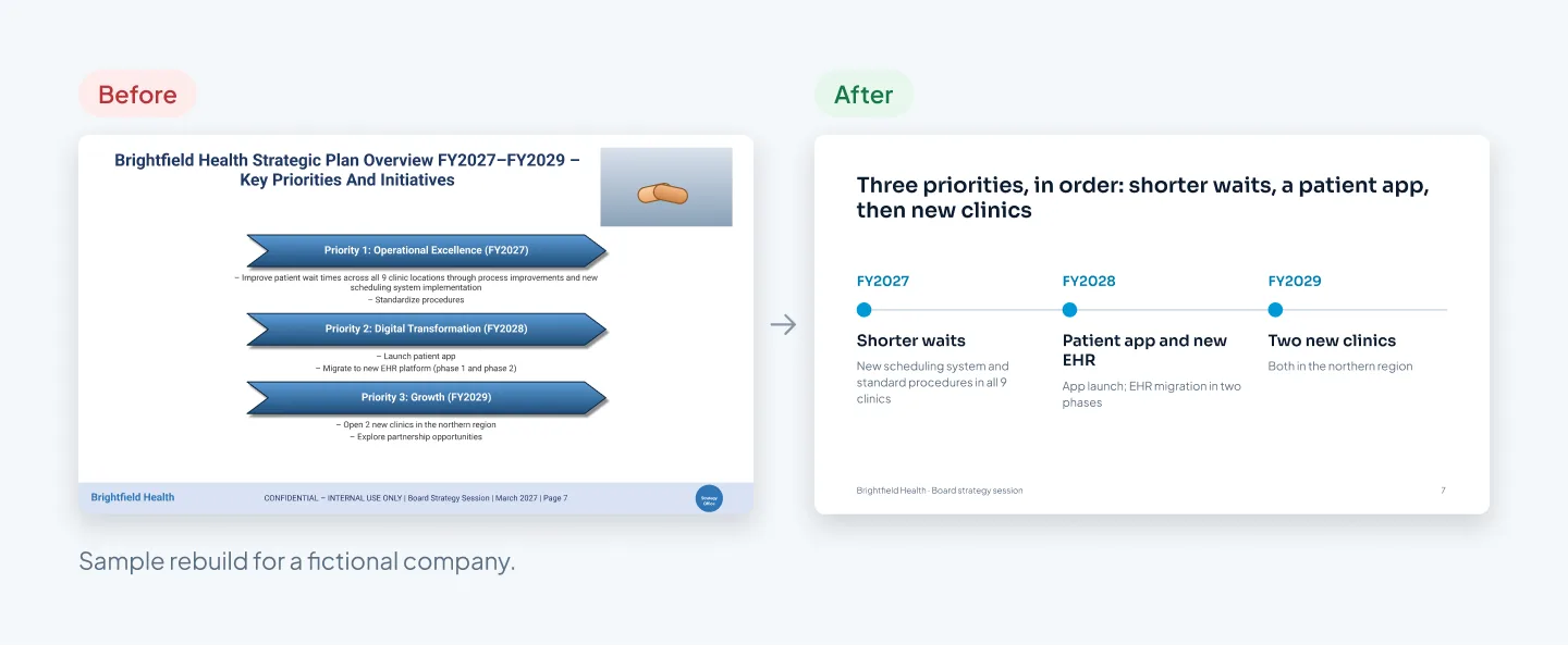
Brightfield Health is a fictional group of nine clinics. This is the strategy slide from a board deck. There's a clear three-year plan inside it, but the before version hides the order behind beveled chevrons, sub-bullets and a stock photo of a handshake.
What we changed and why
- The title carries the plan. A two-line title in Title Case became one sentence: "Three priorities, in order: shorter waits, a patient app, then new clinics". The board knows the sequence before reading anything else.
- The shape matches the content. The plan runs across three years, so it's now a timeline. The chevrons looked like arrows but didn't point anywhere.
- Labels say what happens. "Operational Excellence" became "Shorter waits", the outcome the bullets underneath describe. Each year gets one label and one line of detail.
- One idea is a candidate for the notes. "Explore partnership opportunities" isn't a plan yet. We'd suggest moving it to the speaker notes for the presenter to mention.
- The footer got quiet. "CONFIDENTIAL", the date, two logos and the page number became one small line and a page number.
- The stock photo went. A handshake says nothing about clinics, waiting times or apps. Removing it gave the timeline room.
Before and after: data slides
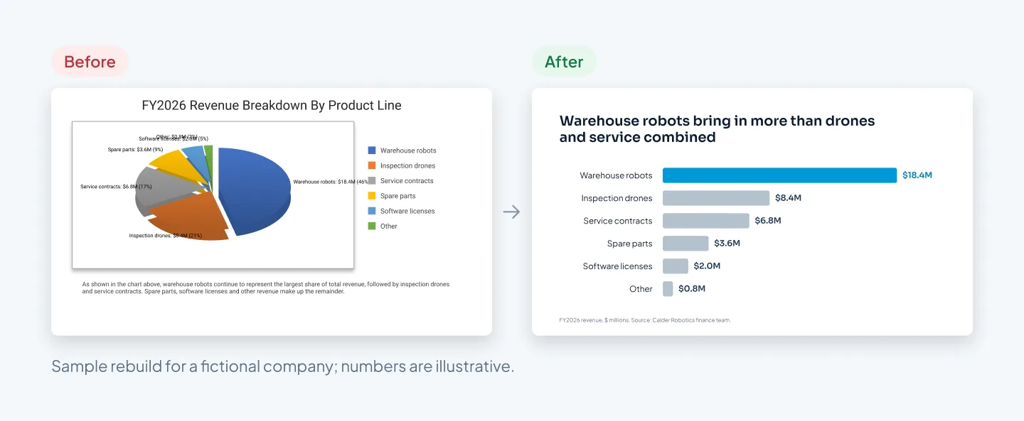
Calder Robotics is a fictional robot maker, and this slide shows revenue by product line. The before version is a 3D exploded pie. The tilt makes the front slices look bigger than they are, and six slices are hard to compare by angle anyway.
What we changed and why
- A pie became a sorted bar chart. Bars share a baseline, so lengths compare at a glance. Sorting largest to smallest shows the ranking without anyone working it out.
- The title says what the chart proves. "Warehouse robots bring in more than drones and service combined" replaces "FY2026 Revenue Breakdown By Product Line".
- One accent color. The bar that carries the point is in the brand color. The rest are gray, so they support it instead of competing.
- Labels sit on the bars. Values at the end of each bar replace the legend, so nobody has to match colors back and forth.
- The paragraph went. It only described the chart. If a chart needs a paragraph to explain it, the chart is doing the wrong job.
- It's still a native chart. It was rebuilt with PowerPoint's own chart tool, so next year's numbers go in through Excel, not a new screenshot.
- A source line was added. Small, and in the same place on every chart slide.
The patterns behind every fix
Look across the four pairs and the same moves repeat. Once you know them, you can spot them in any deck.
| Pattern | Before | After |
|---|---|---|
| One point per slide | Several ideas, equal weight | One claim; everything else supports it |
| Titles that state the point | "Traction", "Our Services" | A sentence with the finding in it |
| Clear hierarchy | Every line the same size | One thing biggest, then the rest |
| One grid | Centered text, placed by eye | Left-aligned to shared margins |
| Restraint | Gradients, mixed clip art, many colors | One accent, one icon style |
| Charts that compare | 3D pie, legend, long caption | Sorted bars, direct labels |
| Built into the master | Logos and footers pasted per slide | Layouts and placeholders |
The last row matters most for whoever edits the deck next. If the new look only lives on the slides, it starts to drift the first time someone adds one. If it lives in the master, every new slide starts in the right place.
Our guide on how to make a PowerPoint look professional covers each of these rules in more detail, and our case studies show them on complete decks.
A redesign changes how your numbers look, never what they are.
Redesign or start again?
A redesign is the right call when the content works and the slides don't. Starting again is better when the problem is the story itself.
| Your situation | Better option | Why |
|---|---|---|
| Story and facts are right; slides look dated or crowded | Redesign | The thinking is done; only the look is wrong |
| An AI draft with the right content but generic layouts | Redesign | Keep the draft, rebuild the slides |
| One deck stitched together from several older ones | Redesign, after fixing the order | Merge the story first, then the look |
| The audience changed, such as a sales deck reused for investors | Start again | Different readers need a different story |
| Nobody can say what the deck should make people do | Start again | No design fixes a missing point |
Starting again doesn't mean a blank page. At Pixel Presentation, a project starts one of two ways: you upload your own deck, document or notes, or you start with a draft in our AI draft studio. Either way, a designer on our team builds the slides.
If you already have an AI draft and want to fix it yourself first, here's how to make an AI-generated presentation look professional.
And if you only have three slides to fix before tomorrow's meeting, do it yourself. Apply the patterns above, one slide at a time. A paid redesign earns its cost on a deck you'll use again, or one that has to win something.
Cost and timing
Our redesign is priced per slide, like the rest of our design work: $10 a slide, with a 5-slide minimum. Complex slides cost $15. That covers custom infographics, multi-series data charts, process diagrams, maps and illustrations built from scratch. You see which slides count as complex before you order.
As an example, a 20-slide sales deck with four multi-series charts comes to 16 × $10 plus 4 × $15, which is $220.
A redesign takes 3–6 working days. The clock starts when the order is placed with the deck and brief we need. If a designer has the hours free, Express (48 hours) adds 25% to the design fee and Rush (24 hours) adds 50%.
Every order includes two revision rounds, and small edits within 14 days of delivery are free. You get fully editable PowerPoint, Keynote or Google Slides files plus a PDF, built natively with nothing flattened into images. You can pay after you approve the final deck.
To price your own deck, try the pricing estimator, or see how a project works step by step.