Investors judge the business, not your fonts. But design decides how quickly they understand the business, and a deck that's hard to follow rarely gets a patient second read.
Below are the design mistakes worth checking for, grouped by story, layout, data and file, each with its fix. The examples use Northlake Analytics, a fictional seed-stage startup that sells demand-forecasting software to retailers. If you're building a deck from scratch, start with our pitch deck guide.
Why design mistakes cost meetings
A deck often gets its first read alone, on a laptop or a phone, between other things. Nobody is there to explain a crowded slide or a confusing chart. Whatever the reader can't work out quickly, they skip.
Design is how a reader finds the point. Clear headlines, one idea per slide and labeled data let someone follow your argument at reading speed. Crowded slides make them dig for it, and a reader who has to dig starts skimming.
Mistakes also send signals you didn't intend. A revenue figure that changes between two slides makes a reader wonder what else wasn't checked. A deck that looks assembled from three templates suggests a team that hasn't settled its story.
Good design can't rescue a weak business, but a confusing deck can bury a good one.
The good news: none of the fixes below needs a big budget, and most take an afternoon.
Story mistakes
Headlines that name the topic, not the point
"Market." "Traction." "Team." Topic headlines make the reader work out what each slide is meant to prove.
Fix: write each headline as the takeaway, in a full sentence. "Traction" becomes "41 retailers pay us, up from 12 a year ago." Then read only the headlines, in order. They should tell the whole story.
Slides in an order that doesn't build
A deck that opens with the team, jumps to financials and only then explains the product leaves the reader to assemble the argument.
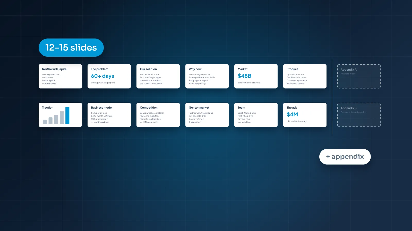
Fix: use an order investors recognize: problem, solution, why now, market, product, traction, business model, go-to-market, competition, team, financials, the ask. Each slide should answer the question the previous one raised.
An ask that's missing or vague
Some decks end on "Thank you" with no ask at all. Others say "Raising $2M" with no hint of what the money does.
Fix: state the amount, what it pays for and the milestone it gets you to. For Northlake: "Raising $2M seed to reach 150 paying retailers in 18 months."
Everything in the main deck
Every chart, every customer logo, every feature. The main story gets lost under detail that only some readers need.
Fix: keep the main deck to the slides that make the case, and move the rest to an appendix. Our guide to how many slides a pitch deck should be covers length by stage and format.
Layout and text mistakes
Walls of text
Seven bullets, full sentences, small type. Whether you present it or send it, nobody reads it all.
Fix: one idea per slide. A headline that states it, then up to three short lines or one visual. Move the rest to your speaker notes if you're presenting, or to the appendix if you're sending. Our post on pitch decks vs investor decks explains how much text each version can carry.
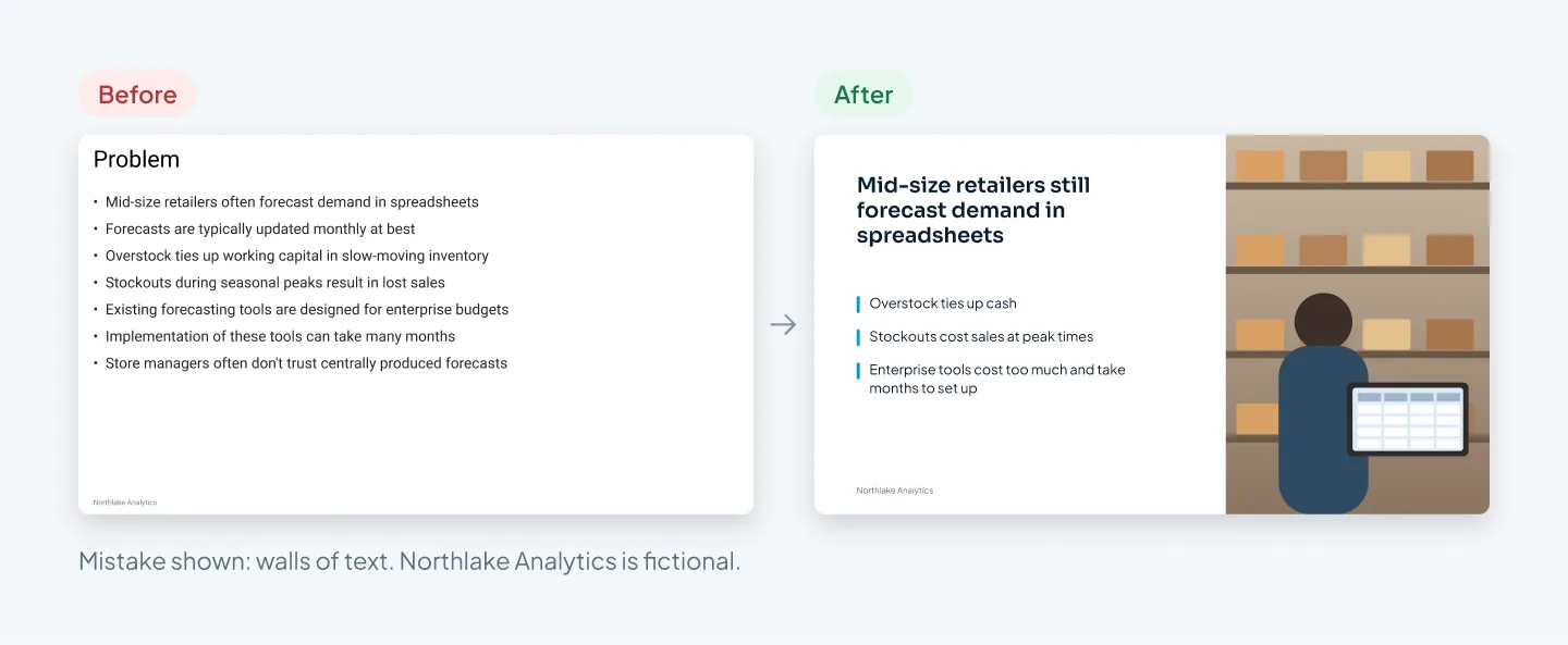
In the redesign, the headline says what the problem is, three short lines name what it costs, and a photo shows who has it. For more pairs like this, see our presentation redesign before-and-after examples.
No focal point
Headline, numbers, labels and logo are all the same size and weight. The eye has nowhere to land.
Fix: decide the one thing each slide should show first, usually the headline or a key number, and make it the largest element. Everything else steps down in size and weight. Save your accent color for that one thing.
Text that's too small or too faint
Light gray text on white, captions over busy photos, chart labels in tiny type. They fail on a projector and on a phone.
Fix: for presented slides, keep body text at 18 pt or larger, and let only small labels and source lines go below that. For sent decks, open the PDF on your phone; if you have to zoom to read a label, it's too small. Check color contrast against the WCAG standard: 4.5:1 for normal text and 3:1 for large text.
Slides that don't match each other
Three fonts, four shades of blue, titles that jump position from slide to slide. This tends to happen when a deck is stitched together from older decks.
Fix: put everything on one slide master, with theme fonts, theme colors and layouts that fix the title position. Then reapply those layouts to every slide. If your team builds decks often, a pitch deck template like aiScout's keeps every future deck on brand.
Data and chart mistakes
Charts with no takeaway
A chart titled "Revenue" shows some bars and leaves the reader to find the story.
Fix: make the headline the conclusion, such as "Revenue tripled in 12 months," and highlight the bar or line that proves it. Mute everything else in gray.
Too much on one chart
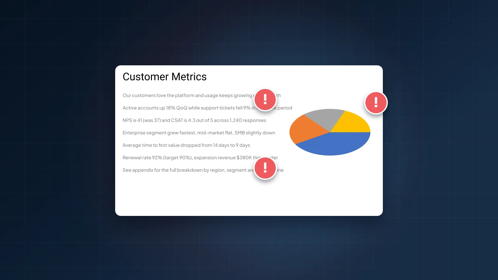
3D bars, four data series in similar colors, a legend far from the data and heavy gridlines. Each extra element is one more thing to decode.
Fix: one message per chart. Drop the 3D effect and most gridlines, label values directly on the bars, and put the full breakdown in the appendix.
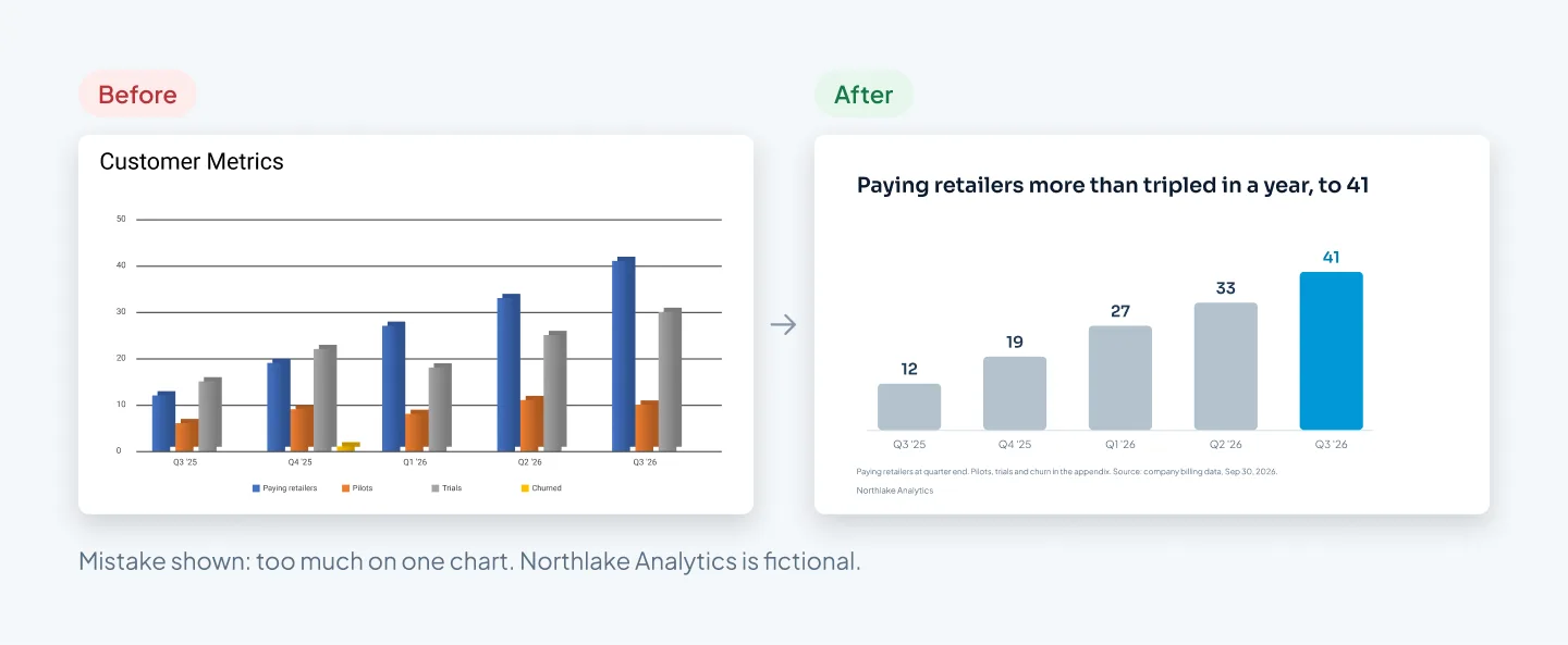
The pilots, trials and churn data still matter. They just belong in an appendix table, where a curious reader can find them.
Numbers that don't match
Revenue is $84K on the traction slide and $80K in the financials. "Customers" means paying retailers on one slide and pilots on another.
Fix: keep one sheet listing every number in the deck and the slides it appears on. Use the same figure, unit, date and definition everywhere, and footnote the source. When a number changes, update every slide that uses it.
Financials pasted as a screenshot
A spreadsheet image with dozens of rows of tiny numbers says "we have a model" and nothing else.
Fix: show the few lines that matter, such as revenue, gross margin, burn and headcount, as a native table or chart. Put the full model in the appendix or your data room. A financial model can be easy to follow: our Utatu Opus investment proposal does it for a rooftop solar project in Uganda.
File mistakes (fonts, links, size)
Fonts that change on someone else's computer
You designed in a font the investor doesn't have, so PowerPoint swaps it and every line breaks differently. Keynote files have the same problem on a Mac without your fonts installed.
Fix: send a PDF, which keeps your fonts and layout. If you must share an editable file, use fonts everyone has; in Google Slides, that means Google Fonts.
Links that don't open
A demo video that asks for a login, a shared folder limited to your company, a booking link that has expired.
Fix: click every link from a browser where you're logged out. Check the sharing settings on any shared file, and make sure the demo plays without an account.
A file too big to email
High-resolution photos and embedded video can push a deck past what an inbox will accept.
Fix: compress images before you export; PowerPoint has a Compress Pictures option. Link to video instead of embedding it in the sent version, and aim for a PDF of a few megabytes.
Sending the working file
A file called Deck_FINAL_v7.pptx, still holding your speaker notes, internal comments and last year's numbers on a hidden slide.
Fix: check for hidden slides, then export a clean PDF without notes or comments. Give it a plain name, such as Northlake-Analytics-Seed-Deck-Oct-2026.pdf, and keep the editable file for yourself.
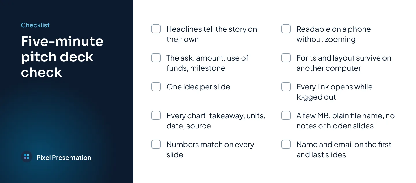
A five-minute self-check before you send
Run this on the exact file you're about to send, not the one you've been editing.
- Read the headlines only, in order. They should tell the story without the slides.
- Find the ask. The amount, what it pays for and the milestone it reaches are all on one slide.
- Count the ideas. Any slide making two points gets split, or one point moves to the appendix.
- Check every chart. Each has a takeaway headline, units, a date and a source.
- Match the numbers. Revenue, customers and runway are identical wherever they appear.
- Open the PDF on your phone. Every label is readable without zooming.
- Open it on another computer. The fonts and layout survive.
- Click every link while logged out. Each one opens without a login or a permission request.
- Check the file. A few megabytes, a plain name, no notes, comments or hidden slides.
- Check the first and last slides. Your name and email are on both, so a forwarded copy can still reach you.
Found more than you can fix before your deadline? The pitch deck design service at Pixel Presentation can redesign the deck from your file. Pitch decks take five working days as standard, or 48 hours with Express when a designer has the hours free.