
A pitch deck has two jobs. First it gets you the meeting, then it helps you win the round. Both depend on the same thing: an investor understanding your business quickly, without having to work for it.
This guide goes through the deck slide by slide: what to include, what each slide must prove and one design tip for each. Then it covers the story that holds the slides together, the design rules investors notice and how to handle the numbers. The examples use Juniper Freight, a fictional seed-stage logistics startup.
What a pitch deck is (and the two versions you need)
A pitch deck is a short presentation that explains your business to investors. It covers the problem you solve, how you solve it, the proof that it works and what you need to grow. It is not a business plan. Its job is to make an investor want the next conversation.
Most startups need two versions of it, built from the same content:
- The sent deck is read alone, usually as a PDF attached to an email or shared as a link. Nobody is there to explain it, so every slide has to make sense on its own.
- The presented deck sits behind you while you talk, in a meeting or on a stage. You do the explaining, so the slides carry fewer words and bigger visuals.
The two versions share an order, a design and the same numbers. They differ in how much text each slide carries, which is covered under sending vs presenting, below. You'll also see them called a pitch deck and an investor deck. Here's how a pitch deck differs from an investor deck, and whether you need both.
The slides every pitch deck needs, in order
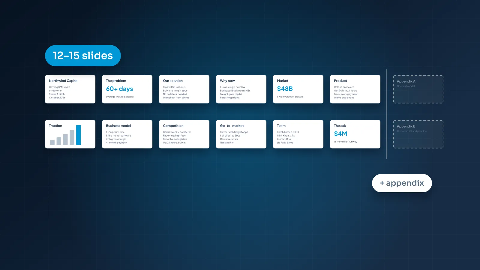
Here is a structure that works for most startups, in order. Our view: usually 12–15 slides for the main deck, with an appendix for detail. That gives each point its own slide and keeps the deck short enough to read in one sitting. For how the length shifts by format and funding stage, see how many slides a pitch deck should be.
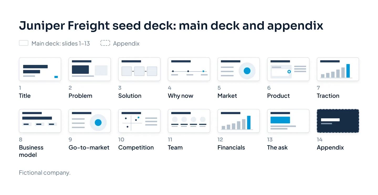
Treat the order as a starting point. If traction is your strongest evidence, move it up to follow the solution. If you're pre-revenue, the traction slide shows pilots and early signals instead of revenue.
1. Title and hook
What it must prove: what your company does, in one line.
The first slide answers "what is this?" before anyone reads on. Show your company name, logo and one plain sentence. Juniper Freight's reads: "We fill empty return trips for regional trucking fleets."
Design tip: make that sentence the largest text on the slide, not the logo. On the sent version, add your name, email and the date at the bottom.
2. Problem
What it must prove: a specific group of people has a problem that costs them, often.
Name who has the problem and what it costs them. "Trucks drive home empty" is an observation. "Every empty return trip costs a regional fleet fuel and driver time, and earns nothing" is a problem with a price on it.
Design tip: show one customer's situation or one large number, not a list of five pain points. One sharp problem is more convincing than five vague ones.
3. Solution
What it must prove: you solve that exact problem, in a way people can picture.
Answer the problem slide directly, in the same words. For Juniper Freight: shippers post loads, the platform matches each load to a truck already heading that way, and the fleet earns on the trip home.
Design tip: show how it works in three steps, left to right, with a short label under each. Cut adjectives like "innovative"; the steps should show why it's better.
4. Why now
What it must prove: something has changed that makes this possible, or urgent, today.
Investors want to know why this didn't work five years ago and why it can't wait. The answer might be a new technology, a rule change or a shift in how customers buy. For Juniper Freight, it might be that small fleets now dispatch from phone apps with live location. An empty trip can be spotted and filled while the truck is still unloading.
Design tip: a simple before-and-after or a short timeline beats a paragraph. Stick to one shift; three loosely related "trends" read like guesswork.
5. Market
What it must prove: the opportunity is big enough, and you know where you start.
A huge top-down figure on its own proves little. Show the segment you'll win first and how it widens from there. A bottom-up estimate (target customers multiplied by what each pays a year) is easier to believe than a slice of an industry total.
Design tip: if you use nested circles for total, serviceable and obtainable market (TAM, SAM, SOM), put the calculation beside them. Circles without math are decoration.
6. Product
What it must prove: it exists and works, or exactly how far along it is.
Show the real thing: app screens, the device, the service in use. If you're pre-product, show the prototype and be clear about what's built and what's planned.
Design tip: crop screenshots to the part that matters and add one callout to each. A full dashboard shrunk to fit a slide is just texture.
7. Traction
What it must prove: people want this, and demand is growing.
Pick the metric that best shows demand for your model, such as revenue, active customers, usage or signed pilots, and show it over time. There's more on traction slides further down.
Design tip: use one chart, with a title that states the result: "Monthly loads matched grew 4x since March." Label the latest value directly on the chart.
8. Business model
What it must prove: how you make money, and that the economics can work.
Say who pays, how much and how often. Juniper Freight charges shippers a fee on each load matched, so revenue grows with every trip filled. If you know your margins, or how quickly a customer pays back what it cost to win them, add that here.
Design tip: put the pricing model in one line of large type, with two or three supporting numbers beneath. Skip the screenshot of your pricing page.
9. Go-to-market
What it must prove: you can reach customers in a way that repeats.
Name your first segment, the channel that reaches it and what you've learned so far. "Sales and marketing" is not a plan. "Direct sales to fleets of 5–50 trucks in three states, then partnerships with dispatch software" is.
Design tip: show the plan as two or three phases on a timeline, or as a funnel with real numbers at each stage.
10. Competition
What it must prove: you know the alternatives and why customers will choose you.
List what customers use today, including the unglamorous options. For Juniper Freight, that's load boards, freight brokers, and a dispatcher with a phone and a spreadsheet. A slide that says "no competitors" suggests you haven't looked.
Design tip: a comparison table built on criteria buyers care about is easier to trust than a 2×2 where you sit alone in the top-right corner. If you do use a 2×2, make both axes things customers actually choose on.
11. Team
What it must prove: these people can deliver this plan.
Show the founders and key hires, each with the one fact that makes them right for this business. Juniper Freight's line for its CEO might read: "Ran dispatch for a 120-truck regional carrier for six years."
Design tip: use photos with the same style, crop and background, and one line of proof per person. Past-employer logos help only when they're relevant to the plan.
12. Financials
What it must prove: you understand what drives the business, and the plan adds up.
Summarize three to five years of revenue, gross margin and burn. Show the few assumptions that drive the model, such as loads per fleet per month. The full model belongs in the appendix or a separate spreadsheet.
Design tip: one clear chart plus a short line of assumptions beats a spreadsheet pasted in as a table.
13. The ask and use of funds
What it must prove: what the money will buy, in milestones.
State the amount, the runway it gives you and what you'll have achieved by the end of it. Juniper Freight's might be: "Raising $2.5M seed: 18 months to reach 5,000 loads a month across three states." Tie use of funds to those milestones, not just to departments.
Design tip: make the amount and the main milestone the largest things on the slide. In the presented deck, end here instead of on a "Thank you" slide, so your ask stays on screen during questions.
14. Appendix
What it must prove: there is solid detail behind every claim.
The appendix holds what an investor may ask for but doesn't need first: the detailed financial model, cohort data, the full competitor list, technical architecture. You don't present it. You jump to it when a question comes up, and you attach it to the sent deck or share it on request.
Design tip: open the appendix with a divider slide and keep the main deck's design. Title each appendix slide with the question it answers, so you can find it fast.
The story that connects them
A stack of good slides isn't a pitch yet. It becomes one when a single argument runs from the first slide to the last, and each slide answers the question the previous one raised.
For Juniper Freight, the argument fits in one breath: fleets lose money driving home empty; we fill those trips; it's working and growing; here's how we scale; here's what we need. Every slide supports one part of that line. A slide that supports none of it belongs in the appendix, or nowhere.
Three habits keep the story tight:
- Write titles as statements. "Market" is a label. "We start with regional fleets in three states, then go national" is a point an investor can agree or disagree with.
- Set up, then pay off. If the problem slide says empty return trips cost fleets money, the traction slide should show those trips being filled. Readers notice when slide 2 comes back on slide 7.
- Keep every number consistent. Revenue, round size and runway must match on every slide and in the appendix. One mismatch makes an investor question the rest.
The order can flex to lead with your strongest evidence, but the logic can't: problem before solution, proof before the ask. The quickest test is to read only the slide titles, in order, out loud.
If an investor reads only your slide titles, they should still get the whole story.
Design rules investors notice
Investors aren't grading your taste. They notice whether they can understand a slide in seconds, and whether the deck looks like it was made with care. Both come down to a few rules.
One message per slide
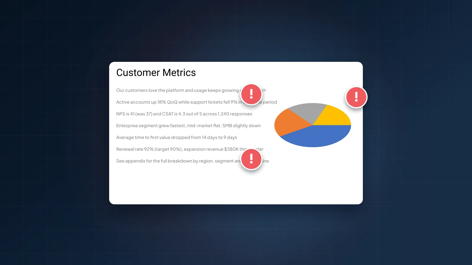
If a slide makes two points, split it or cut one. A crowded slide makes the reader decide what matters, and they may decide wrong. Two clear slides read faster than one crowded one.
Text big enough to read anywhere
Your sent deck will be opened on laptops and phones, and your presented deck on screens of every size. On presented slides, keep body text at 18 pt or larger, with titles well above that. If the text won't fit at that size, the slide has too much text.
A grid, two fonts and one accent color
Put titles in the same place on every slide and keep the margins consistent. Use one font for headings and one for body text, or one family in two weights. Pick a single accent color and save it for what the eye should land on: the key number, your company in the comparison, the latest bar in a chart.
Contrast you can read
Text needs enough contrast against its background, especially on a projector. The WCAG accessibility guidelines set 4.5:1 for normal text and 3:1 for large text. Pale gray text on white often fails both.
Charts built to be read
Use a native chart, not a pasted image, so you can update it when the numbers change. Remove 3D effects, heavy gridlines and any legend you can replace with direct labels. Then highlight the one bar or line that proves your point.
Real images over stock
Product screenshots, photos of your team and your customers' real setting say more than stock photos of handshakes. If you don't have good images, a clean typographic slide beats a generic photo.
For the errors to avoid, each with a before-and-after fix, see pitch deck design mistakes that lose investors.
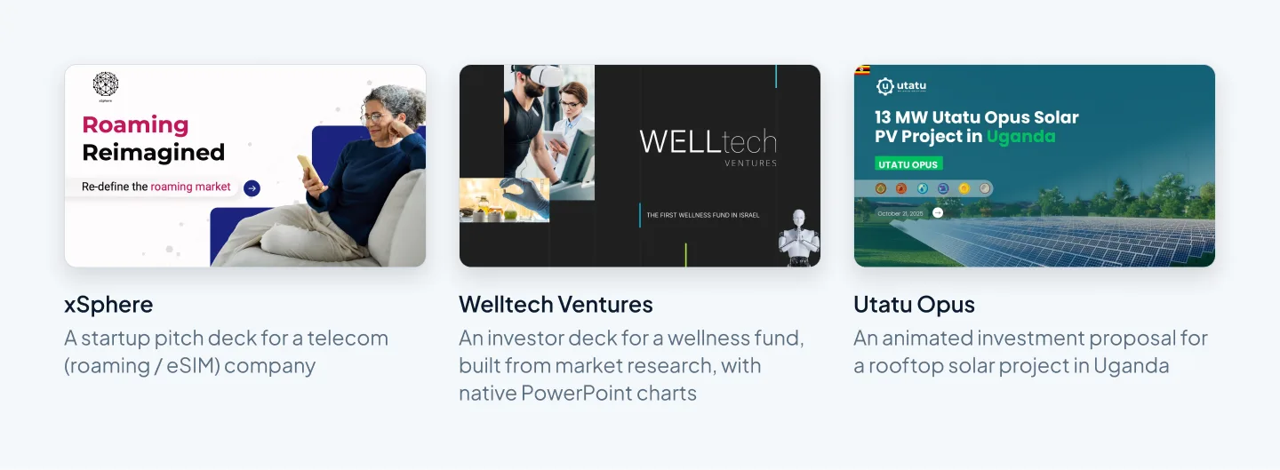
Here's how these rules look in finished work. The slides below come from three investor-facing decks our designers built, including a startup pitch deck for xSphere, a telecom company working in roaming and eSIM.
Traction, market and financial slides
These are the slides where numbers carry the argument, so they get the closest reading. Each has a design job beyond looking tidy: making the number easy to believe.
Making traction readable
Pick one metric that shows demand for your model and plot it over time, with dates. Monthly values beat cumulative totals. A cumulative line always rises, so it can hide a slowdown, and experienced readers know it.
Put the result in the title, label the latest value and add a source line, even if the source is your own dashboard. If you're pre-revenue, show what you have: pilot customers, letters of intent, a waitlist or usage from a beta. Say what each one is, and don't dress pilots up as revenue.
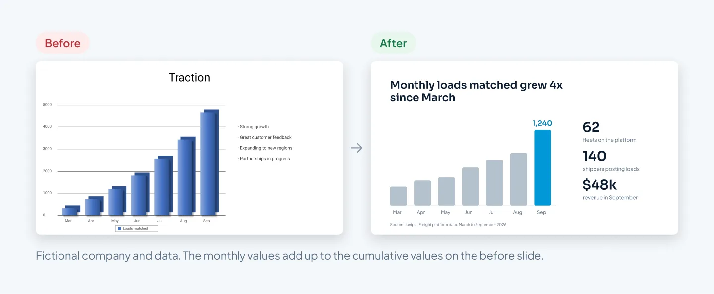
The before slide shows Juniper Freight's loads as a running total under a title that says nothing. The after slide plots the same months as monthly figures, states the growth in the title and puts three supporting numbers beside the chart.
Sizing the market so it holds up
Lead with the market you can reach first, and show how you got the number. A bottom-up calculation, such as target customers in your launch region multiplied by what each pays a year, shows you understand your buyers. A top-down figure from an industry report can sit beside it as context, with the source in a footnote.
Keep the math visible. Three numbers with the multiplication between them are more convincing than one large total. For an example of market research turned into clear, native PowerPoint charts, see the Welltech Ventures investor deck.
Financials that survive questions
Show a summary, not the model: revenue, gross margin and burn for three to five years, as one chart and a short table. List the three or four assumptions that drive the numbers, so an investor can challenge the inputs instead of guessing at them.
Build charts with PowerPoint's own chart tool, so the data sits in an embedded Excel sheet and can be updated when your model changes. Then check that the runway on this slide matches the runway in your ask. Motion can help here too: the Utatu Opus investment proposal uses animation to make a financial model for a rooftop solar project easy to follow.
Sending vs presenting
The sent deck and the presented deck share a structure and the same numbers. They differ in who does the explaining.
| What changes | Sent deck | Presented deck |
|---|---|---|
| Who explains | The slides | You |
| Words per slide | Enough to stand alone | As few as possible |
| Titles | Full-sentence takeaways | Short statements |
| File | PowerPoint, Keynote or Google Slides | |
| Animation | None (a PDF won't play it) | Builds that reveal one point at a time |
| Appendix | Attached or on request | Behind the main deck, for questions |
For the sent version, export to PDF so the fonts and layout hold on any device. Name the file clearly (for example, JuniperFreight-Seed-Deck-Oct-2026.pdf), check every link and keep the file small enough to attach to an email. Put your contact details on the title slide and the ask slide, so a forwarded copy can still reach you.
For the presented version, move supporting detail into the speaker notes and use Presenter View. You see your notes and the next slide; the room sees only the current one. Rehearse on the kind of screen you'll actually use, and keep the appendix ready for questions.
Keep one master file. Build the sent version first, because it holds every claim and number. Then save a copy for presenting, cut each slide back and move the extra text into the speaker notes. When a number changes, update both files the same day.
The pitch deck checklist (download)
Before your deck goes to anyone, run it through a final check. The checklist covers the story, each slide, the design and the file, in the order you'd fix them.
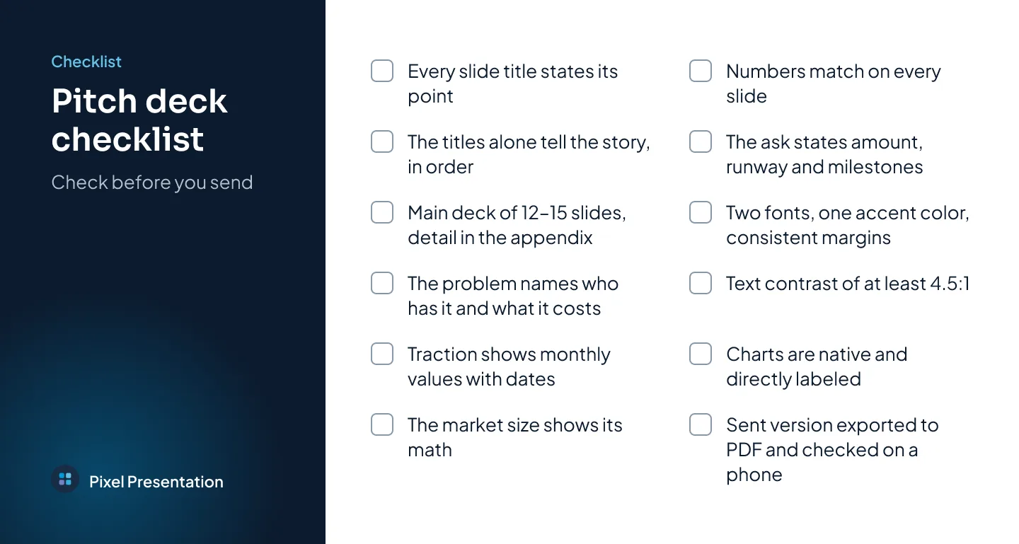
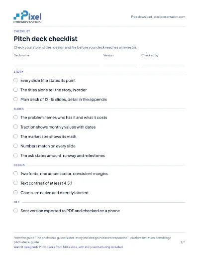
Free download
Pitch deck checklist
Download the pitch deck checklist to check your story, slides, design and file before your deck reaches an investor.