Advice on pitch deck length runs from 10 slides to well over 20. The right number depends on how the deck will be used: read alone in an inbox, presented in a meeting, or pitched against a clock on demo day.
Below is the short answer, then how length changes by format and stage, what to cut and where the detail goes. If you're still working out what goes on each slide, start with the pitch deck guide.
The short answer
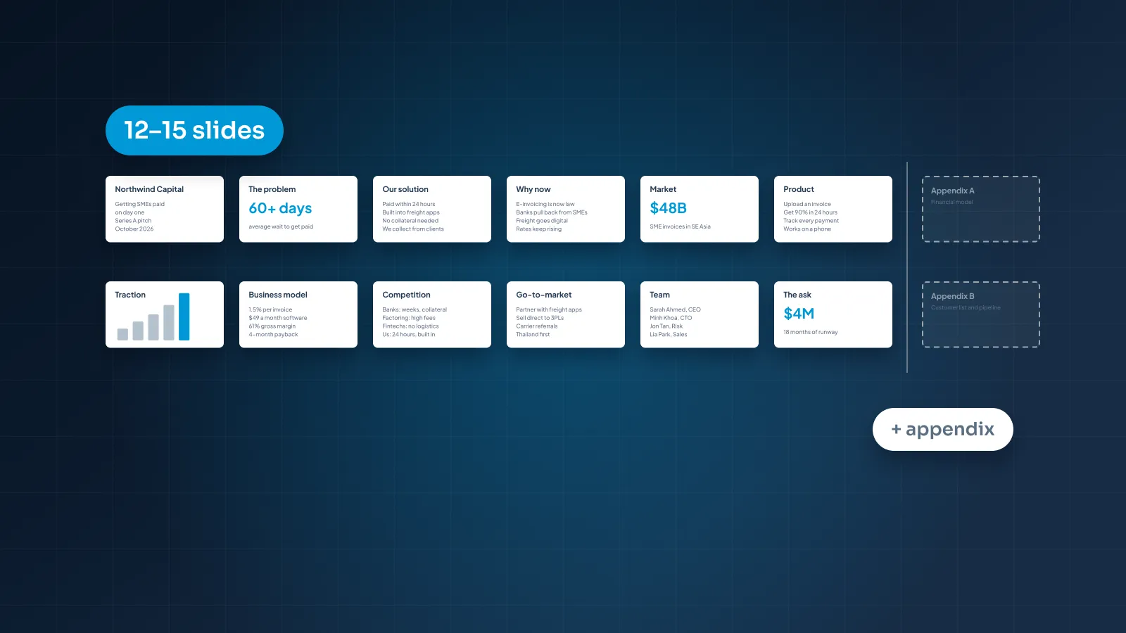
Our view: usually 12–15 slides for the main deck, with an appendix for detail.
That range isn't arbitrary. A complete pitch covers about a dozen points: problem, solution, why now, market, product, traction, business model, go-to-market, competition, team, financials and the ask. Add a title slide, give each point its own slide, and you land at 12–15.
Go below that and you're usually merging points investors expect to see separately. That's fine when you do it on purpose. It's a problem when a whole point quietly disappears.
Go above it and the extra slides are usually detail: a second market chart, three more product screens, every customer logo. That detail has a home, and it isn't the main deck.
Slide count is only a proxy. What you're really managing is the reader's attention: one point per slide, each easy to read, in an order that builds.
A simple test: give the emailed version to someone outside your company and ask them to explain your business back to you. If they can't, the deck needs a clearer story, not more slides. If they start skimming halfway through, it needs fewer.
By format: emailed, live pitch, demo day, follow-up
You may need three or four versions of your deck during one raise. The core story stays the same. The length and the amount of text change with the setting.
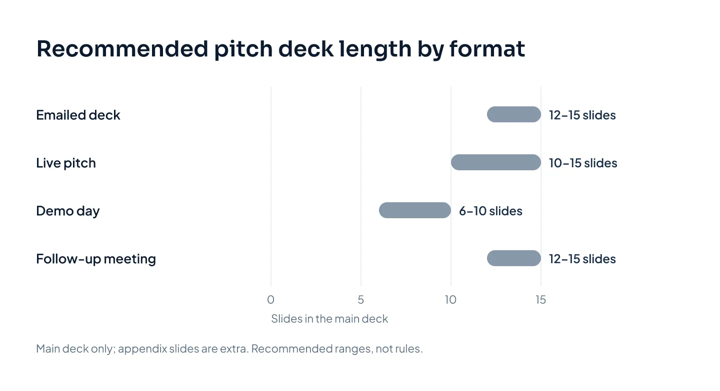
The simplest way to manage that is one master deck. Build the emailed version first, because it's the most complete. Cut text from it for the live pitch, and pick the strongest 6–10 slides for demo day.
| Format | Main deck | Who does the talking | Design for |
|---|---|---|---|
| Emailed deck | 12–15 slides + appendix | The slides | Reading alone |
| Live pitch | 10–15 slides | You | Listening, then questions |
| Demo day | 6–10 slides | You, against a clock | A big room, fast |
| Follow-up meeting | 12–15 slides + a deeper appendix | You and the slides | Detailed questions |
Emailed deck
An emailed deck is read alone, often before anyone has agreed to meet you. With no one there to explain it, each slide needs a full-sentence title and enough supporting text to stand on its own.
Aim for 12–15 slides, and attach the appendix or offer it on request. Send it as a PDF. For more on how the read-alone version differs from the one you present, see pitch deck vs investor deck.
Live pitch
In a meeting, you are the narration. The slides can carry fewer words, so the same story often fits in 10–15 slides.
As a rough guide, plan one to two minutes per slide, then work back from the time you have. Keep the appendix right behind the main deck. A live pitch often turns on the questions, and you want the answers one click away.
Demo day
Demo day slots are short and strictly timed, so check the exact length with the organizer. With only a few minutes, 6–10 slides is plenty.
Give each slide one idea, set the type very large and include nothing the audience has to read twice. Cut go-to-market and financial detail to a line each, and end on your ask and how to reach you.
Follow-up meeting
A second meeting is where investors test what you claimed in the first. Bring the main deck, updated with anything you've learned since, plus a deeper appendix.
The main deck stays at 12–15 slides. The appendix can grow well beyond that: cohort data, sales pipeline, unit economics, the financial model, the hiring plan. That's fine, because you only open what someone asks for.
By stage: pre-seed, seed, Series A
Stage changes what fills the slides more than how many there are.
Pre-seed
At pre-seed you have less to show: perhaps a prototype, some customer conversations and a team. A 10–12 slide deck is often right, because full traction and financials slides would be thin.
Don't pad them to look complete. Swap hard traction for early signals, such as pilot commitments or a waitlist. Put more weight on the problem, why now and why your team.
Seed
At seed, the full structure applies and traction moves to the center of the deck. Expect 12–15 slides, with a small appendix for the financial model and customer detail.
Series A
At Series A, the main deck stays about the same length, but the appendix grows. Investors want evidence that growth can repeat: retention, unit economics, pipeline and a hiring plan.
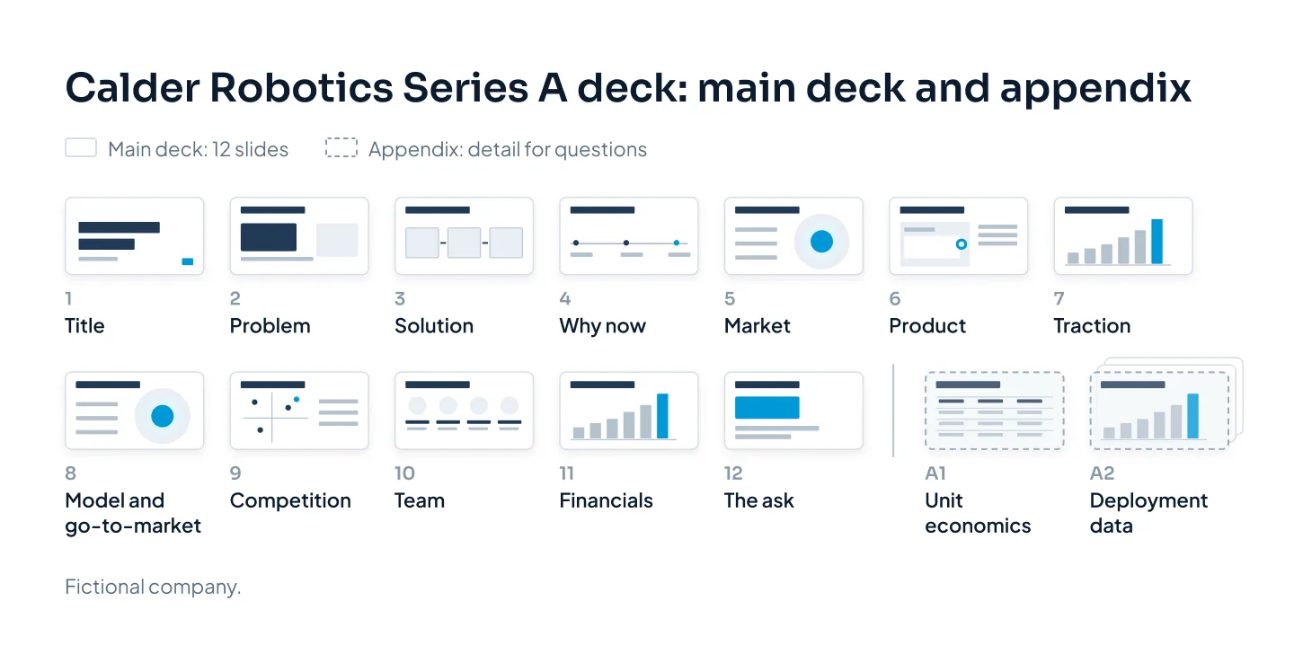
Take Calder Robotics, a fictional warehouse-robotics company raising its Series A. Its main deck might hold 12 slides. Behind them sits a longer appendix: unit economics per robot, deployment data by site, pipeline by customer stage.
The pattern holds at every stage. The main deck stays focused, and the evidence grows in the appendix.
What to cut when it's too long
If your main deck runs past 15 slides, work through it in this order:
- Read the titles only. Any slide whose title repeats an earlier point is a candidate to merge.
- Merge slides that make one point. Two market slides become one. A "how it works" slide joins the solution.
- Move proof to the appendix. Extra charts, the full set of product screens, the complete competitor list and long bios all belong there.
- Drop slides that don't move the argument. Mission statements, company history, a wall of advisor logos and a "Thank you" slide rarely earn their place.
- Cut words, not just slides. Sometimes the deck isn't too long. Each slide is just too full.
Here's how that plays out. Say Calder Robotics' first draft runs to 22 slides. The two problem slides merge into one, and so do solution and "how it works," business model and go-to-market, and the two team slides. Two of the three market slides and two of the three product screens move to the appendix. The mission slide and the "Thank you" slide go.
What's left is a 12-slide main deck, and nothing an investor might ask about has been lost.
Don't hit a number by cramming two slides into one. A 16-slide deck that reads easily is better than a dense 12.
Two clear slides read faster than one crowded one.
Crowding is one of several problems covered in pitch deck design mistakes, with before-and-after fixes. Trimming also keeps the budget down when a designer charges per slide. What a pitch deck costs explains how pricing works, and you can price your own deck in the pricing estimator.
Appendix slides: where the detail goes
The appendix is the part of the deck you don't present. It's also the reason your main deck can stay short. It holds the evidence behind your claims, ready for when someone asks.
What usually belongs there:
- the detailed financial model and its assumptions;
- cohort, retention or usage data;
- unit economics;
- sales pipeline and customer case notes;
- product roadmap and technical architecture;
- a full competitor comparison;
- extended team bios and the hiring plan.
Open the appendix with a divider slide and keep the same design as the main deck. Number every slide, and title each one with the question it answers, such as "How retention changes by customer size." Then you can find it under pressure.
In the sent version, either attach the appendix after the main slides or send it as a separate file on request.
If a designer is building your deck, send the appendix too, so it matches the main slides. Our pitch deck design covers both, and the xSphere startup pitch deck shows a finished example of our work.