

A homeowner who invites agents to pitch is comparing you with others, often in the same week and at the same kitchen table. Many listing presentations open with the agency: its history, its awards, its team photo. The seller is waiting to hear about their house.
This guide covers how to build a real estate listing presentation that keeps the seller at the center: what the seller needs to decide, a slide-by-slide structure, how to make pricing and the CMA easy to follow, the marketing plan, proof, fees and next steps, and whether to present it printed, on a tablet or on a screen. The example is Oakline Realty, a fictional agency pitching to sell 14 Elm Street. A listing presentation is a sales deck, so the principles in our guide to sales deck structure apply throughout.
What the seller needs to decide
A seller isn't buying a presentation. They're deciding who to trust with what is often their largest asset. By the end of the meeting, they want answers to five questions:
What is my home worth, and why?
How will you find a buyer?
What happens, step by step, and how long will it take?
Why you, rather than the other agents I'm meeting?
What will it cost me, and what do I do next?
Every slide should help answer one of them. If a slide doesn't, it belongs in a leave-behind or nowhere.
Notice what's missing from that list: the agency's founding year. History and awards can support question four, but they don't open the conversation. The same logic runs through any proposal, as our guide to proposal presentations explains: the buyer's problem first, your credentials later.
A listing presentation structure
Nine slides are a good starting point for most listing appointments. Add a slide or two if the home or the market needs it, and keep the rest in a printed appendix.
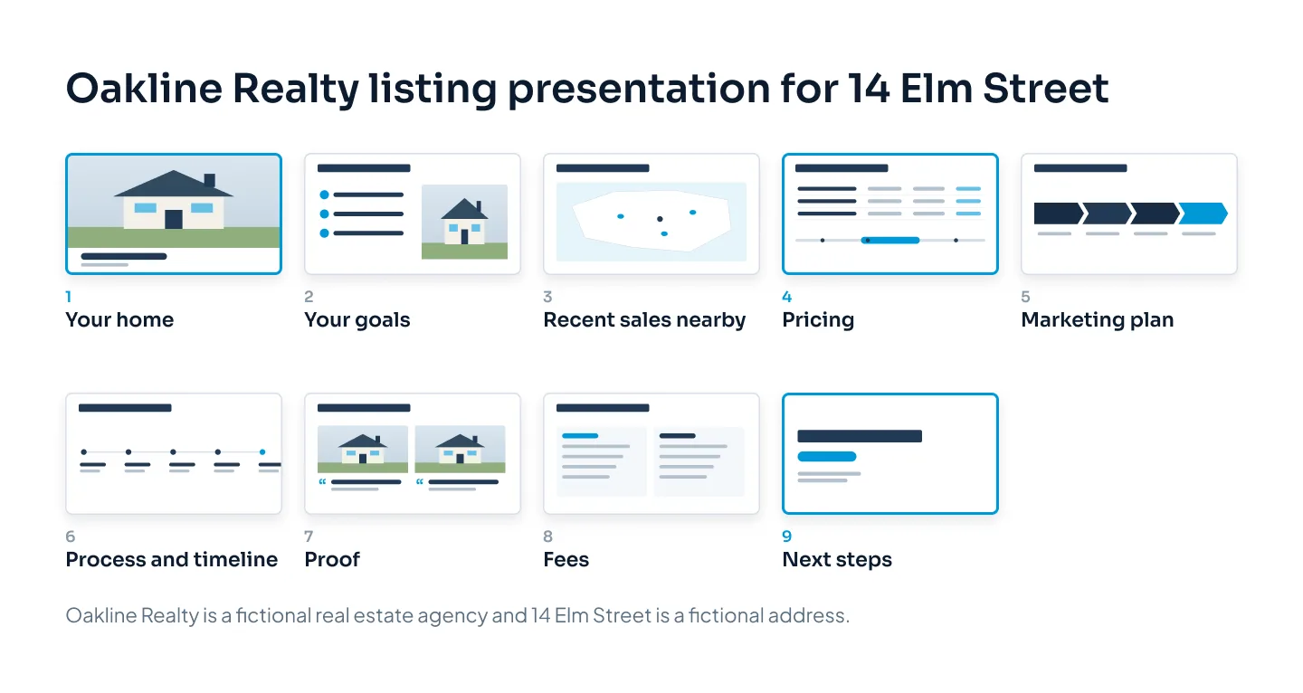
Their home. A good photo of the property and its address. It tells the seller this deck was made for them.
Their goals. What they told you on the phone or at the first visit, in their words.
The market near them. A few recent sales close by, without a wall of data.
Pricing. Your recommended range and how you got there.
The marketing plan. What you'll do, in what order.
The process and timeline. From signing to moving day.
Proof. Homes like theirs you've sold, and what those sellers said.
Fees. What it costs and what's included.
Next steps. One clear action and a date.
This order follows the seller's questions. Goals come before pricing because a price only makes sense against what the seller wants: a fast sale and the highest price can call for different strategies. Proof comes after the plan, so it supports something specific instead of floating on its own.
If you'd like the theory behind ordering a persuasive deck like this, our guide to storytelling in presentations compares several structures, including problem, solution and proof.
Pricing and the CMA, made clear
The pricing slide is the one sellers remember, and the one they push back on. A comparative market analysis (CMA) looks at recent sales of similar nearby homes to support a price. Many CMAs run to pages of tables. The slide needs to do something simpler: show a few comparable sales, make them comparable and land on a range.
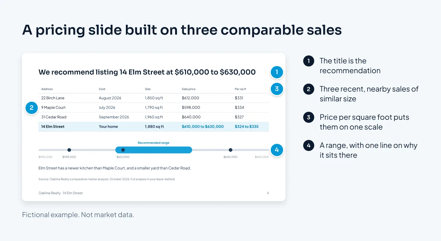
What makes the slide above work:
The title is the recommendation. "We recommend listing 14 Elm Street at $610,000 to $630,000." The seller doesn't have to wait for it.
Three comparable sales, not twelve. Recent, nearby and close in size. Each shows the address, sale month, size and sale price.
One measure that makes them comparable. Price per square foot puts a 1,790 sq ft home and a 1,960 sq ft home on the same scale. In this example the three sales ran from $327 to $334 per square foot. At 1,880 sq ft, that puts Elm Street at roughly $615,000 to $628,000, which rounds out to the recommended range.
A one-line reason for where it sits in the range. "Elm Street has a newer kitchen than Maple Court, and a smaller yard than Cedar Road."
Price per square foot is a simple way to explain a price. It isn't the whole analysis. Condition, location, layout and features all matter, and your judgment is what the seller is paying for. Put the full CMA in the appendix or the leave-behind, and use the slide to explain your reasoning.
Show a range rather than a single figure unless your brokerage prefers one. A range invites a conversation about strategy, such as pricing at the low end to draw more interest. A single figure invites a yes or a no.
If the seller has a higher number in mind, the slide helps you talk about it calmly. The comparable sales are on screen, and the conversation becomes about the evidence rather than your opinion against theirs. For chart and table design on slides like this, see our guide to data visualization in PowerPoint.
The seller should be able to explain your price to their partner that evening, using only the pricing slide.
The marketing plan
"We'll market your home on every major platform" is a line any agent could say. The marketing slide wins when it is specific to this home and shows the order things happen in.
Show the plan as a short timeline:
Week 1: prepare. Staging advice, professional photography, a floor plan and a written description.
Week 2: launch. The listing goes live, with photos, the description and any video.
First weekend: open house and private showings.
Every week: a seller update. Viewings, feedback and any change in strategy.
Then show what the marketing will look like. A sample photo set from a past listing, a page of a listing brochure or a social post tells the seller more than a list of channels. Use only material from listings where you have permission to show it.
Tailor the plan to the home. A family house near schools, a city apartment and a rural property attract different buyers. One line on who the likely buyer is, and how you'll reach them, shows you've thought about this property in particular.
Proof that you'll sell it
Proof answers the seller's fourth question: why you? This is where the agency's story belongs, and it lands better here than on slide one, because the seller has already seen your thinking.
Strong proof is specific:
Homes like theirs you've sold, with a photo and the street.
What those sellers said, in a short quote with their name, used with their permission.
Your results, only where you can back them up and your brokerage allows you to quote them.
The people who'll do the work: you, and anyone else the seller will deal with.
Keep the "about us" material to one slide. Founding year, office locations and awards can sit in small type at the bottom, or in the leave-behind.
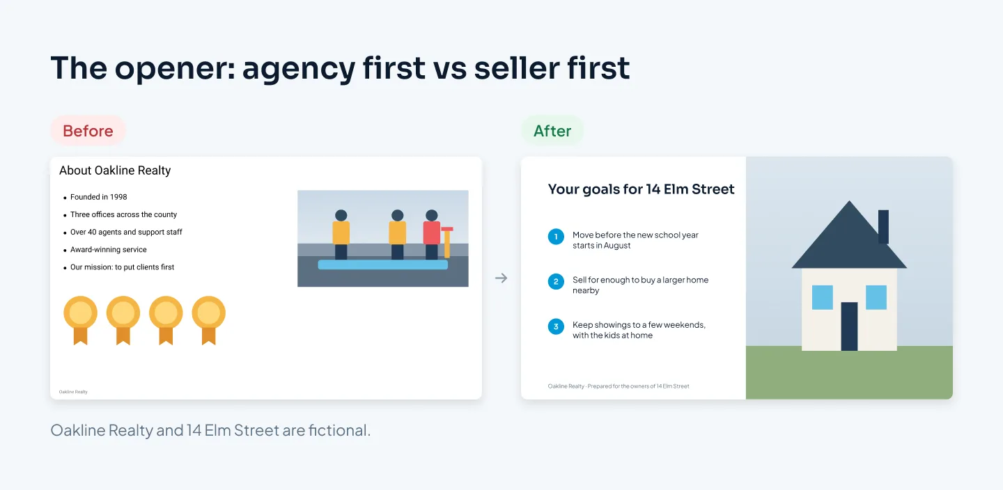
The before slide isn't wrong about Oakline. It's wrong about the order. Moving the agency's story from the opener to the proof slide changes nothing about the facts, and everything about how the meeting starts.
For a related example from our case studies, the Pilot Mortgage Group deck is a realtor partnership sales deck rather than a listing presentation, but it follows the same pattern: pain points first, visible proof, one clear call to action.
Fees and next steps
Some agents leave fees until the seller asks. Putting them on a slide, plainly, removes a moment of tension and shows you have nothing to hide.
The fees slide should show:
What the seller pays, in the structure your brokerage uses.
What's included, such as photography, the marketing plan and open houses.
What isn't included, if anything, so there are no surprises later.
Commission structures and the rules around them vary by country and state. Follow your brokerage's and your local rules for what you can show and how. If your brokerage provides standard fee wording, use it exactly.
The last slide asks for one thing. Usually that's signing the listing agreement, with a proposed date for photos and a target launch date: "Sign this week, photos on Thursday, live the following Monday." A single next step with a date is easier to say yes to than a list of options.
Printed, tablet or screen
Listing presentations happen in kitchens and living rooms, not boardrooms, so think about how the seller will see the deck.
| Format | Works best when | Design for it |
|---|---|---|
| Printed booklet | You sit side by side at a table | Larger type, one point per page, good paper |
| Tablet | You want to share photos and video | 16:9 slides, large photos, few words |
| TV or laptop screen | Several people are watching | Large type, slides that read from across the room |
| Video call | The seller can't meet in person | Larger type still, and the slideshow window shared |
A common approach is to use two formats: a tablet or screen during the meeting, and a printed or PDF copy left behind. The leave-behind can carry more: the full CMA, the marketing plan in detail and contact details. Sellers often decide after you've gone, with only that document in front of them, so make sure it reads well without you.
Our guide to company profile presentations covers how to keep agency information short and useful when it travels as a standalone file.
Build it once, reuse it for every listing
Agents give listing presentations often, and most of each deck stays the same from home to home. Building it as a reusable template saves hours every time.
Set it up with fixed and variable slides:
Fixed: process and timeline, fees, the agency and team slide, and the next steps layout.
Variable, with layouts ready to fill: the home, the seller's goals, comparable sales, pricing, the marketing plan and proof.
Put the variable slides on layouts with placeholders for photos, addresses and numbers, so a new listing presentation is a matter of filling them in. Our guide to custom PowerPoint templates explains how this works.
If you want the deck designed for you, our sales presentation design service builds listing and seller presentations, usually in 5–8 working days. Design is $10 a slide, and a reusable PowerPoint template starts from $150. The pricing estimator shows your exact price.