A roadmap slide carries more weight than its size suggests. Leaders use it to judge whether the plan adds up. Customers use it to decide whether to wait for you or buy elsewhere. Teams use it to plan their next quarter. And a date on a roadmap tends to be remembered long after the plan behind it has changed.
This guide covers how to build a roadmap presentation that holds up: who it's for, three formats that work, how to show confidence instead of false precision, what belongs on a customer slide, and how to design and maintain it. The example is Northlake Analytics, a fictional analytics software company presenting its 2027 roadmap. For the checks every corporate deck needs before it goes out, see our corporate presentation checklist.
Who the roadmap is for
Most companies have one plan and at least three audiences for it. Each audience asks a different question, so each needs a different slide.
| Audience | Their question | What to show | Level of detail |
|---|---|---|---|
| Leadership or board | Does this plan serve our goals? | Themes, outcomes, big bets, trade-offs | Quarters or halves |
| Customers | What's coming that helps me? | Outcomes for them, with honest confidence | Horizons, few dates |
| Internal teams | What do we build, and when? | Sequence, owners, dependencies | Quarters or months |
Leadership wants to know why the plan looks the way it does. A list of 40 features doesn't answer that. Three themes tied to company goals do, along with what you chose not to do. If the roadmap is part of a strategy review, treat it like any other decision slide: lead with the answer, then the evidence. Our guide to presenting to executives covers that structure.
Customers want to know whether the product will solve a problem they have. They don't need your sprint plan, and anything with a date on it will be read as a commitment.
Internal teams need the most detail: who builds what, what has to finish before something else can start, and where the risks are.
The mistake is to build the internal version and show it to everyone. Start from one source plan, then make a slide for each audience from it.
Three formats that work
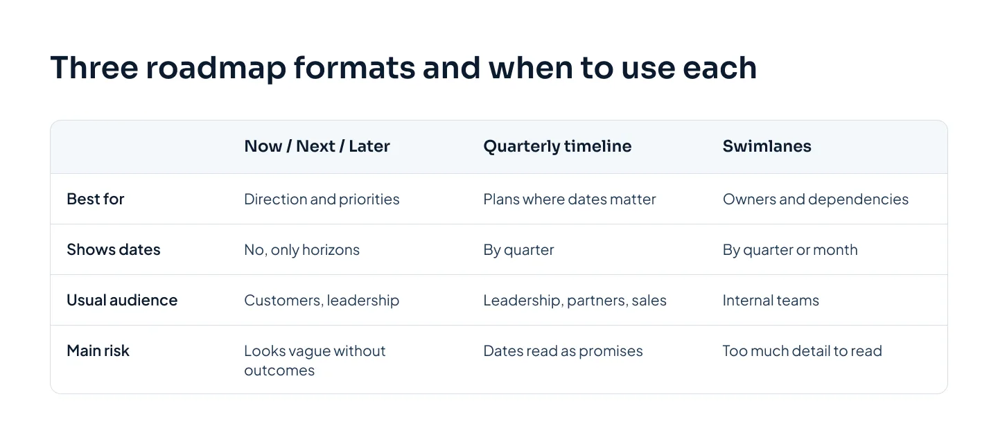
Almost every roadmap slide is a version of one of three formats. Pick the one that answers your audience's question.
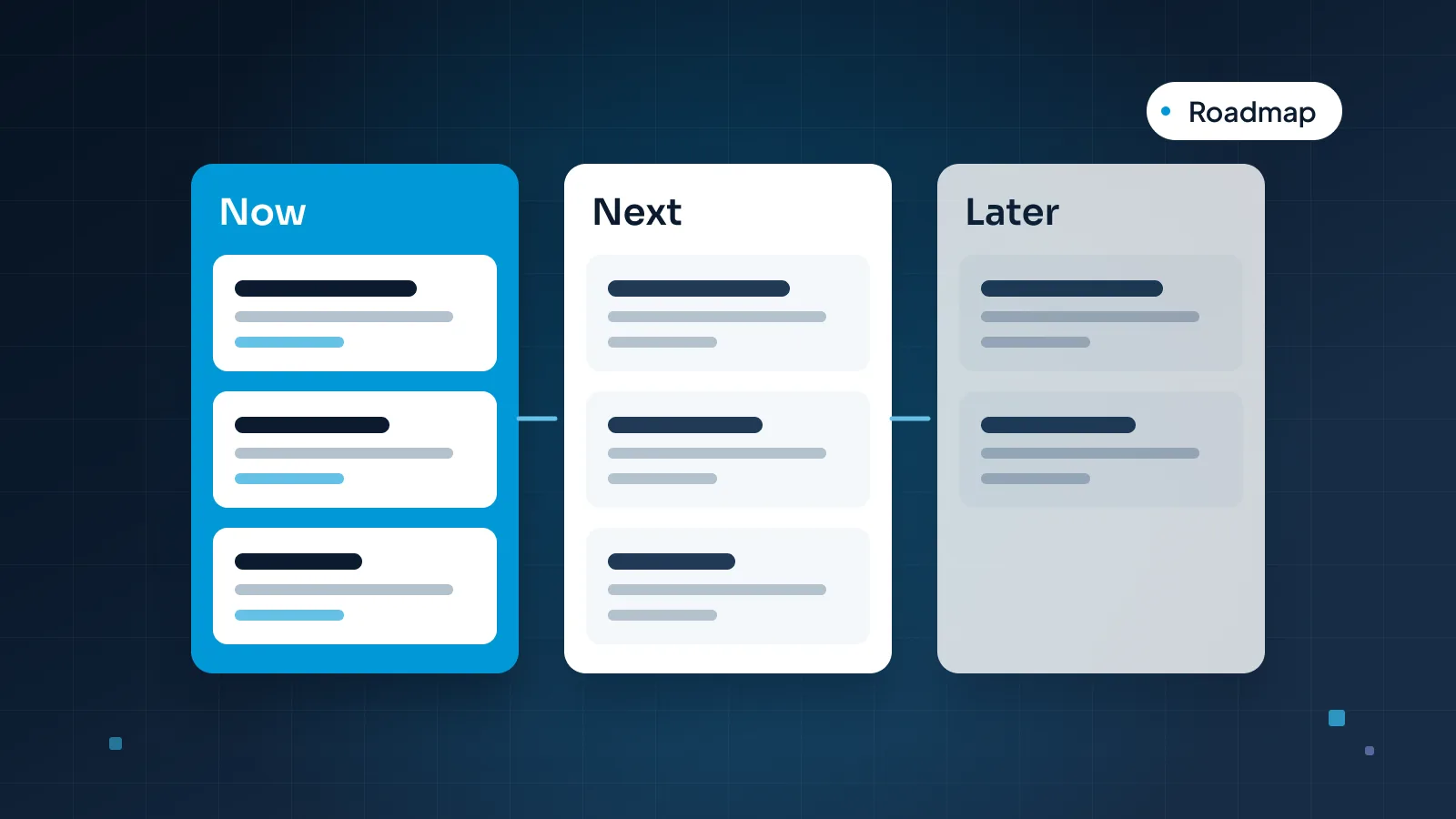
Now, Next, Later
Three columns: what you're working on now, what comes next and what you plan to do later. No dates, only horizons.
This format works because it says what you're sure of (order and priority) and stays quiet about what you aren't (exact timing). It suits customers and leadership, and it's the easiest format to keep current, since items move between columns rather than along a calendar.
Its weakness is vagueness. Without themes and outcomes, three columns of feature names look like a wish list. Give every card a clear outcome, and if leadership needs timing, add a small line under each column header, such as "Next: planned for Q2 and Q3".
Quarterly timeline
Columns for quarters, rows for themes, items placed in the quarter you expect to deliver them. It's the format leadership, partners and sales teams usually ask for, because it answers "when?"
Use it when dates genuinely matter: a contract renewal, a regulatory deadline, a launch event. Keep the unit to quarters. "Q2 2027" is a plan. "May 14" is a promise you'll be held to.
Swimlanes by team
Horizontal lanes, one per team or workstream, with items along a shared time axis. Swimlanes show who does what and where one team waits on another. They're the right format for internal planning and program reviews.
They're also the format most likely to become unreadable. Six lanes with eight items each is a planning document, not a slide. If you need that level of detail, show a summary on screen and share the full plan as a separate file.
Show confidence, not just dates
Every roadmap mixes items you're building today with ideas you haven't tested. Drawn in the same style, they look equally certain. That's how a roadmap loses trust: an idea gets read as a commitment, it slips, and the next roadmap is believed a little less.
The fix is to label how sure you are, on every item. Three labels cover most plans:
Firm. Scoped, staffed and in progress. You'd be surprised if it slipped by more than a few weeks.
Likely. Planned and prioritized, but not started. Scope or timing may change.
Exploring. An idea you're researching. It may change shape, move or be dropped.
A few rules make the labels work:
Confidence falls with distance. Most items in the next quarter should be firm. Items a year out should mostly be likely or exploring. A roadmap that's firm all the way to next December is either very unusual or not being honest.
Use words, not only color. A green, amber and gray dot means nothing to someone printing in black and white or who doesn't see color well. Write the label on the card, and use color or a dashed outline as a second signal.
Use the vaguest unit you can. Exploring items get no date at all. Likely items get a quarter or a half. Firm items get a quarter, or a month if people need it.
Put a date on the slide itself. "Updated 30 October 2026" tells readers how fresh the plan is, especially when the slide gets forwarded.
A roadmap people trust says how sure it is about each item, and then turns out to be right.
When something moves, say so in the next update rather than quietly redrawing the slide. Leaders and customers forgive a plan that changes. They stop trusting one that changes without a word.
Roadmaps for customers
A customer roadmap slide is a sales slide as much as a product slide. It should make the customer more confident in choosing you, without creating promises your team didn't make.
What to include:
Outcomes in the customer's words. "Reports your finance team can build without help", not "Report builder v2 (Project Atlas)".
Items that matter to this customer. In a renewal meeting or a quarterly review, three relevant items beat the whole plan. Our QBR presentation guide applies this to customer reviews: available now, in beta or planned.
Confidence labels, in plain words.
A short line about change, such as "Plans can change. We'll update you each quarter." Many companies have a standard wording for this; ask whoever owns customer communications.
What to leave out:
Exact dates for anything that isn't firm.
Internal code names, team names and dependencies.
Other customers' names, unless you have their permission to show them.
Anything you'd be embarrassed to see in a competitor's sales deck. Customer slides get forwarded.
Clear every item and every date with the product owner before the meeting. If a feature is ready to announce, it no longer belongs on the roadmap slide. It belongs in a launch, and our guide to product launch presentations covers that deck.
Designing a roadmap slide
A roadmap slide should be readable in the few seconds someone looks at it before you start talking. That takes fewer items and more structure than most first drafts have.
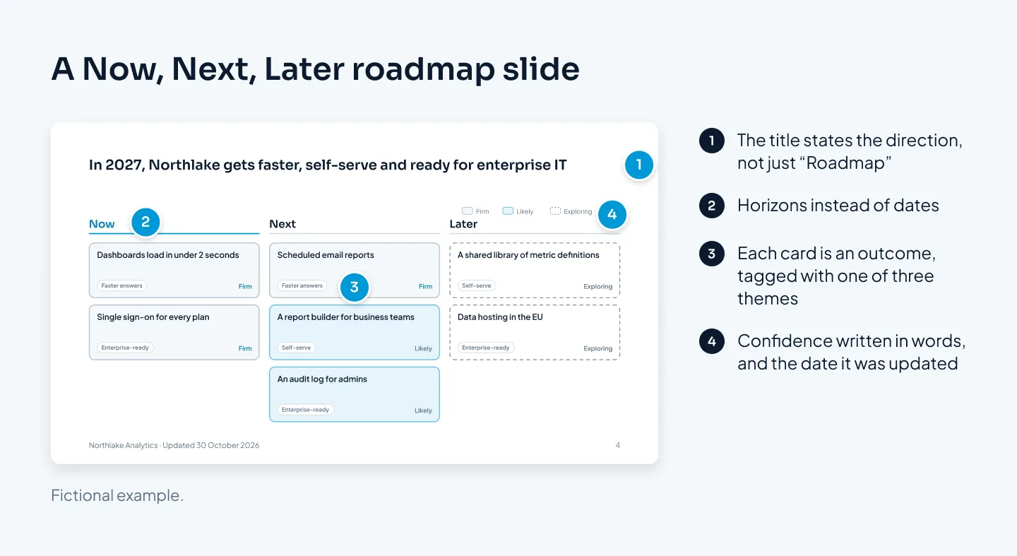
Here's what makes the slide above work:
An action title. "In 2027, Northlake gets faster, self-serve and ready for enterprise IT" tells the room what to take away. "Product roadmap 2027" doesn't. Our guide to consulting-style slides explains how to write titles like this.
Three themes, used everywhere. Each card carries a theme tag, so the audience sees the plan as three bets rather than seven features.
Few cards. Seven items fit comfortably on a 16:9 slide. Past about a dozen, the type gets too small to read and the slide turns into a list. Move the rest to an appendix slide.
Cards that match. Same size, same structure: the outcome in bold, with the theme tag and the confidence label in the same places on every card.
Labels in words. Firm, likely and exploring are written on each card, with a small legend in the corner.
A date. "Updated 30 October 2026" in the footer.
On a quarterly timeline, add two things: a clear marker for today, and a lighter style for the furthest-out column. The eye should land on what's happening soon.
Before and after, the difference is mostly subtraction. Below, a crowded Gantt-style chart becomes a quarterly roadmap with three themes.
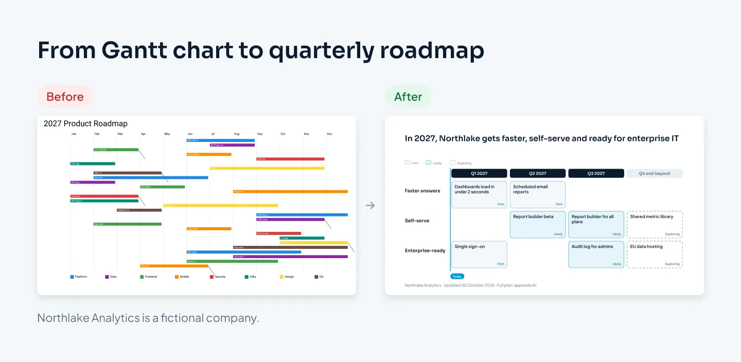
The Gantt chart isn't wrong. It's the right tool for a project manager and the wrong one for a room. Keep it as a backup slide or a separate file for anyone who wants the detail.
Build the roadmap from native shapes and text, not a screenshot from a planning tool. A pasted image can't be edited, blurs when projected, and its tiny type can't be read from the back of the room. Our guide to infographics in PowerPoint covers building diagrams like this with shapes, Align and Distribute, and Group.
Keeping it current
Roadmap slides go stale quickly. Old versions live on in sales decks, partner emails and last quarter's board pack. A few habits keep that under control.
Give it an owner. One person, usually in product or strategy, owns the source plan and signs off every roadmap slide made from it.
Keep one source file. Build the leadership, customer and team versions from the same master file, so an item that moves changes everywhere at once.
Update on a rhythm. Quarterly suits most companies. Match it to your planning cycle, and tell customers when to expect the next update.
Show what changed. At the start of each update, a short "since last quarter" slide lists what shipped, what moved and what was dropped, with one line on why. It's the slide that builds trust over time.
Date everything. The footer date tells people which version they're looking at. Retire old files rather than leaving them in shared folders.
If your team makes roadmap slides often, put the layouts in a template: a Now, Next, Later layout, a quarterly timeline, a swimlane view and a "what changed" slide, all on placeholders. The Merck template system is an example of this kind of work: a PowerPoint template for patient and clinical-trial content, with calm editorial type and layouts built on placeholders.
If you'd rather hand over the whole deck, our corporate presentation design service covers strategy and roadmap decks, usually in 5–10 working days. Design is $10 a slide. A detailed roadmap graphic can count as a complex slide at $15, and you see which slides count before you order. The pricing estimator gives you the exact price.