The round gets all the design attention. Then the money lands, and the deck that matters most is the one you send every quarter to the people who already said yes.
This guide covers what an investor update is for, whether to send an email or a deck, a structure investors can scan in two minutes, how to show metrics and bad news honestly, how to write asks people act on, and how to turn it all into a template. The running example is Juniper Freight, the fictional startup from our pitch deck examples, which sells freight booking software to small shippers. It launched in March 2026, had 140 paying shippers by September and is about to raise a $2.5M seed. Here it's sending its Q3 update to the angels and pre-seed fund that backed it.
What an investor update is for
An investor update is a regular report a startup sends its existing investors, often monthly or quarterly, on progress, numbers, problems and asks. It isn't a pitch. Nobody reading it needs to be sold on the idea. They want to know how it's going.
A good update does three jobs:
It keeps investors informed, so nothing in a board meeting, a down month or the next round comes as a surprise.
It gets you help. Your investors know people. An update with a clear ask turns them into recruiters, connectors and advisers.
It builds a record. A year of updates that report the same numbers against the same plan shows that you do what you say. When you raise again, your existing investors have that record instead of a single pitch.
That last job is why consistency matters more than polish. The structure, the metrics and the plan you measure against should stay the same from one update to the next.
An update is also a different document from the deck you send to new investors. That one has to persuade a stranger; our guide to pitch decks vs investor decks covers it, and our pitch deck guide covers the full fundraising deck.
Email, deck or both
Most investor updates are emails, sometimes with a short deck or PDF attached. A quarterly or board-style update is more often a deck, because a quarter needs charts and a plan comparison that a plain email handles badly.
One rhythm that works well at seed stage is a short email every month and a short deck each quarter.
| Monthly email | Quarterly deck | |
|---|---|---|
| Length | Five minutes to write and read | Six to eight slides |
| Metrics | The same four numbers | The same four, with trend and plan |
| Charts | None, or one small image | One per key metric |
| Bad news | One line, with the fix | A lowlights slide of its own |
| Best for | Staying in touch, quick asks | Progress against plan, cash, the next raise |
Two practical rules hold for both.
Put the headline and the asks in the email itself. Some investors will read only the email body, so it should carry the one-line summary, the four numbers and the asks. The attached deck adds the detail.
Send the deck as a PDF. It opens the same way on any laptop or phone, and nobody can edit your numbers by accident. Name the file so it's easy to find later: "Juniper-Freight-Investor-Update-Q3-2026.pdf".
If you have a formal board, the board deck is a separate document with its own pre-read, decisions and governance items. Our guide to board presentations covers it. The investor update can borrow its metrics slide, so the two never disagree.
A structure investors can scan
The best structure is the one you never change. Investors who read your update every quarter learn where to look, and a fixed order makes a missing section obvious.
Juniper Freight's quarterly update has seven slides:
Headline. The quarter in one sentence, with three supporting lines.
Metrics against plan. Four numbers, each with its plan and last quarter's value.
Highlights. Two or three wins, each with a number.
Lowlights. What went wrong, why, and what you're doing about it.
Product and team. What shipped, who joined, what's next.
Cash and runway. Cash in the bank, monthly burn and months of runway.
Asks and thanks. Up to three specific asks, and thanks for last quarter's help.
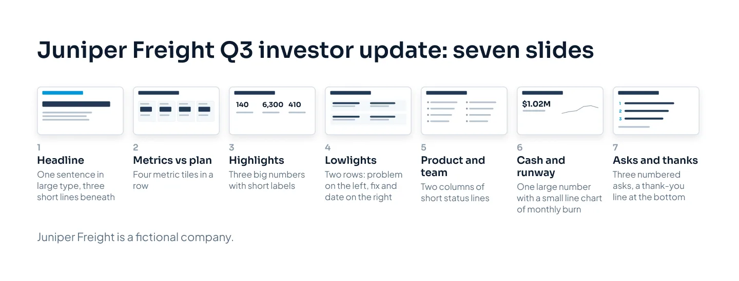
Here's the test: an investor who reads only slide 1 and slide 7 should know how the quarter went and what you need. Everything between is evidence.
The headline slide
Write the headline last, after the numbers are final. It should say how the quarter went, good and bad, in one sentence. Juniper Freight's reads: "Q3: paying shippers up 77% to 140, 10 short of plan. Seed round opens in November."
Beneath it go three short lines: the biggest win, the biggest problem and the most important ask. If an investor stops there, they still have the update.
Highlights, product and team
Keep highlights to two or three, each with a number. Juniper Freight's are 63 new paying shippers in Q3 (61 net of two cancellations), its best quarter yet; 220 shippers on a free trial at the end of September; and its carrier network now live in two of its three launch states.
Product and team is a short status slide: what shipped (tracking with a single invoice, in August), what's next (self-serve booking) and who joined (a first customer success hire, in July). One line each.
Metrics: the same ones, every time
The metrics slide is the one investors compare from quarter to quarter, so it has to be comparable.
Choose four to six metrics and keep them. Swapping metrics when one looks bad is the fastest way to lose trust. If you must change one, say why on the slide.
Show every metric against plan. Last quarter tells investors you grew. Plan tells them whether you grew as much as you said you would.
Show the trend. Last quarter's value, or a small chart of monthly values, next to the current one.
Define each metric once, in a footnote, and keep the definition. "Paying shippers" should mean the same thing in March as in September.
Give bad numbers the same space as good ones. Same position, same size, same color rules.
For a seed-stage software company, the usual candidates are monthly recurring revenue (MRR) or annual recurring revenue (ARR), customers, burn rate and runway. Burn rate is the net cash you spend each month; runway is how many months your cash lasts at that rate. Later, you might add gross margin, customer acquisition cost (CAC), CAC payback period or retention by cohort, the metrics our guide to seed vs Series A pitch decks explains. Add them when they become decisions, not all at once.
Juniper Freight reports four:
| Metric | Q2 (June) | Q3 plan | Q3 actual | Against plan |
|---|---|---|---|---|
| Paying shippers | 79 | 150 | 140 | 10 short |
| MRR | $23.7k | $45.0k | $42.0k | $3.0k short |
| Net burn per month | $78k | $90k | $85k | $5k under |
| Runway | 16 months | 11 months | 12 months | 1 month ahead |
Every number follows from the others. Shippers pay $300 a month, so 140 shippers is $42,000 in MRR. Cash on September 30 was $1.02M, which lasts 12 months at $85k a month.
A table like that suits an appendix. On the slide itself, show the four metrics as tiles, each with its value, plan and direction, and let the title state the headline.
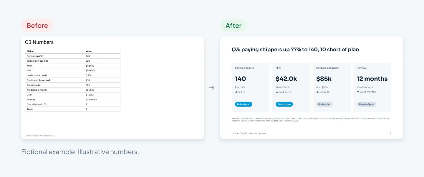
The before slide isn't wrong. Every number on it is accurate. It just leaves the investor to work out which ones matter and whether they're good. The after slide answers both questions and moves the other eight numbers to the appendix.
If you want charts rather than tiles, keep them simple: one series, monthly values, the latest point in the accent color and the plan as a dashed line. Our guide to presenting data in PowerPoint covers chart choice and labeling.
Lowlights, written honestly
The lowlights slide is the one founders are tempted to skip. It's also one investors tend to read closely, because it shows how you handle problems.
A useful lowlight has five parts: what happened, why, what it cost, what you're doing about it and when you'll report back.
A vague one reads: "Some onboarding challenges this quarter, but the team is on it."
An honest one reads: "Self-serve booking slipped from August to November. Without it, every trial shipper needed a setup call, and we finished 10 shippers short of plan. Two engineers have moved onto it full time, and we'll confirm the launch date in our November email."
The second version is longer, and much more reassuring. It names the miss, connects it to a metric and shows a plan with a date.
A few more rules:
One to three lowlights. If nothing went wrong, investors won't believe the rest. If ten things did, pick the three that matter and say so.
Same weight as highlights. Same slide size, same type, same place in the deck every quarter.
No spin. "We're reframing churn as an opportunity" helps nobody. Juniper Freight's second lowlight is plain: two shippers cancelled in Q3, both because the platform can't price unusual loads yet.
Big news goes first by phone. If a lowlight is serious (a key person leaving, a cash problem), call your lead investor before the update goes out.
A lowlight with a plan attached is a status report. A lowlight without one is a worry.
Asks that get answered
Investors want to help, but "let us know if you can help" gives them nothing to act on. A good ask names who you want, why, and by when, and is easy to forward.
| Weak ask | Specific ask |
|---|---|
| "Intros to investors would be great." | "We open a $2.5M seed in November. Intros to seed investors who back logistics or vertical software, by October 31." |
| "We're hiring, send people our way." | "Head of sales: someone who has sold software to small manufacturers or distributors. Job description attached." |
| "Customer intros welcome." | "Operations managers at food distributors with 20 to 100 staff in our three launch states." |
Three habits make asks work better:
Keep it to three. A list of eight asks gets skimmed. Put the most important one first.
Include a forwardable blurb. Two sentences about the company that an investor can paste into an introduction email without rewriting.
Close the loop. Next quarter, report what happened and thank the people who helped, by name if they're happy with that. It shows asks lead somewhere, and people help again.
Make it a template
An update you rebuild every quarter takes a weekend and looks a little different each time. One built on a template takes about an hour and looks the same every quarter, which is the point.
A good investor update template contains:
A layout for each of the seven slides, with placeholders that show what goes where: headline, four metric tiles, highlights, lowlights, asks.
A metrics layout with plan built in, so every tile has a slot for actual, plan and trend, and nobody forgets the plan.
Native charts built with PowerPoint's own chart tool. The data sits in an embedded Excel sheet, so next quarter you paste in the new numbers and the chart redraws in your colors.
Theme colors and fonts, set once in the slide master, plus a fixed rule for color: for example, the accent marks anything behind plan.
An appendix layout for the full metrics table and definitions.
Each quarter, the routine is short. Duplicate last quarter's file, update the data behind each chart, rewrite the headline, highlights, lowlights and asks, check that the numbers match the email, then export to PDF.
Build it on the same system as your pitch deck and it does double duty: the metrics tiles and traction chart from the update drop straight into the next fundraising deck. Our guide to pitch deck templates covers what that system includes, and our custom PowerPoint template guide shows how one is built.
For an example of investor-facing charts built this way, see the Welltech Ventures investor deck: an investor deck for a wellness fund, built from market research, with native PowerPoint charts.
Before you send each update, run through the checklist below.
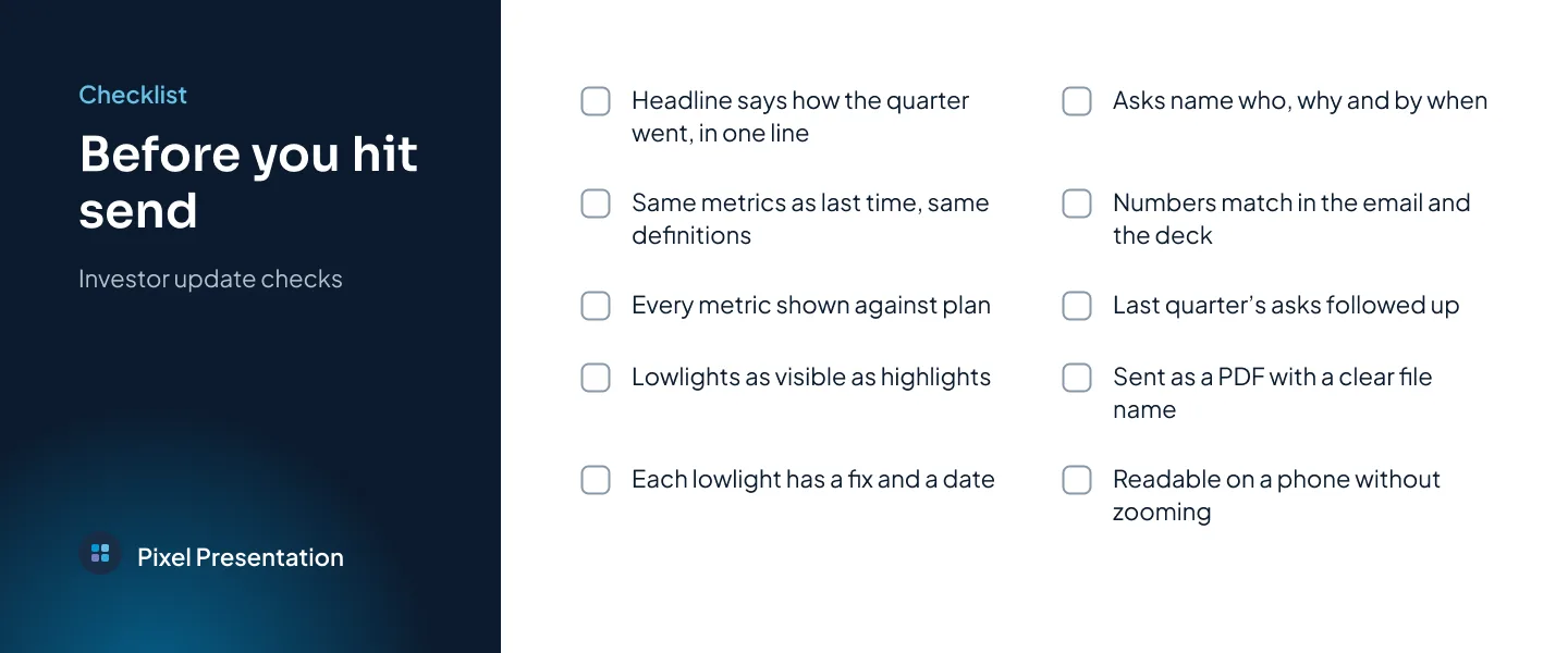
If you'd rather have the whole system designed, our pitch deck design service covers fundraising decks and the updates that follow them. At Pixel Presentation, design is $10 a slide with a 5-slide minimum, so a seven-slide quarterly update is $70, and the pricing estimator shows your exact price before you order.