Search for a pitch deck template and you'll find thousands of them, many free and most very polished. They look good in the preview because they were designed to look good empty. Your deck has to look good full.
This guide covers what a template should give you, where free templates go wrong, how to adapt one so it looks like your company rather than the template's, what a good template contains, when a custom template is worth paying for, and whether to build it in PowerPoint or Google Slides. If you haven't settled your story yet, start with our pitch deck guide, because no template can write it for you.
What a pitch deck template should give you
A template does three jobs well, and one badly.
Structure. A good template suggests an order: problem, solution, product, market, traction, business model, competition, team, the ask. That's a useful checklist when you're staring at a blank file.
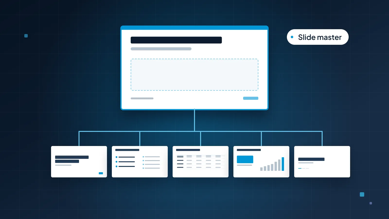
A design system. Layouts for each kind of slide, theme fonts and colors, chart and table styles, all set up in the slide master so every slide matches. This is the part most people underrate. It's what keeps slide 14 consistent with slide 2 when three people are editing the night before a meeting.
Speed. With the system in place, a new slide takes a minute: pick a layout, type into the placeholders, done.
What it does badly is tell your story. A template knows a traction slide needs a chart. It doesn't know whether your strongest proof is revenue, retention or a pilot result, or that your market slide needs the math shown. Those decisions come from your business, and they should shape the slides, not the other way around.
Where free templates go wrong
Free templates aren't bad. Many are well made. The trouble is that they were built for nobody in particular, and that shows in five ways.
Fixed boxes. The template has four icon boxes on the business model slide, so you write four points, even if you have three. Or it has room for one line of text, so you shrink your font to fit two. Content bends to fit the layout, when the layout should fit the content.
Filler layouts. Hexagon diagrams, circular process wheels and timelines with eight steps look impressive in a preview. Most decks need none of them. Kept in the file, they tempt you to fill them.
Someone else's brand. The colors, fonts and image style belong to the template's designer. Unless you change them, your deck looks like the template, not like your company. And if the template uses a font that isn't on the computer opening the file, PowerPoint or Google Slides substitutes another one, and every line break moves.
Familiar layouts. Popular templates are popular for a reason, which also makes them easy to recognize. An investor who reads a lot of decks may have seen yours before, with someone else's logo on it.
Not built as a system. Some templates are designed slide by slide with loose text boxes and pictures of charts, rather than on layouts with placeholders and native charts. They look the same in the preview, but new slides won't match, and the charts can't be updated from your data.
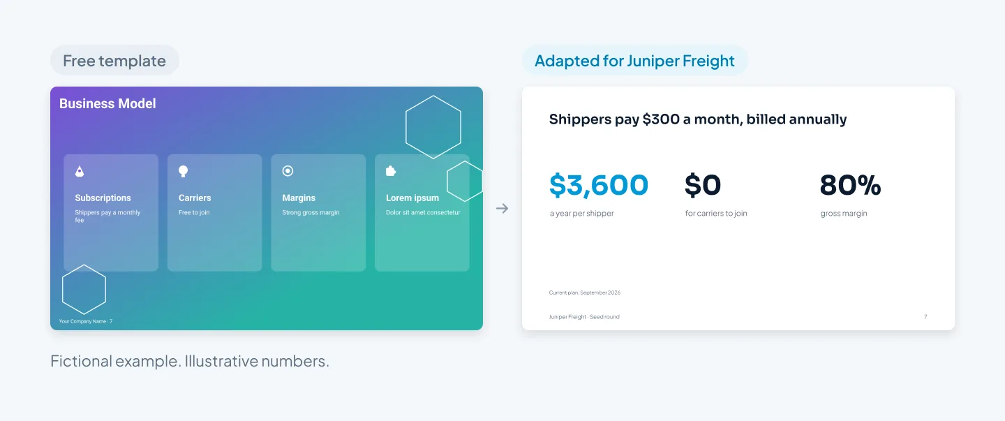
The before slide is a typical result of filling a template as it comes. The content is real, but the template decided how much of it there should be, and the leftover fourth box still says "Lorem ipsum". The after slide keeps the same idea of a row of facts, cuts it to three, and lets the title carry the point.
How to adapt one so it looks like yours
If a free template is the right call, for a first raise or a tight budget, adapt it properly. These steps take an afternoon and make the biggest difference.
Write your titles first. Draft every slide title as a sentence, in order, before you open the template. Then you choose layouts for your story rather than a story for the layouts.
Delete what you won't use. Remove the filler slides and the layouts you don't need. Fewer choices means a more consistent deck.
Replace the theme colors and fonts. In PowerPoint, open View > Slide Master and set your brand colors under Colors > Customize Colors, then set your heading and body fonts as theme fonts. Do it once on the master, not slide by slide.
Fit the boxes to your content. If you have three points, use three boxes. Resize placeholders in the layout, and never shrink text to squeeze it in.
Swap stock for real. Replace placeholder icons and stock photos with your product screenshots, your team and your customers' settings. Delete any icon that's only decoration.
Rebuild every chart with your data. Use PowerPoint's own chart tool so the data sits in an embedded Excel sheet and the chart picks up your theme colors.
Add one thing that's yours. A brand-colored title bar, a consistent big-number style or a particular way of cropping photos. One repeated detail does more than ten decorations.
Check every slide uses a layout. In Normal view, Home > Layout applies or changes a slide's layout. If a slide has drifted out of shape, Reset on the Home tab snaps it back to its layout.
If those slide master steps are new to you, our guide to the PowerPoint slide master explains masters, layouts and placeholders, and how to set them up.
What's inside a good pitch deck template
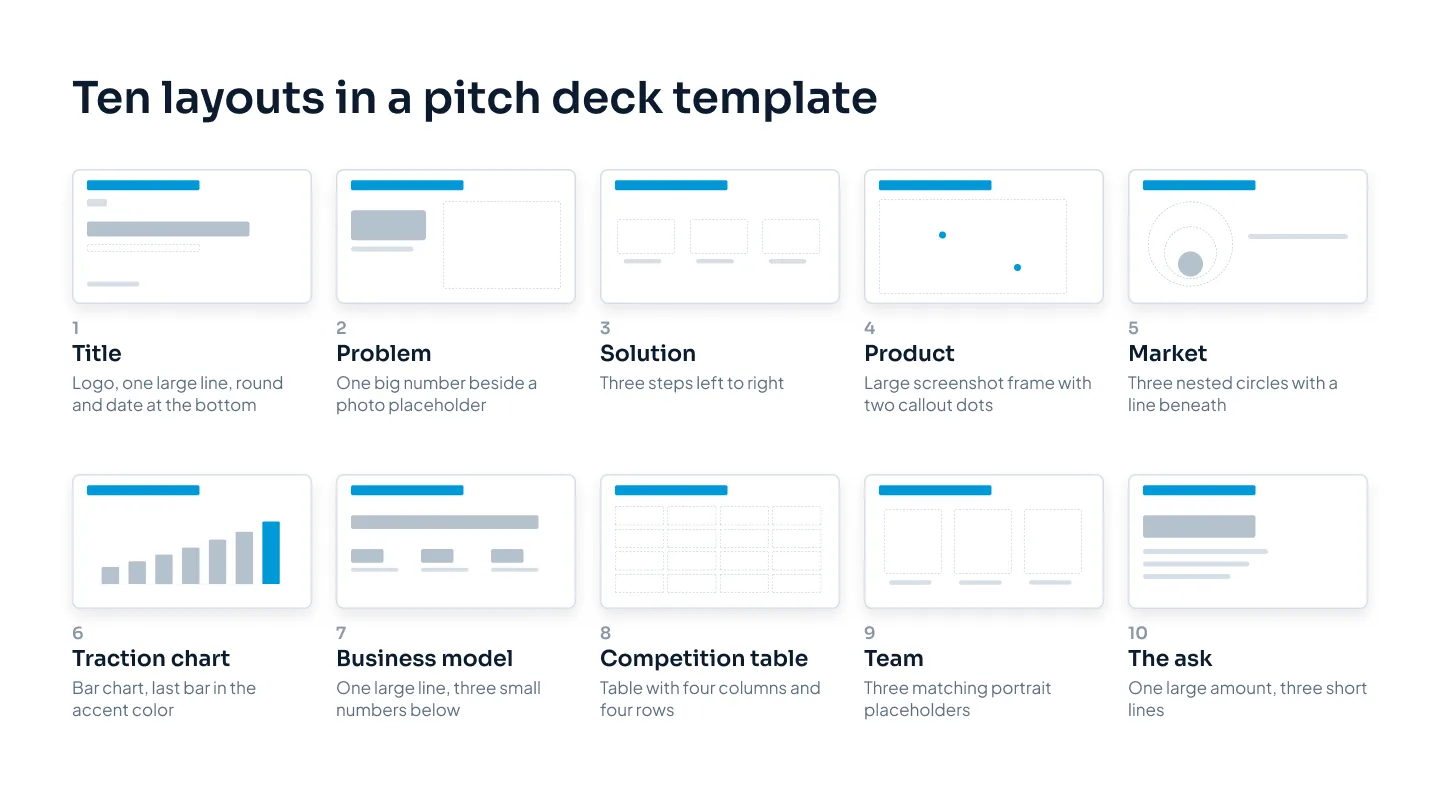
A good template has one layout for each kind of slide a pitch deck needs, plus the system that keeps them consistent. These are the ten core layouts shown near the top of this guide, and what each one needs.
| Layout | What it needs |
|---|---|
| Title | Logo, one-line pitch, round and date |
| Problem | Room for one big number or one customer scene |
| Solution | Three steps, left to right |
| Product | A picture placeholder for a screenshot, with space for callouts |
| Market | Three sizes with a line for the math |
| Traction | A native chart placeholder with a takeaway title |
| Business model | A large price line and three supporting facts |
| Competition | A table with you and the real alternatives |
| Team | Matching photo placeholders with one line each |
| The ask | Amount, milestone and use of funds |
Around those layouts, a complete template also includes:
Section and appendix dividers, so detail can move out of the main deck.
A big-number layout and a text layout for the slides that don't fit the ten.
Chart and table styles in your colors, with the accent saved for the number that matters.
Theme colors and fonts, set in the slide master.
An icon set in one style, if your brand uses icons.
Example slides that show each layout filled with realistic content.
A short user guide so the next person to edit the deck uses it correctly.
For what goes on each of those slides, our pitch deck examples walk through a complete seed deck slide by slide, and our guide to the market size slide covers the one founders most often get wrong.
When a custom template pays off
A custom template costs more than a free one and takes longer to start. It's worth it when you'll reuse it.
You'll raise more than once. The seed deck becomes the Series A deck. If both are built on the same master, the second one starts from a finished system instead of a copy of a copy.
You send investor updates. A quarterly update built on the same template as your pitch deck takes an hour to refresh, and its charts drop straight into the next fundraising deck. Our guide to investor update decks covers what to put in them.
Other teams will use it. Sales decks, company profiles and partner decks can all come from the same template, so everything the company sends looks like one company.
Several people build decks. A template with clear layouts and placeholders keeps a deck consistent when the CEO, the CFO and a contractor all edit it.
If none of those apply, and this is a single deck for a single raise, a template may be the wrong purchase. Having the deck itself designed costs about the same as the smallest template: our pitch deck design service is $10 a slide, so a 15-slide deck is $150, and every PowerPoint deck we design is built on master layouts anyway.
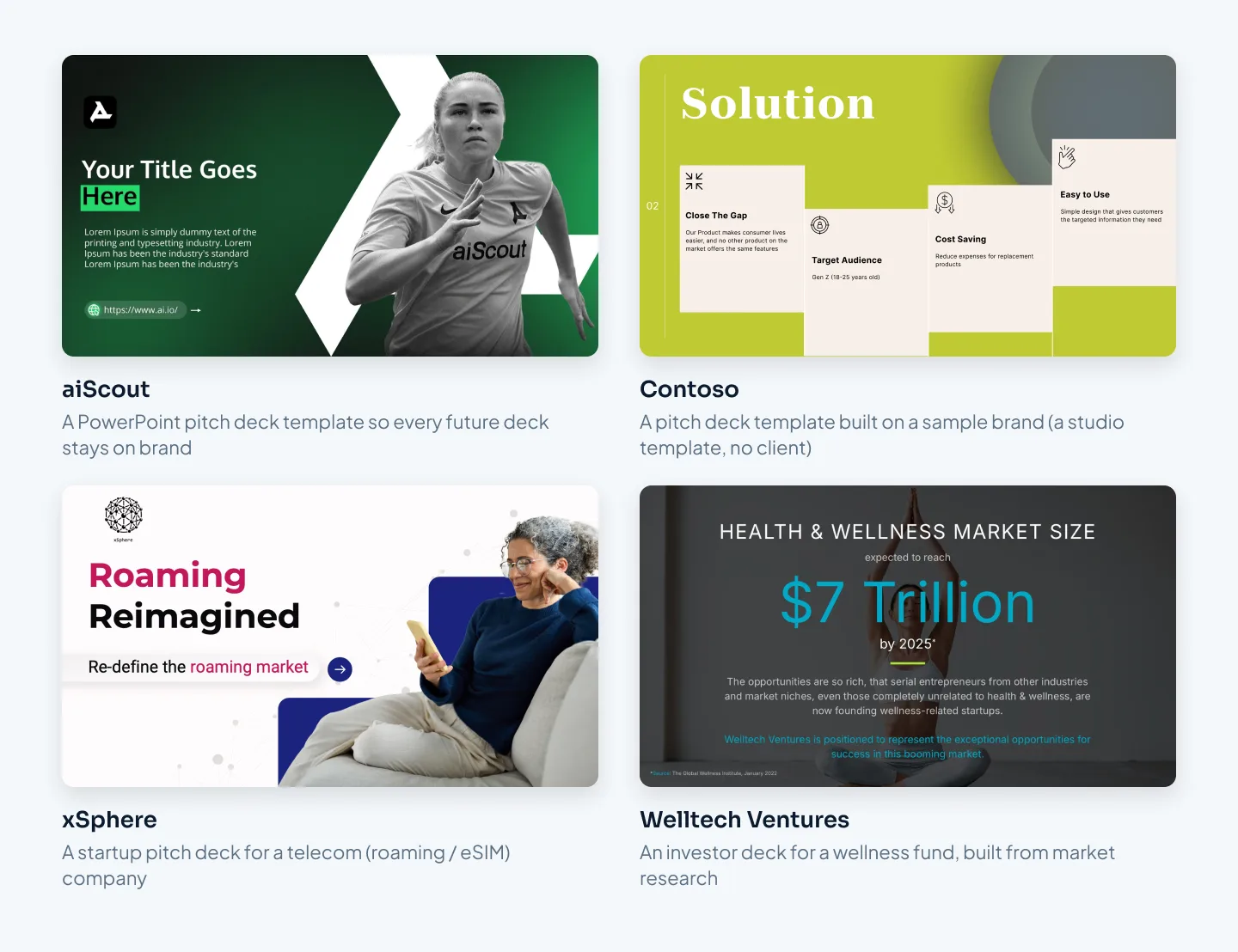
Two of our case studies are pitch deck templates. The aiScout template is a PowerPoint pitch deck template built so every future deck stays on brand. The Contoso template is a pitch deck template built on a sample brand, a studio template rather than client work.
How to brief a custom template
A template brief is mostly a list. Send:
The layouts you need, using the ten above as a starting point. Add any your business needs, such as a pilot results slide or a regulatory timeline.
Your brand guidelines, logo files and font names.
Your current deck, even if you plan to replace it, so the designer sees your real content.
Who will edit it, and in which app. It changes how the template is built.
Examples of the data you'll chart, so chart styles are designed for real numbers.
Our guide to custom PowerPoint templates goes deeper into how a brand template is planned and built.
At Pixel Presentation, PowerPoint templates start from $150, with the price depending on the number of layouts and libraries, and take 5–7 working days. Our PowerPoint template design page covers what's included, and the pricing estimator shows your price before you order.
PowerPoint or Google Slides
Build the template in the app your team will use every day. Converting a template between the two later costs time and often breaks something.
PowerPoint suits a template that has to carry a lot of data and travel well as a file.
Save it as a .potx file. Opening a .potx creates a new, untitled presentation, so the original template stays clean.
Layouts live in Slide Master view, and charts are native, linked to an embedded Excel sheet.
Fonts can be embedded in the file where the font license allows, so a brand font survives on another computer.
Google Slides suits teams that already work in Google Workspace and edit together in real time.
The equivalent of the slide master is the Theme builder (View > Theme builder), with the theme at the top and the layouts beneath it.
Fonts are limited to Google Fonts, so pick the closest Google Font to your brand font and use it everywhere. That limit is also why a Slides deck looks the same for everyone who opens it.
Theme colors are set under Slide > Edit theme > Colors, and you can bring a theme in from another file with Import theme.
If you must work in both, choose one as the master version. Converting back and forth adds damage each time, as our guide to converting PowerPoint to Google Slides explains. When we design in Google Slides, we build natively with Google Fonts rather than converting a PowerPoint file.