Many training decks start life as a document. Someone pastes the procedure into slides, nine bullets at a time, and the trainer reads them aloud. Everyone nods. On Monday, half the room can't do the task.
The fix isn't more polish. It's a different job for the slides: help people do one thing at a time, practice it, and leave the reference material somewhere they can find it later. This guide covers objectives, sections, one-step slides, practice and check-ins, progress markers, handouts and job aids, the differences between live, self-paced and recorded training, and facilitator notes. The example is Fernwood Learning, a fictional corporate training team building a new-hire onboarding course.
Start from what people must be able to do
Before you open PowerPoint, write down what people should be able to do at the end of the session. Not what they should know or understand: what they should be able to do.
| Weak objective | Strong objective |
|---|---|
| Understand the expenses policy | Submit an expense claim that's approved first time |
| Learn about the booking system | Book a client visit, travel included, in under ten minutes |
| Be aware of data protection | Spot personal data in a document and store it in the right folder |
The test is simple: could you watch someone and tell whether they can do it? If you can't, rewrite the objective.
Then use the objective to cut. Every slide should help someone do the task. Policy history, rare exceptions and the full rulebook still matter, but they belong in a handout or job aid, not on the screen. Two or three objectives per section is plenty. More than that usually means the section is really two sections.
Show the objective on a slide near the start of each section, and come back to it in the recap. It tells people what they're aiming for, and the recap becomes a quick check that you delivered it.
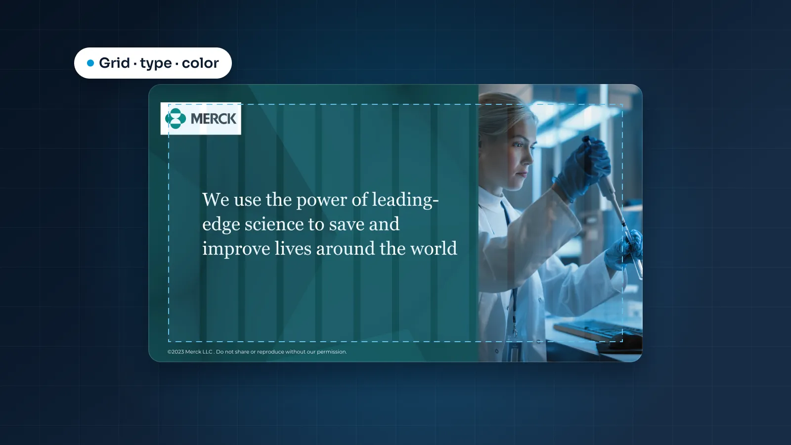
The general rules of slide design still apply: one idea per slide, a grid, two fonts, a small palette. Our guide to making a PowerPoint look professional covers them. Training adds a few rules of its own, and those are what this post is about.
Break it into short sections
Long courses work best as a set of short modules, each built around one task. Fernwood Learning's onboarding course has five:
Your first week
Signing in to company systems
Submit your first expense claim
Booking travel
Who to ask for what
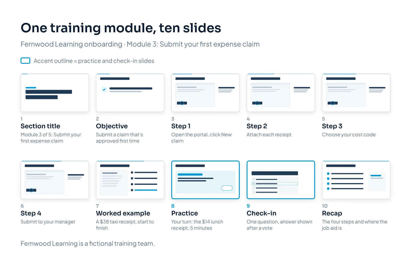
Each module follows the same pattern: a section title, the objective, the steps, a worked example, practice, a check-in and a recap. Repeating the pattern helps learners know what's coming next. It also makes the deck faster to build and easier to update, because every module uses the same layouts.
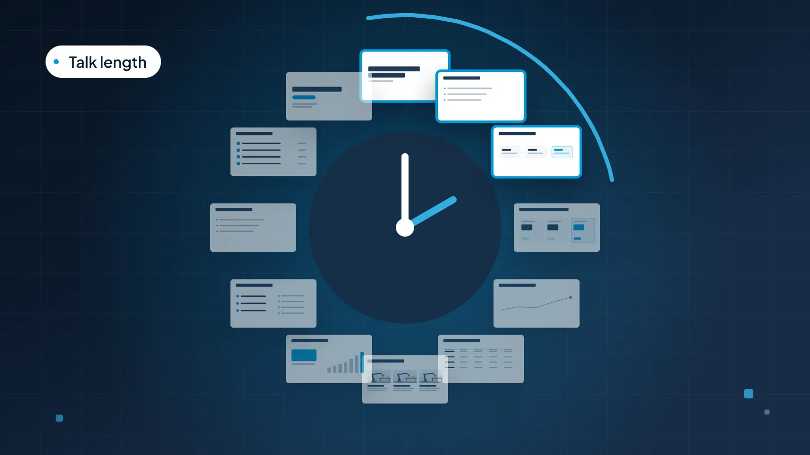
There's no fixed length for a module. In a live session, plan a break or a change of activity between modules. For self-paced training, keep each module short enough to finish in one sitting, so people can stop at a natural point and pick up where they left off. If you're planning a session from its time slot, our guide to how many slides a presentation needs shows how to budget minutes per section.
One step per slide
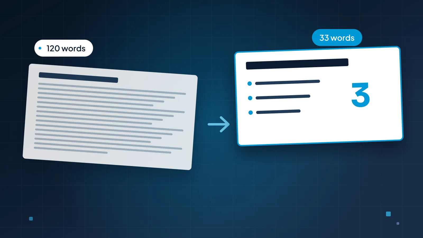
Procedures are where training slides go wrong most often. A nine-bullet slide asks people to read, listen and remember all at once. Worse, it usually mixes two kinds of content: the steps people must follow, and the rules and tips around them.
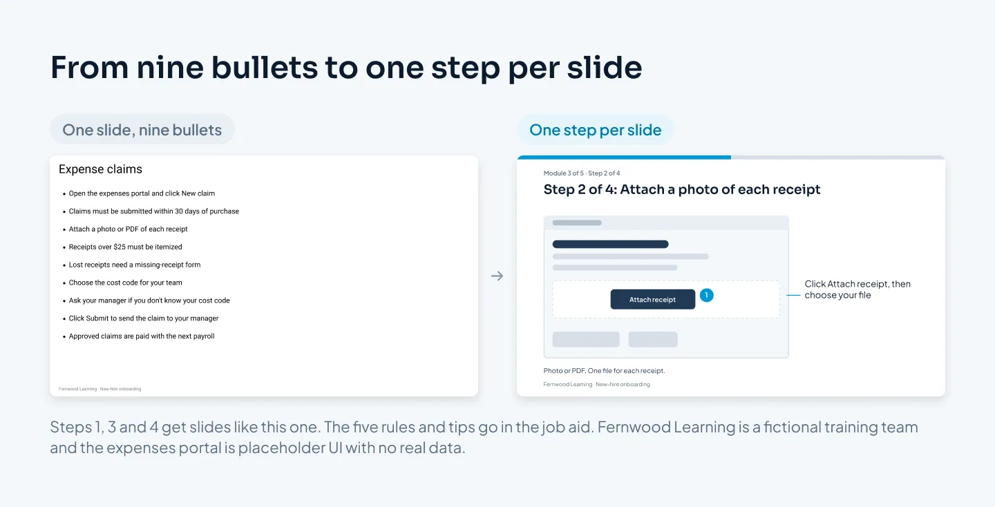
Look at the expense claim slide below. Four of its nine bullets are steps. The other five are rules, a tip and a note about payment. Those belong to the job aid, or at most to one "rules to remember" slide.
A good step slide has four parts:
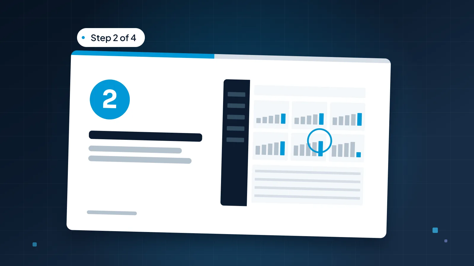
The step as an instruction in the title. "Step 2 of 4: Attach a photo of each receipt", not "Receipts".
A screenshot of the screen where the step happens, cropped to the part that matters and large enough to read from the back of the room.
One callout on the exact button or field, in your accent color. A numbered circle or an outlined box works.
A short line of detail, if it's needed: "Photo or PDF. One file for each receipt."
Use test data in every screenshot, never a real person's details, and check nothing private shows in a corner of the screen.
This means more slides. A procedure with four steps becomes four slides instead of one. We price by the slide, $10 each, so a deck built this way costs more than one built from crowded slides. It's still the better deck, because people can follow it.
Some content can't be split into steps: a concept, a policy, a set of options. The same principle holds. One idea per slide, stated in the title. If a slide still holds too much, our guide to cutting text on slides walks through the method.
Examples, practice and check-ins
Showing a step isn't the same as teaching it. Three kinds of slides turn a presentation into training.
A worked example. Walk through one real case from start to finish. For Fernwood, that's a $38 taxi receipt from a client visit: open a new claim, attach the itemized receipt (it's over $25, so it must be itemized), choose the cost code, submit. One complete example teaches more than four abstract steps.
Practice. Give people a task to do now, not later. A practice slide says what to do, what they need, how long they have and what "done" looks like: "Your turn. Submit a claim for the $14 lunch receipt in your welcome pack. Five minutes. Done when the claim shows Submitted." Leave it on screen while people work.
A check-in. Ask one question that tests a rule people often get wrong, then show the answer with the reason. "A $60 hotel breakfast receipt shows only the total. What do you do?" The answer is to ask the hotel for an itemized receipt, because receipts over $25 must be itemized. A missing-receipt form is only for lost receipts.
Give practice and check-in slides their own layouts, with a distinct color or label, so people recognize them at a glance. In a live room, a check-in can be a show of hands. In a virtual session, most platforms let you run polls, and our guide to webinar slides covers designing for them. In self-paced material, put the question on one slide and the answer on the next.
Show where people are
People settle in when they can see how far they've come and how much is left. Three markers do the job:
A progress label on every slide, in the same place and size: "Module 3 of 5 · Step 2 of 4". A thin progress bar along the top edge works too.
An agenda slide at the start of the session, shown again between modules with the current one highlighted.
A recap slide at the end of each module that repeats the objective and the steps, in the words used on the step slides.
Build the progress marker into your slide layouts, so it sits in exactly the same place on every slide. Self-paced learners rely on it most, because nobody is there to tell them how long is left.
Live, self-paced or recorded
The same course content needs different slides depending on how it's delivered.
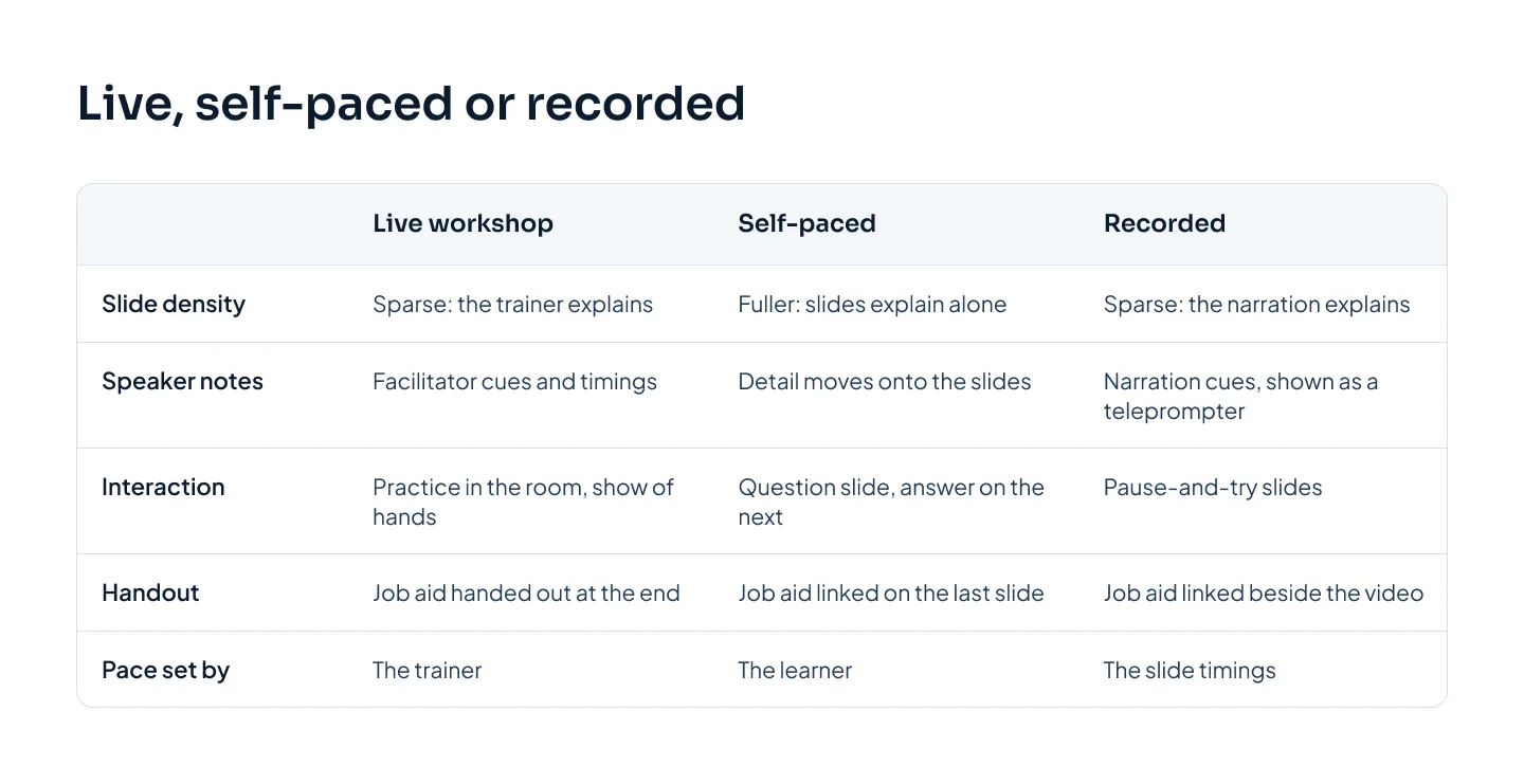
Live workshops can have sparse slides, because the trainer explains. The detail lives in the facilitator's notes, practice happens in the room, and the job aid is handed out at the end.
Self-paced decks are read alone, so they work more like a deck sent to be read: full-sentence titles and a short explanation on each slide. Check-ins put the answer on the following slide, and the last slide links to the job aid.
Recorded training is narrated, so the slides can be sparse again, but timing matters. In Microsoft 365, the Record tab records narration and camera slide by slide, and your notes can show at the top of the screen as a teleprompter. Add "pause the video and try it" slides where a live session would have practice. Our guide to turning a PowerPoint into a video covers export settings and timings.
Whatever the format, make it usable for everyone. Give every slide a unique title, add alt text to screenshots, keep text contrast at 4.5:1 or more, and add captions to videos. In PowerPoint for Microsoft 365, Slide Show > Always Use Subtitles shows live subtitles while you present. Our accessible presentations checklist has the full list.
Slides, handout and job aid
A training deck tries to be three things at once: the material for the session, the reading for afterwards and the reference people use on the job. Split it into three.
| What | Slides | Handout | Job aid |
|---|---|---|---|
| Used | In the session | After the session | While doing the task |
| Holds | One step or idea per slide | Explanations, rules and reasons | Steps, rules and who to ask |
| Length | As long as the session needs | A few pages | One page |
| Format | PowerPoint or Google Slides | PDF or document | One-page PDF, printed or pinned |
The job aid is the one people keep. For Fernwood's expense module, it's a single page: the four steps, the five rules and tips that came off the crowded slide, the cost code list and the name of the person to ask. It sits on the intranet and in the welcome pack.
Writing the job aid first is a useful discipline. Once the reference material has a home, it's much easier to keep it off the slides.
Notes so anyone can run it
Training decks outlive their authors. The person who built the course often isn't the person delivering it next quarter. Facilitator notes are what let anyone run it well.
In PowerPoint, notes go in the Notes pane below the slide in Normal view; click Notes on the status bar if it's hidden. In Presenter View, the trainer sees the current slide, the next slide, the notes and a timer, while the room sees only the slide. In Google Slides, notes go in the box under the slide, and Presenter view shows them with a timer in a separate window.
Good facilitator notes include:
The point of the slide, in one line
What to show or click, if there's a demo
Practice instructions and timing: "Five minutes. Walk the room."
Check-in answers, with the reason
Questions people often ask, with short answers
The transition to the next slide
Write cues, not a script, except where exact wording matters, such as a safety rule or a legal statement. For a printed facilitator guide, View > Notes Page shows each slide with its notes as it will print, and you can print the whole deck as Notes Pages. Text that doesn't fit the notes box prints on an extra page, which is a sign to cut.
Trainers can rehearse with Speaker Coach in PowerPoint for the web and Microsoft 365 (Slide Show > Rehearse with Coach). It gives feedback on pace, filler words and whether you're reading the slide text, and it needs a microphone and an internet connection. Our guide to speaker notes covers writing them in more depth.
For an example of talk slides from our studio, see Filler Myths, slides for a dermatology talk (client name withheld).
For a finished course deck, our PowerPoint presentation design service covers training decks. At Pixel Presentation, design is $10 a slide with a 5-slide minimum, animation is $3 a slide extra, and PowerPoint design takes 3–6 working days once we have your content and brief. The pricing estimator shows your exact price.