
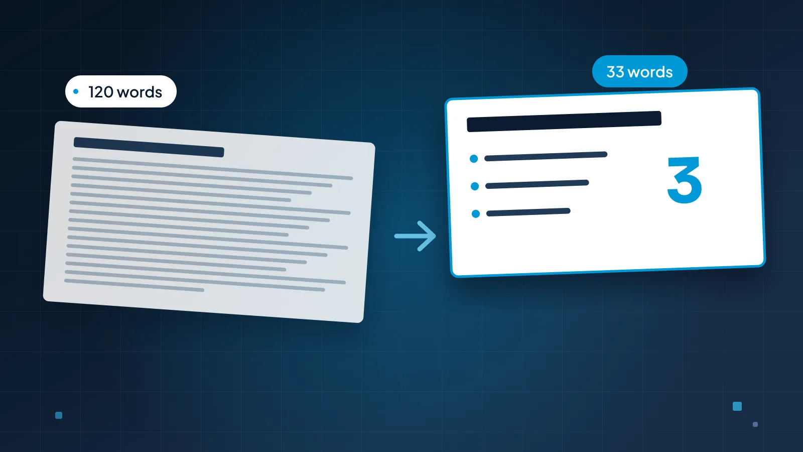
Most wordy slides aren't written by people who like text. They're written by people who are worried: that they'll forget a point, that someone will miss a detail, that the deck will be forwarded to someone who wasn't in the room. Every worry adds a line, and soon the slide is a page.
This guide explains why text piles up, then walks through a five-step method for cutting it without losing anything that matters. The running example is a typical quarterly-review slide from Brightfield Health, a fictional clinic group, cut from 120 words to 33.
Why slides fill up with text
Three habits put most of the text on slides.
The deck is doubling as a document. The same file gets presented on Tuesday and emailed on Wednesday, so every slide tries to work both with and without the speaker. It ends up doing neither well: too much to read while someone talks, and too choppy to read as a report.
Nobody wants to cut. Each line has an owner who thinks it matters. A slide written by a committee keeps every contribution, because removing one feels like a decision nobody wants to make.
The slide is the speaker's script. Presenters put the words on screen so they won't forget them, then read them aloud. The audience reads faster than you speak, finishes first and stops listening.
The result is the same in every case. When a slide is full of text, the audience has to choose between reading and listening, and reading usually wins.
Here's where this guide ends up. The slide on the left is what Brightfield's operations lead might put up for a quarterly review. The slide on the right says the same thing to the room.
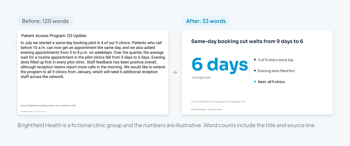
Nothing true was lost. The pilot, the result, the evening slots and the next step are all still there. The staffing request and the reception feedback moved to places where they work better, which the rest of this guide explains.
Our presentation redesign before-and-after examples show the same kind of fix across pitch, sales and corporate decks.
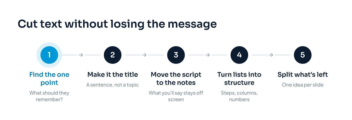
Find the one point
The method has five steps, and the first one does most of the work.
Before you delete a word, ask: if the audience remembers one thing from this slide, what should it be? Write that as a single sentence.
For the Brightfield slide, it's "Same-day booking cut waits from 9 days to 6." Everything else on the slide either supports that sentence or belongs somewhere else.
Then make that sentence the title. "Patient Access Program: Q3 Update" names a topic. "Same-day booking cut waits from 9 days to 6" states the point, so the audience gets it before you say a word. Titles written this way are called action titles, and our guide to consulting-style slides covers how to write a whole deck's storyline with them.
If you can't write the point in one sentence, the slide has two or three points. That's not a writing problem. It's a sign the slide needs to split, which we come to in step five.
Move the script to the notes
Look at what's left on the slide and sort it into two piles: what the audience needs to see, and what you need to say.
The second pile is usually the bigger one. Background ("In July we started..."), explanations, caveats, thanks to the team, the story of how the pilot came about. You'll say all of it. None of it needs to be on screen.
Move it into the speaker notes. In PowerPoint, the Notes pane sits below the slide in Normal view; click Notes on the status bar if it's hidden. In Google Slides, notes go in the box under the slide (View > Show speaker notes if you can't see it). When you present with Presenter View, you see the notes and the room sees only the slide.
Two rules make this work:
Don't paste the paragraph in whole. Rewrite it as short cues you can read at a glance. A script in the notes is as hard to use as a script on the slide.
Keep exact numbers and names in the notes too. If you must say "6 additional reception staff" precisely, write it down.
Our guide to writing speaker notes covers what to put in them and how to rehearse with them.
If you need the words, put them in the notes. If the audience needs them, put them on the slide.
Turn lists into structure
Most of what survives the first two steps is a list. Lists are where text hides, because every bullet looks equal even when the content has a shape.
Look at what the list actually is, and show that shape instead:
| If the list is... | Show it as... |
|---|---|
| Steps in order | A numbered process or a row of chevrons |
| Two or three options | Columns side by side, on the same criteria |
| A before and after | Two panels, or a two-bar chart |
| Results with numbers | One or more big numbers with short labels |
| Dates or milestones | A timeline |
| Examples | An image or a screenshot with one caption |
On the Brightfield slide, the result was a number buried in a sentence. Pulled out as "6 days" in large type, with "average wait" under it, it becomes the visual. The three supporting facts become three short lines: where the pilot ran, what filled first, what happens next.
Structure also cuts words, because the layout carries part of the meaning. A numbered process doesn't need "first", "then" and "finally". A two-column comparison doesn't need "whereas". Our guide to making infographics in PowerPoint shows how to choose the right shape for your information and build it with native shapes.
A few rules for the lines you keep:
Fragments, not sentences. "Evening slots filled first" instead of "We found that the evening appointment slots were the first to fill up."
Three lines, roughly. Past three or four, the list stops being scannable. It's the same limit our guide to making a PowerPoint look professional sets for a one-idea slide.
One line each. If a point wraps onto a second line, shorten it or give it its own slide.
Same grammar. Start every line the same way, with a number, a noun or a verb, so they read as a set.
Split, don't shrink
Sometimes, after all that, a slide still holds too much. The tempting fix is smaller type and tighter spacing. Don't. Shrinking text to make it fit keeps every problem and adds a new one: nobody at the back can read it.
Split it instead. Give each idea its own slide, with its own action title. Here's the Brightfield update split three ways, with the script moved to a notes card.
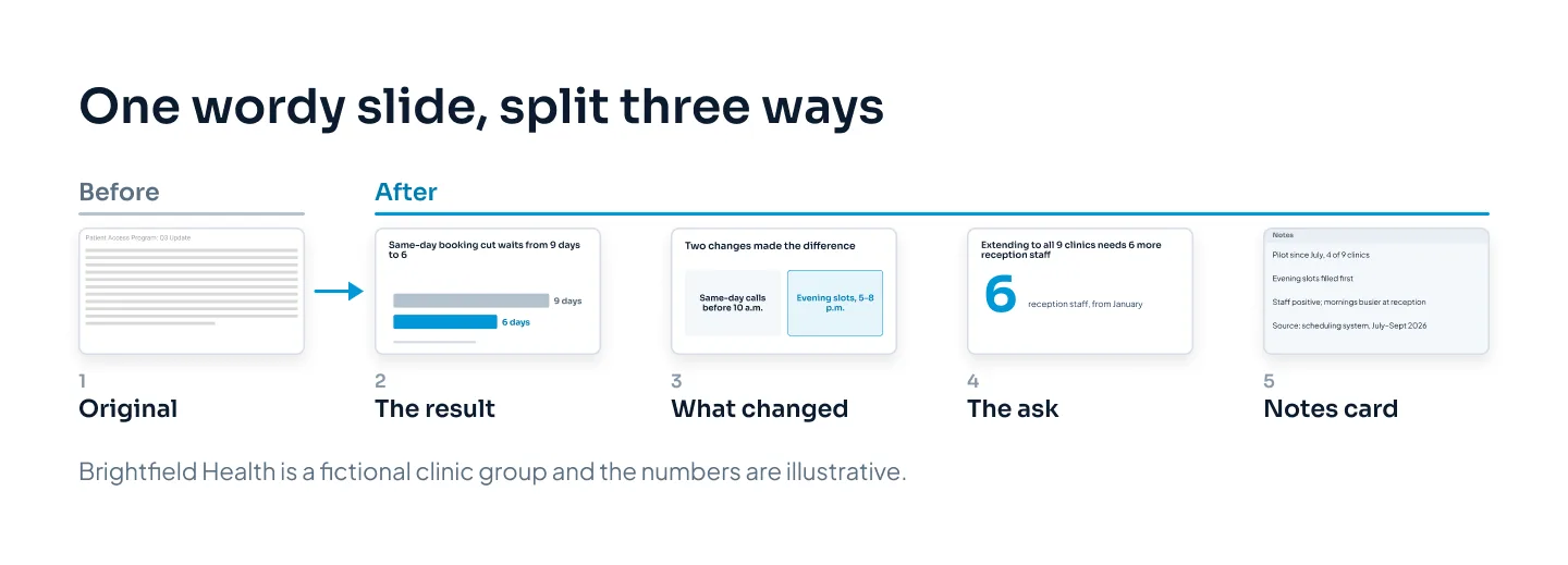
Splitting works better than condensing when each part deserves time on its own. Here the ask for 6 more reception staff is a decision, and decisions get their own slide. On the condensed version in the first figure, it went to the speaker notes instead, because that version was built for a short slot.
Three slides take no longer to present than one crowded slide. They often take less, because nobody stops to read. If you're worried about the slide count, our guide to how many slides a presentation needs explains why the number of ideas matters more than the number of slides.
Keep the detail somewhere else
Cutting text from a slide doesn't mean throwing it away. It means putting it where it does its job. You have four places:
Speaker notes, for what you'll say. Covered above.
The appendix, for detail someone might ask about: the full data, the method, the breakdown by clinic. Put it after a clear divider, and point to it from the main slide if you like ("Clinic-by-clinic results: appendix A2").
A leave-behind or handout, for people who need to read the detail later. A short document or a separate read-alone version of the deck works better than asking presented slides to double as one.
A sent version of the deck, if the deck will be emailed. Build it from the same master, with fuller slides that make each point without you. Our guide to pitch decks and investor decks shows how one master file becomes a presented and a sent version.
That last option removes the main reason slides fill up in the first place. Once the emailed version has a home, the presented slides don't have to carry everything.
For a talk deck from the medical field, see our Filler Myths case study: slides for a dermatology talk, with the client's name withheld.
What not to cut
Cutting text is about removing repetition and script, not substance. Some text has to stay on the slide.
The numbers that prove the point. Round where nobody's decision depends on the last digit, but don't drop the number itself, and never change it.
Units and time periods. "6 days" and "July–September" make the number mean something.
Sources and dates. A small source line under a chart or result costs a few words and earns trust. Keep it at a readable size.
Required wording. Disclaimers, risk statements and other text your legal or compliance team requires stay as written. Ask them before you shorten anything they've approved.
Labels that make a chart readable. Axis labels, series names and data labels are text, and the chart doesn't work without them.
Credits and permissions. Photo credits and customer names you've agreed to show stay where they were agreed.
If you're unsure whether a line can go, move it to the notes rather than deleting it. You can always bring it back.
For a full redesign, our presentation redesign service turns crowded slides into clear ones. Redesign takes 3–6 working days once we have your deck and brief, at $10 a slide, or $15 for complex slides such as process diagrams and multi-series charts. A 20-slide deck that becomes 26 slides after splitting would cost $260 to redesign, with no complex slides. The pricing estimator shows your exact price.