
A deck that works on a laptop in a meeting room often fails on stage. Text that looked fine at arm's length turns to gray noise from the back rows. The video won't play on the venue computer, and your brand font quietly becomes a default one.
This guide covers slides for conferences, keynotes and TEDx-style talks. It explains what changes on stage, how to keep slides readable and paced with your talk, and how to hand files to the AV team so nothing breaks on the day.
What's different on stage
Three things change when your slides move from a meeting room to a stage.
Distance. The screen is bigger, but the audience is much further from it. For the back half of the room, your text looks smaller than it did on your laptop, not larger.
Attention. In a meeting, people can ask you to go back a slide. In a hall, each slide gets one chance, and the room is listening to you at the same time. If a slide holds a paragraph, people read it instead of hearing you.
Control. You don't own the computer, the screen or the clicker; the organizer's AV team does. Your file has to run on their setup, sometimes in a version of PowerPoint or Keynote you didn't choose.
There's a fourth, smaller change: people photograph slides. Any slide you'd like shared should make sense as a single phone photo, with no context around it.
That's why event presentation design is its own discipline, not a meeting deck on a bigger screen. Here's the same content built both ways.
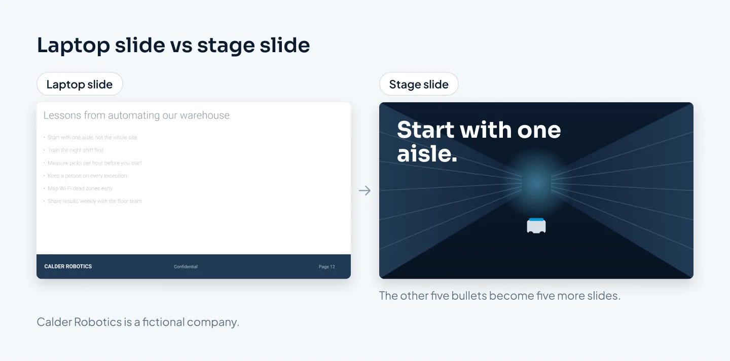
Design every slide for the back row, not for your laptop.
Big-screen readability: size, contrast, aspect ratio
Text size
Make text larger than feels comfortable at your desk. A useful rule of thumb: if text has to drop below about 24 pt to fit on a 16:9 slide, there's too much of it. Split the slide rather than shrink the type.
To test a deck, open the slide grid view (Slide Sorter in PowerPoint) and make the thumbnails small. If you can't read a slide's main point at that size, the back row can't either.
Choose regular or bold weights. Thin and light weights tend to break up on projectors and on LED walls with visible pixels. Our guide to making a PowerPoint look professional covers type and spacing in more depth.
Contrast
WCAG sets minimum contrast ratios of 4.5:1 for normal text and 3:1 for large text. On stage, treat those as the floor, not the goal. Projectors wash colors out and stage lighting spills onto the screen, so a pale gray that passes on your monitor can disappear in the hall.
In a darkened room, a dark background with light text is usually easier to watch than a big white slide that glows. Check with the organizer first: some events have a house style or background color they want speakers to use.
Aspect ratio and the screen spec
Most screens today are 16:9, the standard slide size of 1920 × 1080 pixels; 4:3 is a legacy format. But don't assume. Ask the organizer for the screen spec before you design a single slide:
- the aspect ratio and resolution of the main screen;
- for an LED wall, its exact width and height in pixels, because walls are built from panels and are often not 16:9;
- whether side screens or a camera feed share the display with your slides;
- any house template, title slide or sponsor slide you must use;
- which software and version the venue computer runs, and whether you can present from your own laptop.
Keep important content away from the bottom of the slide. In a room with a flat floor, the lower part of the screen is often hidden behind the heads in front.
Pacing slides with your talk
On stage, slides should follow your voice, not lead it. The simplest way to get there is one idea per slide.
That usually means more slides, not fewer. A meeting deck might cover a topic on one slide with six bullets. A stage version gives each point its own slide, with a single line or a single image, and you move through them as you speak.
The word count goes down; the slide count goes up. That's fine, because each slide is on screen for less time.
A few habits that help:
- Change the slide on the sentence that needs it. If the slide shows the answer before you ask the question, the room gets ahead of you.
- Build complex slides in steps. Reveal a chart's highlight or a diagram's next stage when you reach it, not all at once.
- Use section slides. A simple title between parts tells the audience where they are in the talk.
- Use a blank slide for key moments. A plain dark slide puts all the attention on you for a story or an important point.
- Rehearse with a clicker and a timer. Time each section, not only the whole talk, so you know what to cut if the schedule slips.
If you're not sure whether a slide does too much, say what it shows in one sentence. If you need "and" twice, split it.
Images, video and motion on stage
Images. Use photos at least as large as the screen: 1920 × 1080 pixels for a standard 16:9 screen, or the wall's own pixel size for an LED wall. Small or heavily compressed images look soft when they're blown up to the size of a wall. A full-screen photo with one short line of text is one of the strongest slides you can put on a stage.
Video. Embed video in the file instead of linking to a file elsewhere on your computer. Don't count on streaming from the web; venue Wi-Fi is shared with everyone in the building. MP4 is a safe choice for both PowerPoint and Keynote.
Embedding makes the file larger, so send it with a file-transfer link rather than by email. And tell the AV team which slides have sound.
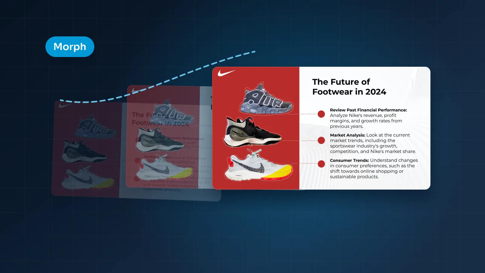
Motion. Movement on a big screen is powerful and easy to overdo. Use it to explain: zooming from an overview into a detail, moving a product into place, building a process step by step. PowerPoint's Morph transition and Keynote's Magic Move both do this well.
Morph needs PowerPoint 2019 or later, or Microsoft 365, so check the venue's version before you build a sequence around it. Our post on PowerPoint animation and Morph covers when motion helps and when it gets in the way.
Speaker notes and confidence monitors
In PowerPoint, Presenter View shows you the current slide, the next slide, your notes and a timer, while the audience sees only the slide. Keynote and Google Slides have their own presenter views. They're the best way to rehearse.
On stage you may not get them. Many venues put a confidence monitor at the front of the stage, facing you, and what it shows depends on the setup.
Some monitors show Presenter View with your notes. Others show only the current and next slide, or a copy of the main screen.
So ask the AV team two questions: what will the confidence monitor show, and will there be a countdown clock? Then plan for the worst case.
Write notes for a glance, not a read:
- short lines of a few words, in large text;
- the one point the slide must land;
- a cue for the move to the next slide;
- any number or name you can't afford to get wrong.
If the monitor won't show notes, your slides become your notes. That's one more reason for one idea per slide: the slide itself reminds you what to say next.
Handing files to the AV team: a checklist
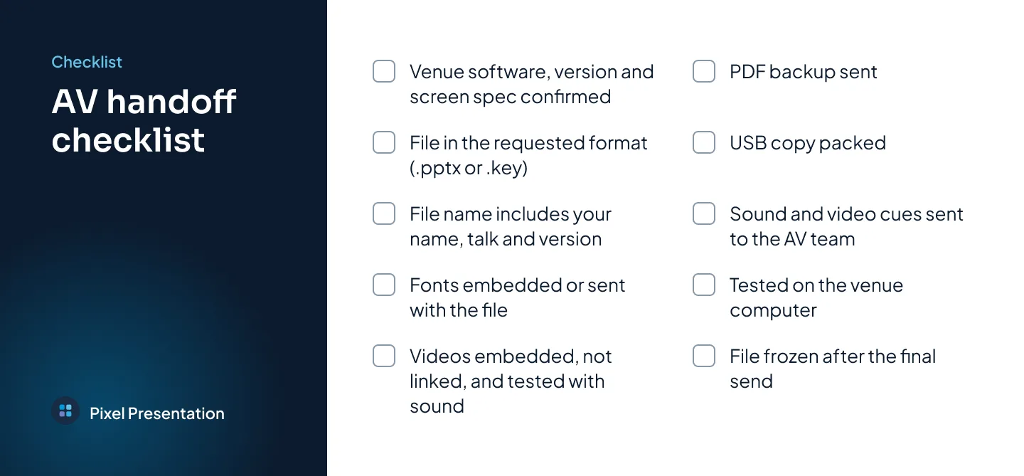
A missing font, a silent video, last week's version on screen: problems like these start at handoff, not on stage. Run through this list before you send your final file.
- Confirm the setup. The venue computer's software and version, the screen spec, and whether you can use your own laptop.
- Send the format they asked for. Usually .pptx or .key, named with your name, talk and version, such as "Calder-Robotics_Warehouse-Talk_v4.pptx".
- Package your fonts. Embed them in PowerPoint where the font license and your version allow, or send the font files for the AV team to install. Keynote needs the fonts installed on the presenting Mac.
- Embed video, don't link it. Check that every video plays from the file alone, with sound.
- Send a PDF backup. It won't play video or animation, but it opens on almost anything.
- Bring a USB copy. Carry the final file, fonts, videos and the PDF, even if you've sent them already.
- List your cues. Tell the AV team which slides have sound, video or anything unusual.
- Test on the venue computer. At the tech check, click through every slide: fonts, video, sound, transitions, the clicker and the confidence monitor.
- Freeze the file. Avoid edits after the final send. If you must change something, give it a new version number and tell the AV team.
Examples: TEDx Westminster and other talks
Three of our case studies are decks built for a stage:
- TEDx Westminster: slides for a TEDx talk.
- The Aligned Mindset: a conference keynote deck.
- Filler Myths: slides for a dermatology talk, with the client's name withheld.

When you look through them, or any stage deck you admire, apply three tests from this post:
- Could you read each slide from the back row?
- Does each slide carry one idea?
- Would a phone photo of it make sense on its own?
Those questions are a quick way to judge any set of conference slides, including your own.
When to start
Keynote presentation design takes longer than a meeting deck because there's more to get right: story, pacing, images, video, motion and the venue's setup. Our turnaround for event and keynote decks is 7–12 working days, so start two to three weeks before the event if you can.
Work back from the organizer's deadline, not the event date. Ask when they need your final file, because it's often days before you speak.
Then keep the last few days for rehearsing with the finished slides and for the AV handoff. A deck you've only seen in the editor can still surprise you on a screen the size of a wall.
The design clock starts when you order with your content and brief, so have your talk outline or notes and the screen spec ready. If your date is closer, check the faster delivery options when you order; they depend on a designer having the hours free.