

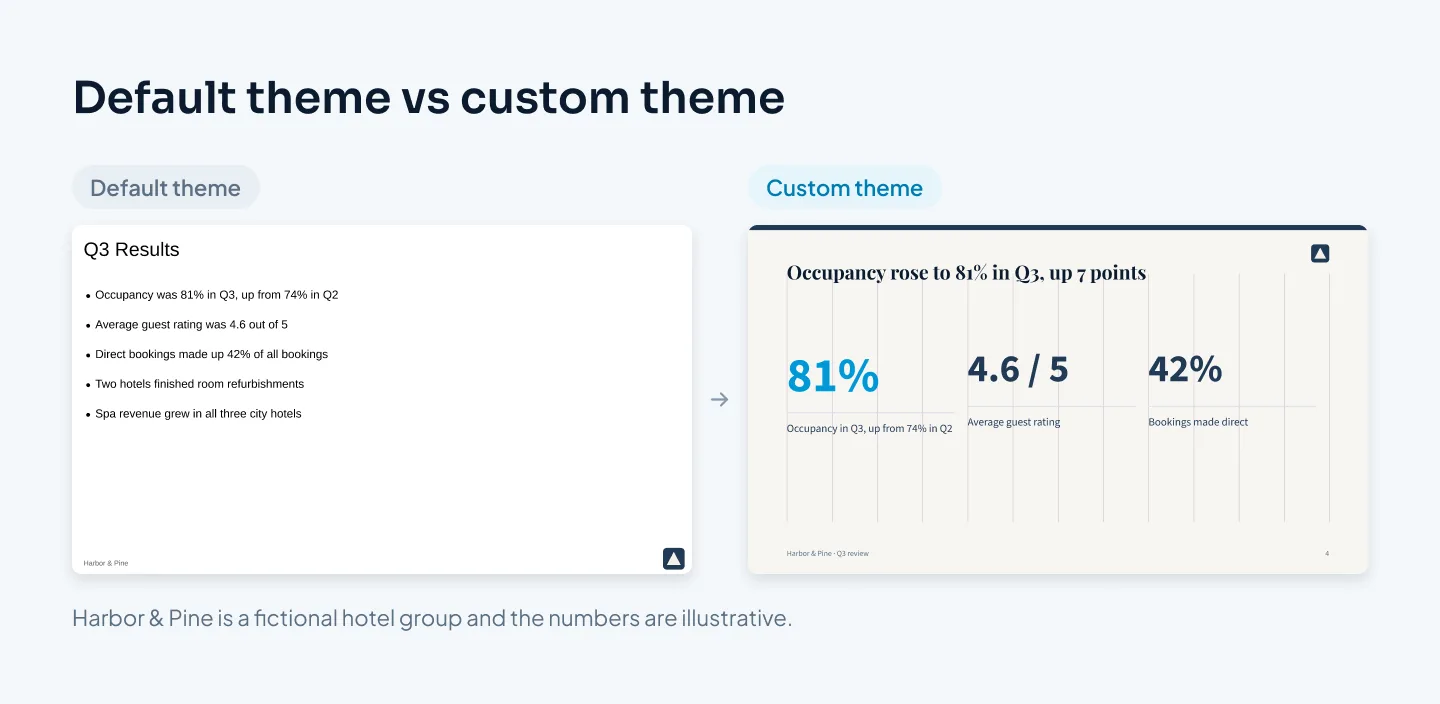
Google Slides has a reputation for looking plain. Most of that comes from the default theme, not the tool. Open a blank deck, type into the first layout, and you get the same look as every other deck started that way.
Set the theme up first, and a Google Slides deck can look as considered as one built in PowerPoint. This guide follows the order a designer works in: theme, fonts, colors, layouts, grid, images and charts, motion, then sharing and presenting. If you're still choosing a tool, our comparison of Google Slides, PowerPoint and Keynote covers that decision first.
Start in the Theme builder
Every Google Slides deck has a theme: the fonts, colors, backgrounds and layouts that each slide inherits. Open it from View > Theme builder. It used to be called Master, so older guides and colleagues may still use that name.
The Theme builder has two levels:
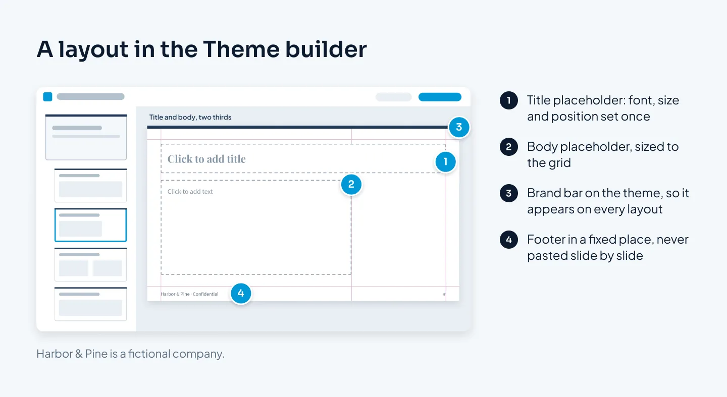
The theme is the first thumbnail. Fonts, colors, the background and anything you place on it flow down to the layouts beneath.
The layouts sit beneath it. Each one is a pattern for a kind of slide: a title slide, a section header, a title with body text, and so on.
Slides you build in the normal editor take their look from a layout. That's the point of the whole system. Decide the look once in the Theme builder, and every slide that uses a layout follows it. Change the title font on the theme, and every title in the deck changes with it.
The common mistake runs the other way. Someone picks a theme, then fixes each slide by hand: a bigger title here, a new color there, a logo pasted onto 30 slides. Every manual fix is something the next person has to copy, and they usually won't.
There are three good places to start:
A plain theme. Choose the simplest theme on offer and build your own look on it. Less to undo.
The template gallery. File > New > From template gallery opens ready-made decks. They're useful for structure, but expect to replace their fonts, colors and decoration with your own.
An existing file. Slide > Change theme, then Import theme, brings in the theme from another Google Slides or PowerPoint file. It's the quickest route if your company already has a branded template. If the source is a PowerPoint file, check its fonts first, because fonts that aren't in Google Fonts get replaced. Our guide to converting PowerPoint to Google Slides covers what else can change.
If you know PowerPoint, the Theme builder is Google's version of the slide master. Our guide to the PowerPoint slide master explains the same logic in more depth.
Pick fonts that work in Google Slides
Google Slides uses Google Fonts. The font menu shows a short list, and More fonts adds others from the Google Fonts library. Google Fonts are free to use, including commercially, and because Slides supplies them itself, the deck looks the same for everyone who opens it.
That's the big advantage over PowerPoint, where text depends on the fonts installed on each computer. It's also the main limit. If your brand font isn't a Google Font, Slides can't use it, and fonts that aren't in Google Fonts are replaced when a file is converted.
Three ways to choose:
One family, two weights. Inter bold for titles and Inter regular for body text is clean and hard to get wrong.
A pairing with clear contrast. Montserrat headings with Open Sans body text, or IBM Plex Serif with IBM Plex Sans. Playfair Display works for headings at 28 pt and up, beside Source Sans 3.
A stand-in for your brand font. If your brand typeface isn't a Google Font, choose the closest match once and write it into your brand guidelines as the Google Slides font. Then every Slides deck in the company matches.
Set the fonts on the theme, not slide by slide. In the Theme builder, select the theme thumbnail, then choose the font and size for the title placeholder and the body placeholder. The layouts pick them up, so new slides start with the right type.
The sizes we start from are the same as in PowerPoint: 36–40 pt for titles, 24–28 pt for subheads, 18–20 pt for body text on a presented deck and 12 pt for labels and sources. Keep script fonts, very thin weights and display fonts at body size out of the deck. Our guide to the best fonts for presentations has the full list of Google Fonts that hold up on slides, with pairings.
Set theme colors once
Open Slide > Edit theme, then Colors. Select each theme color in turn and type its hex code from your brand guidelines. The colors then appear in the theme section of the color menus, so people pick from the brand palette instead of the default swatches.
Give each color a job. The palette we start from has five or six:
A dark text color, often a very dark gray or navy rather than pure black.
A light background, usually white or off-white.
One or two neutrals for lines, secondary text and chart bars that aren't the point.
A brand color for structure: section headers, key headings, icons.
One accent that means "look here", used once per slide.
Check text against its background. The WCAG standard asks for a contrast ratio of at least 4.5:1 for normal text and 3:1 for large text. Pale gray text on white and white text on a light photo are the usual failures. Our guide to presentation color schemes has six starter palettes with hex values you can paste straight into the theme.
Backgrounds
Slide > Change background sets a color or an image. Click Done to change one slide, or Add to theme to apply it to every slide that uses the theme.
Keep content slides on one background, usually white or very light for decks read on laptops. Give section headers their own layout with a dark or brand-colored background, so the change is deliberate and the same every time.
Layouts for every slide type
The default layouts are a generic set. A professional deck needs a layout for each kind of slide it repeats. A typical set:
Title
Section header
Title and body
Two columns
Big number
Image and text
Chart
Quote
Closing
To build one, right-click the closest existing layout in the Theme builder and duplicate it. Rename it, then move and resize its placeholders so they sit on your grid. Names matter more than people expect. "Chart, full width" tells a colleague what the layout is for; "Custom layout 4" doesn't.
Put the things that repeat on the theme or a layout rather than on individual slides: the logo, a brand bar, the footer text. They then sit in exactly the same place on every slide.
To use a layout in the normal editor, pick it from the Layout button in the toolbar, or right-click a slide and choose Apply layout. Build new slides from a layout every time, rather than duplicating an old slide and editing it, so they keep the layout's placeholders.
If your team builds decks every week, this is where a branded template pays off: the setup is done once and everyone starts from it. The launchwisely branded template is one example from our studio.
A grid, guides and alignment
Alignment is what makes a slide read as designed. When titles start in a slightly different place on each slide, few people can name the problem, but the deck feels loose.
Google Slides doesn't come with a column grid, but guides do the same job. Turn them on from View > Guides and add guides for your margins and columns:
Margins. Choose one margin and keep it on all four sides. Titles, text, charts and logos stay inside it. Only full-bleed images cross it, and those go all the way to the edge.
Columns. Divide the space inside the margins into 12 equal columns. Twelve splits into halves, thirds and quarters, so two-column, three-column and text-and-image layouts all line up with each other.
Fixed positions. Titles start at the same point on every slide, and body content starts at the same height. Placeholders on your layouts take care of most of this.
Snapping pulls objects onto guides and onto each other as you drag. For anything more than two objects, use Arrange > Align to line up edges or centers, and Arrange > Distribute to space three or more objects evenly. Dragging by eye is how gaps end up 3 pixels apart on one side and 9 on the other.
Use space to group. Put related items close together and leave more room between unrelated ones, and the structure reads without boxes or divider lines. Our guide to making a PowerPoint look professional covers margins, grids and hierarchy in more detail, and every rule in it carries over to Slides.
Images, icons and charts
A deck looks assembled when its pictures come from five places. It looks designed when they belong together.
Photos
One style. Keep lighting, color and framing consistent. Glossy stock next to phone snapshots is a giveaway.
Real over generic. Your product, your team, your customer's setting. Handshakes and lightbulbs read as filler.
Crop with intent. Run a photo to the slide edges, or fit it to a frame that sits on your grid. Avoid small photos floating mid-slide.
Never stretch. Resize from a corner and check that nothing looks squashed.
Alt text. Right-click an image and choose Alt text, so screen-reader users get the same point. Our accessible presentations checklist covers the rest.
Icons
Use one set, in one style and one color: all outline or all filled, the same stroke weight, the same size. An icon should help someone scan. If it needs explaining, delete it.
Charts and tables
Charts in Google Slides come from Google Sheets. So the chart's design starts in the sheet: build the chart there, then remove gridlines, label the data directly instead of using a legend, and put every series in gray except the one that proves your point. A chart that stays linked to its sheet can be updated when the numbers change, which beats pasting a screenshot.
Title each chart with its takeaway, such as "Occupancy rose to 81% in Q3", not "Occupancy". Tables follow the same logic: light horizontal rules, no vertical lines, numbers right-aligned with the same decimals, and the row that matters in bold. Our guide to presenting data in slides goes deeper on chart choice.
Transitions and animation, sparingly
Google Slides offers a short list of transitions and basic animations, and nothing like PowerPoint's Morph. For a business deck, that's rarely a loss.
One transition, or none. Pick a simple fade for the whole deck, or leave transitions off. A different effect on every slide looks like a demo of the menu.
Builds with a purpose. Reveal steps one at a time when you walk through a process, so people don't read ahead. Skip motion that only decorates.
Fast and quiet. Short durations and subtle effects. Spins and bounces pull attention away from what you're saying.
If the deck depends on motion, such as a product reveal or objects moving smoothly between slides, it probably belongs in PowerPoint. Our guide to PowerPoint animation and Morph covers what's possible there.
A professional Google Slides deck isn't more decorated. It's set up once and followed everywhere.
Share and present it well
Collaboration is where Google Slides is strongest, so set it up deliberately.
Share with the right access. Give editors edit access and reviewers comment access. Feedback arrives as comments on the slide it's about, instead of edits nobody can trace.
Use version history. Before a big round of changes, check you can go back. Version history keeps earlier versions, so a bad edit at midnight isn't final.
Write speaker notes. Notes go in the box under the slide. If it's hidden, View > Show speaker notes brings it back.
Present with Presenter view. From the Slideshow drop-down, choose Presenter view. It opens your notes and a timer in a separate window while the audience sees the slides. It also has audience Q&A, which lets people submit questions from their own devices.
Turn on captions if they help. Live captions are available while presenting, from the Captions button in presenter mode.
Send a PDF to outsiders. A link works for colleagues. For a client or investor, a PDF shows the deck exactly as designed, whatever they open it with.
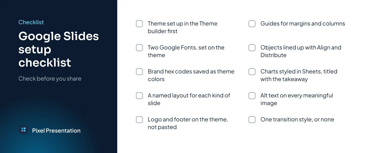
Before you share, run through the setup once more. The checklist below covers it.
If you'd rather hand the whole thing over, our Google Slides and Keynote design service builds decks natively in Google Slides. At Pixel Presentation, design is $10 a slide with a 5-slide minimum, so a 20-slide deck is $200, and Google Slides design takes 3–6 working days once we have your content and brief. The pricing estimator shows your exact price before you order.